| Image |
Comment |
| 07/12/2003 05:27:45 PM |
HM-Torso Studyby Chilly0999Comment: I don't like the grain on the shot. A clean smooth look would have given so much more character to the skin. The subject is somewhat interesting, but probably needs a more compelling angle or lighting to make it draw the viewer in. |
 Photographer found comment helpful. Photographer found comment helpful. |
| 07/12/2003 05:24:09 PM |
Curves and Stripesby kerrywcComment: I really love the tones of this shot. The lines are excelent as well, adding interest to the subject. Beautiful work. |
| Photographer found comment helpful. |
| 07/11/2003 08:04:11 PM |
blue bikiniby shutterflyComment: Well, I'm torn on this, especially given all the recent controversy about "meeting the challenge". Nude means (dictionary.com) "Having no clothing" and involves "full exposure of the body". This isn't nude. So you don't fit the challenge and I'll take off for that. But now that's out of the way so lets forget about it.
I really like this shot a lot. Everything about it really works well. The most obvious thing about it is the muted colors and it is brilliant. The grey skintones (which I love on their own) contrast beautifully with the blue, but a fully saturated blue would have been too intense to flow together nicely; the mild blue is perfect. The other touch of color, the hair, adds another entire level of depth and interest. Also, the freckles add a lot of character to the shot, and make it seem less generic. The face turns away from the camera keeps the emphasis on the body, which works well for this shot.the composition is wonderful, a tight crop to hold back enough to keep curiosity (which is added to by the open shorts and what seems to be a tatoo peeking out) but wide enough to give the viewer a strong understanding of the subject. The diagonal lines are nice. The background is surprisingly nice as well.
I'm sure you'll get a crummy score for this, and I can't say I feel bad about it, because this is a pretty clear failure to meet the challenge, but this is a wonderful shot either way, and I hope to see more of your stuff in the future. (If I remember I'll be sure to add this to my favorites as well.) Message edited by author 2003-07-18 18:20:20. |
| Photographer found comment helpful. |
| 07/11/2003 07:47:00 PM |
Untitledby jenaromComment: Well, it's a very simple composition which works more or less but doesn't have a lot of uniqueness to offer. The grain helps to add some interest, and the lighting is fine, but the shot as a whole lacks anything specially unique or interesting to set it apart in my eyes. |
| Photographer found comment helpful. |
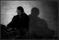
| 07/11/2003 07:41:20 PM |
|
| Photographer found comment helpful. |
| 07/11/2003 07:37:47 PM |
Maestroby albright1Comment: The pose works well, the light and shadowing on the body also work nicely, but I think the background poses problems. Those redish spots on the bottom left would have been better off avoided (especially since you could have spot edited them out) but even ignoring that, I think the lighting on the background wall doesn't work out. An evenly light plain white background (or perhaps with a gradient from the top or bottom) would probably work better than the odd streaks of light intensity in this shot. |
| Photographer found comment helpful. |
| 07/11/2003 06:36:38 PM |
Reflecting on Anna by dan_pendletonComment: I like the pose and lighting here. It seems like an effective composition as a whole. I really like the abstract shape it produces if you let your eyes release their focus a little bit. I do take issue with the inclusion of both the b&w and color versions. I can see why you'd want to include both, as they each have different strengths and weaknesses. I think I prefer the black and white version, because it emphasizes the forms better, seems to have a smoother flow to it, and I much prefer the shadowed black hair to the brown of the color. The color version has more warmth to it and seems more personal than the cold b&w shot. So while I think both of these individually are good shots, I think the combination of the two results in a clash. The color and black and white doesn't flow together into one seemless shot. Instead of bringing out each others advantages they seem to dull each other's strengths. So, I like the reflection (which I'm guessing was post-production produced and not an actual reflection) because of the added abstract quality it creates, but I'd have made the entire image black and white or color (and personal I'd have gone b&w). Great work though. This might show up on my favorites. 9 Message edited by author 2003-07-18 00:47:06. |
| Photographer found comment helpful. |
| 07/07/2003 05:56:38 PM |
...by kosmikkreeperComment: Great depth of field and framing. The camera tilt adds a lot. It might have worked even better if the model's head had been turned away from the camera, adding more mystery to the shot, and avoiding the plesant sleep pose that seems to show up here. |
| Photographer found comment helpful. |
| 07/07/2003 05:01:58 PM |
Why God...why now?by K-RobComment: I think it relies a bit heavily on it's title to be an effective shot, however, it does a good job of depicting an unanswered question many people face. |
| Photographer found comment helpful. |
| 06/24/2003 11:53:23 PM |
meby heidaComment: Beautiful. I could go on about all the things I like about this, but I'll just throw out a few.. I like the symetry, and I like that it's not perfect symetry, and that the whole thing is off center, and the pose, and the lighting, and the black and white, and the concept, and the texture of the wall you used, and the angle of the shot. I have a feeling this won't score as high as it should, but I know I'll add it to my favorites after the challenge ends. 10. Great work.
(I just thought I'd add that I voted on almost every entry in this challenge, and this was my only 10 I gave.) |
| Photographer found comment helpful. |
Home -
Challenges -
Community -
League -
Photos -
Cameras -
Lenses -
Learn -
Help -
Terms of Use -
Privacy -
Top ^
DPChallenge, and website content and design, Copyright © 2001-2025 Challenging Technologies, LLC.
All digital photo copyrights belong to the photographers and may not be used without permission.
Current Server Time: 08/24/2025 06:27:16 AM EDT.