|
|
|
Showing 3601 - 3610 of ~4217 |
| Image |
Comment |
| 11/17/2005 09:16:55 PM | I See You...by davidus428Comment: 8 - Very good, and two for one meet of the Challenge. Criticism; very difficult given the composition and inclusion of the two 'characters', but maybe a slightly different cropping. Would like to say different angle, but I am sure this was an opportune capture as is. Definition is good on both but would like to have seen perhaps a touch more as well as more vivid (especially in the green) colors, again though, difficult with the resulting contrast issues I imagine, as well as retaining definition in both 'characters' at once, in a macro. |  Photographer found comment helpful. Photographer found comment helpful. |
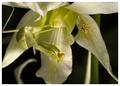
| 11/17/2005 09:13:19 PM | Leaf me alone by BrennanOBComment: 8 - Good meet of Challenge. Very nice colors. Criticism; different composition if possible, either sharper angle (face more at the fore), or the inclusion of the entire body, depending what you had to work with, may have made this even better in my opinion. Difficult with such a small snake though. | | Photographer found comment helpful. |
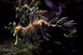
| 11/17/2005 09:11:59 PM | Natures Disguise by DefyTimeComment: 8 - Very nice capture. Nice colors. Criticism; like to see the colors even bolder if possible, but difficult with aquarium shots. Even more definition too on the seahorse, but again, difficult. Even though you haven't captured the seahorse close to a rock etc, to really emphasize the camouflage, this still works with the background, but I think had it been 'closer' to a rock/coral etc, would have made this even better, especially for the Challenge. | | Photographer found comment helpful. |
| 11/17/2005 09:09:34 PM | Waiting by wsteynComment: 8 - Very good meet of the Challenge. Good colors/contrast control, while retaining definition in the hairs, etc. Criticism; despite that contrast comment, seems a little 'blown' (or whatever the correct term is, ie bottom right of 'leaves' and 'in between' the spider's eyes) in some areas but difficult to control this I imagine, however this looks like a studio set up (apologies if wrong) so maybe the use of 'cards/boxes' whatever, may have helped, not sure, don't have enough knowledge to suggest anything there. | | Photographer found comment helpful. |
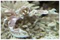
| 11/17/2005 09:06:01 PM | Anenome Crabby cloudsmeComment: 8 - Very good aquarium shot, they are not easy. Good colors and 'composition'. Criticism; just a little sharper on the crab, especially the 'fore parts', would have made this even better in my opinion, but very difficult to do. Not sure on the white with the frame, it works, but not sure it enhances the shot to the full potential. | | Photographer found comment helpful. |
| 11/17/2005 09:04:26 PM | Female Ring-neck Pheasant in Habitatby sfaliceComment: 8 - Very good meet of the Challenge. Good coloring. Criticism; not much, maybe a different 'composition'/placing/crop, not sure. Maybe, a small frame, though not sure on that. | | Photographer found comment helpful. |
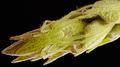
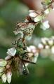
| 11/17/2005 09:03:11 PM | Hidden Assassin Kills Waspby kenskidComment: 8 - Good macro and coloring. Criticism; even though I like the added 'context' by the inclusion of more stem/flowers, I think, if possible, an even tighter crop/zoom would have worked well. Difficult to tell (and indeed do), but perhaps a little more sharpness, 'somehow' on the assassin, would have made this even better. Good capture and timing. Title is perhaps a little too 'spelled out' for the Challenge, in my opinion. | | Photographer found comment helpful. |
| 11/17/2005 08:58:05 PM | Can you see me now?by ZippyComment: 8 - Very good clarity and coloring. Criticism; obviously, the 'cropping', although, especially for this Challenge, the 'crop' enhances the camouflage, I still think it may have worked as well, if not better, uncropped, but don't know what you had to work with or what camouflage effect is lost in doing so if possible so, not sure. | | Photographer found comment helpful. |
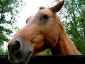
| 11/17/2005 06:57:54 PM | The Horseby A VaryaComment: This is a funny (ha ha) angle and perspective. I think if the very bottom of the horse's lip were not 'cut out', would make this better, same with the top of it's ear. I wonder if (even though I like the angle) you were perhaps a little too 'close', and the nose especially is out of focus, a little blurred, but maybe you were going for this kind of focus, so not sure. The photo seems nice and 'straight' so good there. The only other thing might be that the 'contrast' is a bit blown, especially with the horse's mane/hair at the top against the bright sky, but difficult to get the contrast right in a shot like this I think. He/she deserves an apple if you go for another shot. edit:he/she Message edited by author 2005-11-17 19:02:36. | | Photographer found comment helpful. |
| 11/17/2005 06:53:23 PM | Robert E. Leeby A VaryaComment: Firstly, good for you for taking up a 'good' hobby, there are far worse things that 9 year olds can do to occupy their minds these days.
Here is my comment on this shot (of a great man by the way); I like the colors, the reds, especially in the foreground/front are nice and bold and they go well together with the white/gray and bronze/black of the pedestal and statue. Very difficult I imagine to adjust the contrast in this shot, but it seems that the sky is just a little bit 'bright'. Perhaps waiting for a change in the 'sky' if possible, or shooting on another day (again, if possible) would have made this better in my opinion. I like the perspective and angle, but wonder if either incorporating/bringing in, more of the branches at the top, to create a pseudo/make believe 'frame' may have also given this shot a different feel. Otherwise, perhaps just cropping out those few leaves at the top, so they cannot be seen at all, may have made this better too, not sure.
Just for 'fun', if this were a statue/monument challenge, I would have given this a .....7. Also, when you comment, perhaps putting a little note that you can 'cut and paste' each time, like (I am 9 years old and learning, my Dad is Skiprow (this shows you have someone here watching out for you, very important)) may give you more encouragement to comment, and allow people who receive your comments to better understand your comments. I would like to see you comment more, but I understand it is difficult among so many 'adults', but you seem serious about learning so in that you have a lot in common with many users here. I think it is great that we have young people here, and at 9, I imagine you may be one of the youngest, if not the youngest. Your shots certainly do not 'show your age'. Good for you, really. | | Photographer found comment helpful. |
|
Showing 3601 - 3610 of ~4217 |
Home -
Challenges -
Community -
League -
Photos -
Cameras -
Lenses -
Learn -
Help -
Terms of Use -
Privacy -
Top ^
DPChallenge, and website content and design, Copyright © 2001-2025 Challenging Technologies, LLC.
All digital photo copyrights belong to the photographers and may not be used without permission.
Current Server Time: 06/22/2025 12:48:53 AM EDT.
|