| Image |
Comment |
| 01/31/2006 05:27:40 PM |
|
 Photographer found comment helpful. Photographer found comment helpful. |
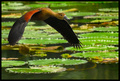
| 01/31/2006 05:17:19 PM |
Fly By by kloutitComment: 8 - Very nice capture. Good stop motion. Criticism; difficult, the lily pads more OOF or sharper (difficult), and maybe a fraction more space above the duck (dependent of course) - and I want to say sharper, even 'more' stop motion, but very difficult, plus I am sure that this size doesn't show the detail larger does. Coloring, on the duck especially, very good. Perhaps a variation in cropping. Not sure on the frame. Up to 8 from 7. |
| Photographer found comment helpful. |
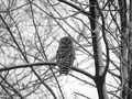
| 01/31/2006 05:08:42 PM |
Whoooo me?by shes_troubleComment: 9 - Very nice. Toning works well. Good composition. Criticism; mainly just wish the owl 'popped' more, but difficult, especially with the toning/contrast. Perhaps a more finely tuned crop on the right, not sure, works well as is. Up to 9 from 8. |
| Photographer found comment helpful. |
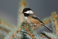
| 01/31/2006 05:07:27 PM |
Black-capped Chickadeeby janrussComment: 9 - Very nice capture. Nice 'simple' composition. Criticism; not much... maybe a crop variation, especially at the top, otherwise, depending what you had to work with, more height/bigger, may have given this even more, not sure. Up to 9 from 8. |
| Photographer found comment helpful. |
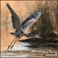
| 01/31/2006 05:06:12 PM |
heron landing by coolharComment: 8 - Nice capture and composition. Criticism; difficult, perhaps some slight gamma issues in the darker areas in the background. Depending what you had to work with, 'using'/incorporating the good water element more may have given this a little extra, not sure. |
| Photographer found comment helpful. |
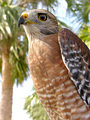
| 01/31/2006 05:04:56 PM |
Red-Shouldered Hawkby GraciousComment: 8 - Nice clarity, detail and strong coloring. Criticism; difficult given you've likely cropped it like this for a reason - and does work like this anyway in my opinion, but perhaps a little tighter at the bottom and looser at the top/more space (depending what you had to work with of course), may have made this even better in my opinion. |
| Photographer found comment helpful. |
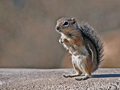
| 01/31/2006 05:01:30 PM |
Hmmph...by halcyonComment: 8 - Good capture, nice colors, good composition. Criticism; a little more detail, although I realize you may have intentionally gone for this 'softness'. |
| Photographer found comment helpful. |
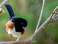
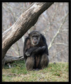
| 01/31/2006 05:00:42 PM |
Nervous Poserby Postgate1Comment: 8 - Very good and clean. Criticism; not much, more definition mainly, but difficult. Tweaking of the colors, focus looks slightly sharper at the fore perhaps, not sure. |
| Photographer found comment helpful. |
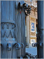
| 01/31/2006 04:52:14 PM |
Invitation to Artby imagine74Comment: This shot perhaps more finely tuned crop-wise, possibly also with a slight nudge rotation for added symmetry would be better in my opinion. The concept of the sculptures/pillars creating a pseudo frame is good, but again needs to be 'used' more - whether it be via a different depth of field, making them out of focus, or just more 'abstract', not sure. The yellow and red 'band'/whatever 'stuck' in the iron/metal detracts slightly but again, perhaps could be 'used' as an element in this, not sure. Just looks like something discarded/stuck there, as is. |
| Photographer found comment helpful. |
| 01/31/2006 04:16:30 PM |
School Studyby CutterComment: Good and unusual capture/view. Toning works well. Perhaps an even tighter crop at the top to accentuate the line/school of fish - but I realize you've gone for a central composition. No expert on fish, but they look like they all have a 'false eye', so whether they are the same species but males/females, or different, not sure. |
| Photographer found comment helpful. |
Home -
Challenges -
Community -
League -
Photos -
Cameras -
Lenses -
Learn -
Help -
Terms of Use -
Privacy -
Top ^
DPChallenge, and website content and design, Copyright © 2001-2025 Challenging Technologies, LLC.
All digital photo copyrights belong to the photographers and may not be used without permission.
Current Server Time: 06/26/2025 05:28:25 PM EDT.