| Author | Thread |
|
|
02/01/2006 04:35:13 AM |
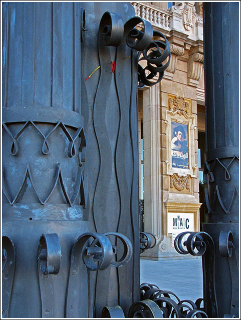
Well, I like the sharpness of the image, and definitely the color, but two things stand out. I'd like to see the base of whatever is in the foreground (doors? columns?) so that it will give us some more context, and secondly, if the focus is the doors (or columns or whatever) in the foreground, you might want to consider slightly blurring the background slightly to make them stand out a bit more. Or vice versa if the background is the focus.
But nice shot anyhow - love the balance of colors here. :) |
|
 Photographer found comment helpful. Photographer found comment helpful. |
|
|
01/31/2006 04:52:14 PM |
|
This shot perhaps more finely tuned crop-wise, possibly also with a slight nudge rotation for added symmetry would be better in my opinion. The concept of the sculptures/pillars creating a pseudo frame is good, but again needs to be 'used' more - whether it be via a different depth of field, making them out of focus, or just more 'abstract', not sure. The yellow and red 'band'/whatever 'stuck' in the iron/metal detracts slightly but again, perhaps could be 'used' as an element in this, not sure. Just looks like something discarded/stuck there, as is. |
|
| Photographer found comment helpful. |
|
|
01/31/2006 03:43:52 PM |
|
The dying flower is a lovely grace note. I like this shot very much. |
|
| Photographer found comment helpful. |
|
|
01/31/2006 02:42:16 PM |
|
you've captured the detail very well- i really like the lighting, there are no overly dark areas. the colors are interesting and the whole image is very clear. i like it, well done |
|
| Photographer found comment helpful. |
Home -
Challenges -
Community -
League -
Photos -
Cameras -
Lenses -
Learn -
Help -
Terms of Use -
Privacy -
Top ^
DPChallenge, and website content and design, Copyright © 2001-2026 Challenging Technologies, LLC.
All digital photo copyrights belong to the photographers and may not be used without permission.
Current Server Time: 07/27/2026 03:33:30 AM EDT.