| Image |
Comment |
| 12/30/2007 02:57:40 PM |
Chinese Paint Brushesby BHusemanComment: The frame is too dominant for the delicate nature of the bristles, which are the main 'subject' here - in my opinion. |
 Photographer found comment helpful. Photographer found comment helpful. |
| 12/30/2007 02:56:31 PM |
On the Way Downby banmornComment: 6 - Nice texture capture. Colors are nice too. Wonder about a variation in composition/crop. |
| Photographer found comment helpful. |
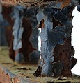
| 12/30/2007 02:53:18 PM |
Agedby CEJComment: Good texture find, but it is blurry. Like the composition. |
| Photographer found comment helpful. |
| 12/28/2007 04:55:28 PM |
boxing.jpgby aliquiComment: Does look like the bug is boxing in this and the other image. The top of this image dominates too much and distracts from the little 'scene'. If the quality was there, perhaps a much tighter crop - roughly a third of the way down, to just below the blown white area of the petal, may help. The resulting squareish crop may benefit as well. Tweaking in pp to bring out some more detail may also have helped enhance what you have captured. |
| Photographer found comment helpful. |
| 12/28/2007 04:44:55 PM |
2406.jpgby aliquiComment: In response to your request. I'm curious to see the original. If you would share some of your pp would be good too. Also, some insight into your 'vision' for this image; scene, 'feel', colors, etc.
As is, the combination of the curvature of the horizon, the shoreline and the angle/perspective you have taken this image from, makes the image seem off balance, or 'skewed', in a sense. The colors seem a little washed out and, as mentioned below (I don't usually read others' comments before making my own, but did this time), the pp seems to have diminished those colors and, in my opinion, also the textures and detail - which I do wish to see.
Another reason to see the original was to see if perhaps more could be included for added compositional balance.
I like the shape and patterns of the water (seemingly) gently coming in at the foreshore on the right and the other few elements that seem there, but not 'enhanced' (such as the wood/sticks). I wonder what those little things at the edge and in the water are.. Aside from the (tiny) sign visible on the right and the (seeming) footsteps in the sand, looks like quite an untouched scene. |
| Photographer found comment helpful. |
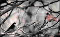
| 12/28/2007 01:09:09 AM |
Long Train Runnin'by JeniYComment: Like the way you have brought out the colors in the train, creates 'segments'. Your call of course, but I wonder whether the distant something far right and the greenery edging on the track cropped out, may have made this an even stronger image. Like to have seen the perspective a bit stronger for this Challenge too, 'somehow'. |
| Photographer found comment helpful. |
| 12/27/2007 10:52:41 PM |
|
| Photographer found comment helpful. |
| 12/27/2007 10:50:29 PM |
|
| Photographer found comment helpful. |
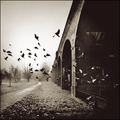
| 12/21/2007 04:44:38 PM |
Boom!by TomComment: 8 - Nice capture. Wish I could see more of the details that are likely there 'wall sized'. Some good elements here. The color of the lighting on the boats seems a little dull in contrast to the rest of the image, however, again, especially larger, may well add to it. |
| Photographer found comment helpful. |
| 12/21/2007 08:13:17 AM |
|
| Photographer found comment helpful. |
Home -
Challenges -
Community -
League -
Photos -
Cameras -
Lenses -
Learn -
Help -
Terms of Use -
Privacy -
Top ^
DPChallenge, and website content and design, Copyright © 2001-2025 Challenging Technologies, LLC.
All digital photo copyrights belong to the photographers and may not be used without permission.
Current Server Time: 06/27/2025 06:43:31 AM EDT.