| Image |
Comment |
| 10/11/2005 05:20:43 PM |
Party Time!by debitiptonComment: nice concept. i like the hanging drop on the orange, and choice of colors. the interior orange wedge picks up the color of the beverage, which casts an odd hue. i don't know if this is the case, but the hanging curls in the background appear to have been edited in? there's an odd outline around them that's distracting. |
 Photographer found comment helpful. Photographer found comment helpful. |
| 10/11/2005 05:20:39 PM |
Shock of the Newby ImagineerComment: nice choice of subject, and beautiful models. the angle of the shot makes the child's hand appear disproportionately large. i would be interested in seeing how a darker background would have affected the richness of this photo. imo, all the light colors wash away the impact of this tender scene. for example, even looking at the right side of the shot...the shadowed background makes the child's head pop out at you more than the light side. OR...how would this have looked with a dark background and some off-side lighting options, then done as a b&w to really have those sweet faces pop out? |
| Photographer found comment helpful. |
| 10/11/2005 05:20:35 PM |
Celebration: Circle of Lifeby gsalComment: interesting shot of blowing leaves. when i think "circle of life" i think about birth, death, and rebirth. imo, title does not match image (light on the birth and rebirth aspects). what DOES give me cause to celebrate is being able to watch leaves swirling about the sidewalk, though!
in terms of this pic, beyond the challenge, i love it. i love the colors and the exposure and the contrast of shapes (grid vs circles vs pavers picking up the grid pattern again). i love the yellow in the leaves, and how that one grid square and leaf towards the center just anchor the eye in the shot. part of me wonders how this image would look with a wee bit of cropping to center the grid, but most of me really prefers the asymetric layout. so, mismatched title (and i'm being called on that same thing in this challenge, too), but nicely done, and a groovy photo! |
| Photographer found comment helpful. |
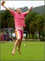
| 10/11/2005 05:20:28 PM |
I Won!by suemackComment: cute shot! nice colors and dof. i wish there was more space on the left side of the shot to better frame your subject. the bird on the lawn is also a bit distracting. but the expression on her face is priceless...congrats to her! |
| Photographer found comment helpful. |
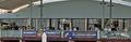
| 10/11/2005 05:20:23 PM |
October feastby BrianRComment: while this shot does show lots of people, the focus becomes the architecture/banner because that's the only thing you can see clearly. it results in a not very interesting photo, imo. i would be interested in seeing tighter shots of the people enjoying that feast. |
| Photographer found comment helpful. |
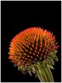
| 10/10/2005 05:26:15 PM |
flower02web.jpgby RikkiComment: absolutely amazing image. composition, background, lighting, focus, color, wow wow wow. nothing at all to critique, everything to enjoy. an automatic favorite. darn good work. congratulations. |
| Photographer found comment helpful. |
| 10/10/2005 05:23:07 PM |
Sonoma Vineyardsby RikkiComment: out of all the images in your thread, this is the one that made me say "eh." the composition of the other vinyard shot is so much more engaging and interesting to my eye. you still have these amazing rich colors and lines, which make this image still quite pleasing to look at. compared to the others, though, this would be my least favorite. |
| Photographer found comment helpful. |
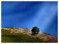
| 10/10/2005 05:21:10 PM |
Somewhere Between Heaven and Earthby RikkiComment: sad to hear that this image was dq'd. the ray of light makes it. was it natural or a light effect? loads of rich colors, and i like the red tones in the scrub on the right edge of the hill. that light looks downright holy, and it would be great if that tree ended up glowing in the light. |
| Photographer found comment helpful. |
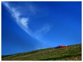
| 10/10/2005 05:18:20 PM |
My Own Slice of Heavenby RikkiComment: there's something about the placement of the person that feels a bit odd. perhaps it's because i can only see one raised arm? it's neat how the wisp of cloud appears to be rising from the person on the ground...great vivid colors, too. |
| Photographer found comment helpful. |
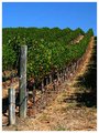
| 10/10/2005 05:15:47 PM |
Vine Rowby RikkiComment: i like the lines and the colors, but the front vine area by the post feels odd (blurry? a bit 3-d?) to my eye and that detracts from my enjoyment of this image. very nice composition. |
| Photographer found comment helpful. |
Home -
Challenges -
Community -
League -
Photos -
Cameras -
Lenses -
Learn -
Help -
Terms of Use -
Privacy -
Top ^
DPChallenge, and website content and design, Copyright © 2001-2025 Challenging Technologies, LLC.
All digital photo copyrights belong to the photographers and may not be used without permission.
Current Server Time: 06/20/2025 06:10:56 PM EDT.