| Image |
Comment |
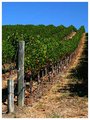
| 09/27/2005 09:05:03 PM |
Vine Rowby RikkiComment: Nice shot - just looks a bit over-sharpened. Colors are beautiful |
 Photographer found comment helpful. Photographer found comment helpful. |
| 09/23/2005 07:11:14 PM |
Look Who Is Coming to Dinner, from a Flea's Perspectiveby olddjComment: ** Greetings from the Critique Club **
This is a great idea - however the execution could have been better with a little extra work. The grass covers too much of the dog's face - you might try getting the dog in position - tell him to stay - then clear away some of the grass that obscures the facial expression, yet leaving enough to give the idea of a flea hiding in the long grasses.
One of the comments you received indicated a flea does not see this clearly - I personally have no idea if this is true or not. I do think a slight gaussian blur over the entire image might have worked as it would have drawn away attention to how OOF the grass is in the foreground. The image is a tad grainy which I would not have expected with such a low ISO. Perhaps sending it through NeatImage or a similiar program that eliminates noise would have helped out.
- Linda
|
| Photographer found comment helpful. |
| 09/18/2005 11:38:12 PM |
Serenityby jeroweComment: The first thing I sense when I look at this is serenity. A nice warmth comes over me. The colors and composition are beautiful. Only recommendation would have been to get the focus sharper as it is a bit too soft in my opinion.
- Linda Message edited by HBunch - removed Critique Club status. |
| Photographer found comment helpful. |
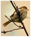
| 09/18/2005 11:35:18 PM |
Bird in the Windby bobdaveantComment: ** Greetings from the Critique Club **
This is a beautiful shot! I love the softness, only would have liked to see the tail less blurry. The subtle color tones are very complimentary.
Excellent bokeh! Focus was right on.
- Linda |
| Photographer found comment helpful. |
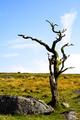
| 09/18/2005 11:14:17 PM |
Dead Woodby HattieComment: ** Greetings from the Critique Club **
Pros: Composition is executed perfectly within the rule of thirds.
I like the DOF - the feeling of depth is excellent. Nice contrast.
Subject matter is pleasing to me as I like old snarly trees, old wooden items, etc.
Cons: The yellows seem a bit over saturated.
- Linda |
| Photographer found comment helpful. |
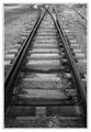
| 09/18/2005 11:07:46 PM |
branchby tcmartinComment:
Pros: Excellent use of gray tones. I really like the composition and angle here. I'm a sucker for railroad tracks too. Even your frame was well done in my opinion.
Cons: none - just a wonderful photo
- Linda Message edited by HBunch - Removed Critique Club status. |
| Photographer found comment helpful. |
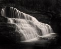
| 09/18/2005 06:18:35 PM |
Canyon Fallsby alfrescoComment: JP you've done really great on this shot! You don't usually see as many of the ledges at Canyon Falls as the water flow and level would have made them subdued. Great idea with the B&W too. I love it.
- Linda |
| Photographer found comment helpful. |
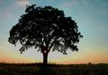
| 09/18/2005 05:56:38 PM |
Branching From The Lightby ColeyComment: ** Greetings from the Critique Club **
Pros: I love the colors f the sky. The lone tree is a classic. Yours has an added element that sets it off nicely - the sun spot in the trunk.
Cons: As others have mentioned - the buildings in the back distract, but just a bit.
- Linda |
| Photographer found comment helpful. |
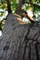
| 09/18/2005 04:52:36 AM |
The Branches Within A Branchby princessfriesenComment: ** Greetings from the Critique Club **
As many of your comments stated already - I have to agree that there simply is not enough in focus here. There is not any particular thing that grabs my eye and holds it. Instead I am distracted by the blurred areas making my eye draw away and jump place to place, searching for a point of focus.
- Linda |
| Photographer found comment helpful. |
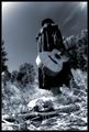
| 09/18/2005 04:46:09 AM |
The Strangerby fotodudeComment: ** Greetings from the Critique Club **
This shot is full of emotion and tells a story. I really like that in a photo. Great angle and composition. Only real negative is that it does not meet "High Contrast" - the tones are all in the mid-range. More of a gray scale portrait than High Contrast. Also - the skull looks a bit blown out.
- Linda |
| Photographer found comment helpful. |
Home -
Challenges -
Community -
League -
Photos -
Cameras -
Lenses -
Learn -
Help -
Terms of Use -
Privacy -
Top ^
DPChallenge, and website content and design, Copyright © 2001-2025 Challenging Technologies, LLC.
All digital photo copyrights belong to the photographers and may not be used without permission.
Current Server Time: 06/21/2025 06:29:25 AM EDT.