| Image |
Comment |
| 03/12/2009 06:20:49 PM |
|
 Photographer found comment helpful. Photographer found comment helpful. |
| 03/12/2009 06:19:50 PM |
|
| Photographer found comment helpful. |
| 03/12/2009 06:19:18 PM |
horizonby FranzDavisComment: Wonderful color capture, but the palm tree is more of a distraction than an element of interest. I think that I would have shot this one with out it in the foreground. |
| Photographer found comment helpful. |
| 03/12/2009 06:18:25 PM |
Freight Trainby vladoComment: Great leading lines and very nice colors. I'd probably crop a little of the darkness off from the right side of the frame. |
| Photographer found comment helpful. |
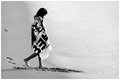
| 03/12/2009 06:13:44 PM |
Alone on the beachby edmengComment: Very nice composition, and your tonal conversion adds a terrific moodiness to the image. Well done. |
| Photographer found comment helpful. |
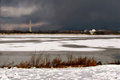
| 03/12/2009 06:12:53 PM |
Home Portby sailjoComment: Nice potential, but tilted horizons drive me nuts. |
| Photographer found comment helpful. |
| 03/12/2009 06:12:17 PM |
|
| Photographer found comment helpful. |
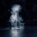
| 03/12/2009 06:11:59 PM |
Breathby LVicariComment: Very nice capture, but I'd really like to see some of the darkness cropped out. I think this one would be better served in a portrait orientation as opposed to the square that you have provided us here. Great, cool tones. |
| Photographer found comment helpful. |
| 03/12/2009 06:10:53 PM |
|
| Photographer found comment helpful. |
| 03/12/2009 06:09:50 PM |
Colors of Japanby TheguzzComment: While I am, by no means, a stickler for the 'rules' of photography, I would recommend not chopping off body parts at or near their joints. I'd like to see this one with either a tighter or looser crop that either included her wrist and hand or was tighter toward the waist line. I'd also like to see some better lighting on her face. |
| Photographer found comment helpful. |
Home -
Challenges -
Community -
League -
Photos -
Cameras -
Lenses -
Learn -
Help -
Terms of Use -
Privacy -
Top ^
DPChallenge, and website content and design, Copyright © 2001-2025 Challenging Technologies, LLC.
All digital photo copyrights belong to the photographers and may not be used without permission.
Current Server Time: 08/05/2025 02:30:02 AM EDT.