| Image |
Comment |
| 02/24/2003 05:24:49 AM |
Harris Hawkby scrooslooseComment: I don't like the fence in the background but the bird is magnificent. Very well taken. A pinch more exposure might've done you good if it didn't was the background out |
 Photographer found comment helpful. Photographer found comment helpful. |
| 02/24/2003 05:19:11 AM |
dollby shutterflyComment: This looks like it might fit in a sunflower themed room. My friend used to have one at her house that this would fit right into. The biggest problem being that its' not terribly focused. Other than that is has nice colors and is well framed with good background |
| Photographer found comment helpful. |
| 02/24/2003 05:12:41 AM |
The Weakest Linkby rmahanComment: I like the lighting and the shadows. Good choice of background colors as well. |
| Photographer found comment helpful. |
| 02/24/2003 04:38:24 AM |
one item, wine, glass, drink, vertical, nobody, close-up, empty, curve, blue, fragile, transparent by Pep VentosaComment: Great subject and composition. The tight center crop works very well. The pic IMO looks like its been oversharpened or taken with a high ISO. It also is a little overexposed for my tastes. The blue is a nice color for the background. |
| Photographer found comment helpful. |
| 02/24/2003 04:35:55 AM |
Dawn at the Harbourby andrewmComment: Pretty good photo. Lacking the crispness to make it a really good photo though. I like the concept and the angle, just wondering where the sun is at this point. |
| Photographer found comment helpful. |
| 02/23/2003 08:15:49 AM |
Peek a Boo!by mcraelComment: Greetings from the Critique Club
By Inspzil
Composition - Good concept for Where's Waldo. I think the challenge on the whole produced some interesting photos. This is no exception. There are 2 things about this photo that I don't like, and all the rest I like. The first is your "vase," and the doily looks like a napkin. The second is the dominance of the shadows in the pic. The colors I think are great, the double exposure thing is cool, the framing is nice. The biggest thing that I can't get around are the darn shadows.
Technical - Well done. My wife has tried doing stuff with the multiple exposure feature on her 602 with not much success. This was well done and well thought out.
Overall - A little of the finishing touches added to this and you'd really have something. This is a well executed picture, just the setup might've been better served with some better props and less shadows. Good job Mcrael, keep up the good work. - Inspzil |
| Photographer found comment helpful. |
| 02/20/2003 07:56:00 AM |
The Chameleonby macroviperaComment: Greetings from the Critique Club
By Inspzil
Composition - This was tricky to see how it met the challenge. I had to look at it a second time (on 2 consecutive days) and now I see the point of it. I think as an image, its too much of the leaves thing. For the challenge, I think its pretty good. Not much else to say about composition at this point.
Technical - I think the focus is a little soft, especially on the foliage part of it. It may be the focus of the slide itself which would make it significantly harder to make a clear image. A couple degrees of sharpen in PS might help some. The exposure is actually pretty good. I could see the subject being exposed a bit more and the slide image a little less, but its not bad as is.
Overall - Not a whole lot to say about this image really (for this long-winded critic anyway). I genuinely like the idea, but I just don't think this came out near as well as it could've. As you stated though it was just preliminary. I think it met the challenge well but as strictly an image, I don't really like it. Sorry I couldn't be more helpful on this one. Good luck on future challenges - Inspzil |
| Photographer found comment helpful. |
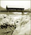
| 02/19/2003 04:56:09 AM |
Waldo's Creekby DJLubaComment: Greetings from the Critique Club
By Inspzil
Composition - Good job meeting the challenge on this one, it is very well conceived. Waldo is just visible enough, but not too visible. Cool bridge and good foreground stuff as to not be distracting but not be too boring. The biggest problem I have with the composition on this photo is that its just a plain old crappy winter day. The white sky leaves no contrast between the roof of the bridge and the sky. It sort of just blends together. The haze makes the background a little less appealing too by simply making it less visible. On a nicer day, I'd see this scoring quite well.
Technical - The framing on this shot is pretty good. I wasn't so sure I like waldo in the middle of the pic horizontally, but I don't think it hurts the image. The exposure of this picture is pretty difficult but I think you did pretty well. Its so easy to blow out a snow picture. The subject seems pretty well focused too. DOF is as it should be for this shot. Doesn't look like a ton of processing went into this either. Thats great, even if it did have a lot done to it.
Overall - A good solid photo that would've done much better I think if the day were nicer to add a little color and a little contrast to the snow covered stuff. Meets the challenge well. Good image and good luck in future challenges - Inspzil |
| Photographer found comment helpful. |
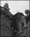
| 02/18/2003 05:24:36 AM |
Shipmates of Bontekoeby AzrifelComment: Greetings from the Critique Club
By Inspzil
First off, that is far and away the longest comment I've ever seen regarding a picture. It will most likely be longer than my critique.
Composition - I think you could've focused solely on the statue and gotten a good image. The statue is my favorite part of this image. Unfortunately I can't stop looking at the white spot on his left foot where it looks like once there was a toe. The spotlight on top of the wall keeps catching my attention now and again. That would've been a nice thing to spot edit out as you said above. The building looks huge, which I'm sure is what you were going for. I like the overall composition and the choice of black and white is very good. I think this might be a little dark for my taste though.
Technical - This does look a little dark but if you lightened it up any I think you might lose the sky. The photo looks pretty clear with good DOF. Fill flash looks like it was a good idea, but that might be where the white spot on the toe came from. Processing - Overall I think you did a very nice job with this one. If there ever was a flash on the spotlight, I can't tell.
Overall - A solid image, but a little dreary with the dark colors and greyscale. By your description of what you did to the shot to make it better I'd say you really did a good job saving a picture. I think the statue should've been a stronger part of this picture. Hats off to your comments, they've proven to be helpful to some degree!! Interesting story - Good luck in upcoming challenges - Bob |
| Photographer found comment helpful. |
| 02/17/2003 12:22:02 PM |
In the Shadow of Heroesby ClubJuggleComment: Greetings Terry from the Critique Clubjuggle
By Inspzil
Composition - Would be a nice pic without that pesky foot in the bottom corner. Oh wait, that's waldo.... I see now. I thought it was for the other challenge at first. It would be a good perspective shot though methinks. The monument is great. I like the little snow frosting on top of it. The background is very good too. The sky is really.. blah looking unfortunately. This would've been a better photo for springtime, but that would be a little after the challenge deadline. I wish there were some more color.
Technical - For a snow picture, very well exposed. The monument is very clear and readable. Good DOF and the framing is pretty good. It wouldn't have hurt it to be a little further back. Processing could've added a little color to this scene, but I think spring would add even more. I think a little more contrast would have helped but it's a touchy thing to get right with snow anywhere. marble is pretty white, but not like new snow.
Overall - Not a badly taken picture really, but the conditions just weren't quite right for it. In a few months I bet it would've been much better. It does meet the challenge pretty well and is well conceived in that right. It might take a few tweakings on the levels or greyscaling it to make it come out better. Good Luck on coming challenges and have some :pie - Bob |
| Photographer found comment helpful. |
Home -
Challenges -
Community -
League -
Photos -
Cameras -
Lenses -
Learn -
Help -
Terms of Use -
Privacy -
Top ^
DPChallenge, and website content and design, Copyright © 2001-2025 Challenging Technologies, LLC.
All digital photo copyrights belong to the photographers and may not be used without permission.
Current Server Time: 08/13/2025 10:24:36 PM EDT.