| Image |
Comment |
| 01/22/2003 07:42:02 PM |
Lunada Bayby daysezComment: FIRST IMPRESSION : Waow, perfect composition, nice to have the 2 people in a perfect pose.
COMPOSITION : Very nice. The eye is drawn directly to the 2 people in a pose tha does not sound posed at all, very natural. They are not hidden by the .. 'plants' (sorry do not know the name), they are between them but without any interference.
I like the curve of the edge going down on the right side of the picture.
TECHNICAL : Perfect exposure , the two peole are not tatally balck but without too much details so that the pose and the shape of the bodies prevails. Nothing to say about depth of field.
A little distracting (not that much ) ?flare? at the feet of the man (or something else) but not very bad and not tha much you could do anyway.
DIGITAL : Signs of oversharpness ( edges of bodies and plants) or maybe compression artefact. They are
MY OPINION :
I like that photo, it gets a waow factor at the begining. The 2 people add a lot of impact to the picture and in a nice way.
Even at the end of the critic ... I still enjoy looking at it , imagining some story between the 2 people, their stories, did they walk hand in hand ? dud they meet there after a long time, did she just told him she is pregnant ? did he just asked to to marry him ?
Nice photo, a very fine job.
Lionel, for the critique club |
 Photographer found comment helpful. Photographer found comment helpful. |
| 01/19/2003 07:03:00 PM |
The Watcherby ManicComment: INITIAL RESPONSE : Paris !Nice gargoyle detached from background, horizon line feel a little too close to the middle for my tastes.
COMPOSITION; I like the balance between the 2 main 'subject' the gargoyle and the Eiffel tower. They kind of response to each other.
Very good Depth of field. it separate the gargoyle from the background but still giving nice details ( the building, the cars) without them 'invading' the subject.
The horizon line is a little too much in the middle, when I remove a little bit of sky at the top , I think it's better.
Day was not sunny I wonder how it would have looked a sunny/bright day. But that's one of the 'real Paris'.
BACKGROUND : see above. nice tones of brown/beige. Enough out of focus/enough in focus .. very good.
DIGITAL : No sign of any digital processing => perfect!
MY OPINION:
Being french and lived in paris for 15 years .. the gargoyles are something 'special' on Notre Dame, something unusual on an unusual building. Meet the challenge perfectly!
I like A LOT the way the gargoyle is detached from the back ground and the balance with the eiffel tower.
Very well done ! And very good correlation to the challenge theme !
For the CC club
Lonel |
| Photographer found comment helpful. |
| 01/17/2003 10:12:07 PM |
Kitty in the "No Felines Zone"by kandyjComment: INITIAL RESPONSE : Greta colors, Car nicely 'detached' fro the background, perfect Depth of field, What is the cat looking at ?
COMPOSITION : The cas is so great, the position of the head, the expression. One of the rare photo of animal where I think the cat is really living something, almost 'human'. The face is so great , the fur so nice with all its variations of gery.
What bothers me a little is that there is not 'space' between the head and the pole. It's not that important in this case because the cat is really on a different vertical plan than the pole in term of depth, so they are separated by depth.
TECHNICAL : Perfect, depth of field, exposure, speed (thepicture look so precise and sharp without showing any post-sharpening. Very sharp and soft at the sae time. I like it.
DIGITAL PROCESSING : None or not visible so .. perfect
MY OPINION :
I Like this picture a lot, one of the best 'cat picture' I have seen for the expression of the cat. A little bother by the pole touching the head (see above).
As of the relation to the challenge .. I am not sure I get it.
Nice picture, worth a good place in your personnal gallery.
For the Critique Club
Lionel Message edited by author 2003-01-17 22:13:14. |
| Photographer found comment helpful. |
| 01/17/2003 07:50:47 PM |
|
| Photographer found comment helpful. |
| 01/16/2003 11:12:59 PM |
King of the Hillby DougPazComment: Nice but look oversharpened a lot it's very distracting. I am not sure the foreground branches bring to the picture.I mighthave preferedthe same shot just behing those branches. |
| Photographer found comment helpful. |
| 01/16/2003 11:04:40 PM |
|
| Photographer found comment helpful. |
| 01/14/2003 08:54:34 PM |
Given to Flyby welcherComment: Initial response : very nice, nice blue, a little too much blue ? Nice angle, cute kid.
COMPOSITION : Nice and jsutified use of the angle and good perspective. Nice colors. the branch on the left is a little distracting. Tried cropping on my screen with a piece of paper .. maybe a little bit better.
I would have removed some blue on top , the plane looks a little too much 'dead centered' vertically.
Nice use of negative space .. it looks vertically like an arrow, conveys a dynamic feeling to the shot, not only the kid holding the plane.
PHOTO TECHNIQUE : Good exposure (the part in the neck is ntot fully dark and stil lcontains details, same for the hand holding the plane). Depth of field good as well.
DIGITAL : Looks a little oversharpened (below the chin, right of arm, right of plane) but.
MY OPINION:
A great shot. I do not know the song but I guess there is one called that name ;-). I like that shot. Congratulations !
Lionel |
| Photographer found comment helpful. |
| 01/14/2003 07:43:45 PM |
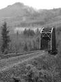
Crossing by timj351Comment: I like the top 2/3 ... I really think you should have cropped a lot at the bottom. I put a piece of papen on my screen just below the track and like it a lot better. Otherwise .. in the 2/3 I llike nice grey tones and very good atmosphere. 5 (6 or more with a different framing or cropped)/. Lionel |
| Photographer found comment helpful. |
| 01/14/2003 07:39:12 PM |
He likes itby lumbusComment: Calm and serene. I like it. Maybe a little bit of level adjustment to have the shadows on the left a little less dark. 6. Lionel |
| Photographer found comment helpful. |
| 01/14/2003 07:37:37 PM |
Shore View of Lake Couchichingby mcraelComment: I think you should havve cropped a little buit on the right to get rid of that 'start of a new bush' I find it distracting. Otherwise very nice job and tones. 7. Lionel |
| Photographer found comment helpful. |
Home -
Challenges -
Community -
League -
Photos -
Cameras -
Lenses -
Learn -
Help -
Terms of Use -
Privacy -
Top ^
DPChallenge, and website content and design, Copyright © 2001-2025 Challenging Technologies, LLC.
All digital photo copyrights belong to the photographers and may not be used without permission.
Current Server Time: 08/26/2025 01:37:45 AM EDT.