| Image |
Comment |
| 02/02/2005 01:33:07 AM |
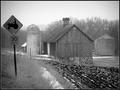
Mountain Signby WawaaComment: Lots of uninteresting visual "debri" in the background of this photo. The sign is interesting but a little dull. Probably didn't use a flash, and not enough post processing. The best thing you ahve going for you are the mountains in the background. Wish you would have cropped out the powerlines..... |
 Photographer found comment helpful. Photographer found comment helpful. |
| 02/02/2005 01:31:34 AM |
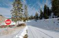
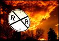
Crossingby pumaComment: Interesting perspective. Very nice. 7 |
| Photographer found comment helpful. |
| 02/02/2005 01:30:47 AM |
|
| Photographer found comment helpful. |
| 02/02/2005 01:29:17 AM |
|
| Photographer found comment helpful. |
| 02/02/2005 12:30:08 AM |
Guaranteed Satisfactionby CorySmithComment: Wish the focus was sharper and it was composed a more interesting fashion. It would be easier on the eye if it didn't "almost" fill the whole frame. Feels cramped. Its kind of like how in motion film cinematography, you should never fram just someone's head in the shot cut off at the neck. Its whats called a tansition point. Bad. Whats better is to either go tighter or wider. (If it were a person that would mean cropping off the top of the forehead and the chin, or slightly wider, a crop including some of the shoulders. Hope this makes sense.
Chris |
| Photographer found comment helpful. |
| 02/02/2005 12:26:08 AM |
|
| Photographer found comment helpful. |
| 02/02/2005 12:24:46 AM |
|
| Photographer found comment helpful. |
| 02/02/2005 12:22:29 AM |
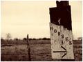
DESTINATION REACHEDby bairasComment: Interesting that you photographed the back of the sign. Very interesting. Exposure is good too. Was it hard to pexpose the detail in the sign with the bright clouds behind it? Long shutter? Nice job |
| Photographer found comment helpful. |
| 02/02/2005 12:21:33 AM |
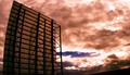
The Flagrant Crossing by CutterComment: Love the firey sky. I almost think the sign is a half stop too bright...but still should place highly. |
| Photographer found comment helpful. |
| 02/02/2005 12:20:53 AM |
The road signby LevTComment: Hope you didn't get into too much trouble from this! haha. First of these I've seen. Great creativity. |
| Photographer found comment helpful. |
Home -
Challenges -
Community -
League -
Photos -
Cameras -
Lenses -
Learn -
Help -
Terms of Use -
Privacy -
Top ^
DPChallenge, and website content and design, Copyright © 2001-2025 Challenging Technologies, LLC.
All digital photo copyrights belong to the photographers and may not be used without permission.
Current Server Time: 08/24/2025 02:10:56 PM EDT.