| Image |
Comment |
| 04/28/2005 04:31:51 PM |
|
 Photographer found comment helpful. Photographer found comment helpful. |
| 04/28/2005 04:29:13 PM |
|
| Photographer found comment helpful. |
| 04/28/2005 04:28:21 PM |
|
| Photographer found comment helpful. |
| 04/28/2005 04:26:35 PM |
|
| Photographer found comment helpful. |
| 04/28/2005 04:24:26 PM |
One Man's Dreamby mrezaComment: Beautiful, the title is very open to ideas with this one, nice comp, and nice ideas for this one. 8 |
| Photographer found comment helpful. |
| 04/28/2005 04:20:45 PM |
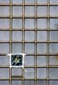
"Curiously Strong Mintamalism"by tfarrell23Comment: lose the border; too distracting. Perhaps some more contrast or a little stronger lighting, or maybe not, im not sure, this is a strange image. a little too pink too. 4 |
| Photographer found comment helpful. |
| 04/28/2005 04:19:31 PM |
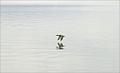
To the water!by gwendyComment: Was this image sharpened a lot?> it looks like it, and the water hurts my eyes; a photos should be pleasing to the eyes, not painful. I like it, but the subjects are also pretty big in the frame. 3 |
| Photographer found comment helpful. |
| 04/28/2005 04:17:05 PM |
Old Manby H R VerryComment: Interesting work, the, 'no skateboarding' or whatever it is, sign, is distracting, too bad no cloning eh? I light the light, and how the brighter aspect of this photo on the left side silluettes the man. There is too much of a division in the lighting though, between the left side and right side; the left side is really bright, and the right side is darker. T'would be better if both were the same. Nice image though, 6 |
| Photographer found comment helpful. |
| 04/28/2005 04:13:44 PM |
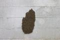
Out of Wall St.by charmayneComment: Not really following the title, but I love this image. Great minimalistic photo!, love the sunlight, however, the sky is maybe a little too blue. Perhaps desaturating the entire image, or just adjusting the tints and hues. nice one though, fits the challenge perfectly, 6 |
| Photographer found comment helpful. |
| 04/28/2005 04:10:17 PM |
1 / 35by virtuamikeComment: Interesting, but lacks visual interest and appeal. 5 |
| Photographer found comment helpful. |
Home -
Challenges -
Community -
League -
Photos -
Cameras -
Lenses -
Learn -
Help -
Terms of Use -
Privacy -
Top ^
DPChallenge, and website content and design, Copyright © 2001-2025 Challenging Technologies, LLC.
All digital photo copyrights belong to the photographers and may not be used without permission.
Current Server Time: 08/19/2025 04:26:37 PM EDT.