| Author | Thread |
|
|
05/08/2005 09:19:15 AM |
|
very nice. good geometric and minimalistic composition. I like the balance in it. |
|
 Photographer found comment helpful. Photographer found comment helpful. |
Comments Made During the Challenge  |
|
|
05/03/2005 08:38:31 PM |
|
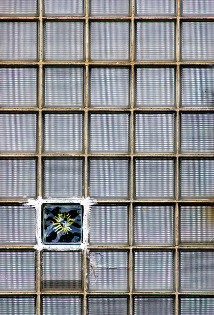
I can't quite make out what the pattern on the contrasting brick is, but I like the composition. There are discolorations on some of the bricks, but in this case it complements the feel of the rest of the image. |
|
| Photographer found comment helpful. |
|
|
05/03/2005 08:16:28 PM |
|
Wow, great find! Works well for the challenge. |
|
| Photographer found comment helpful. |
|
|
05/02/2005 12:22:34 PM |
|
| Photographer found comment helpful. |
|
|
05/02/2005 12:21:54 PM |
|
I really like this one - the statement of repetition and then a different element is definitely minimalist. Did you explore different ratio formats? Just a thought that maybe a perfect square to echo the squares of the glass blocks might lend more to the minimalist vibe. 7 |
|
| Photographer found comment helpful. |
|
|
05/02/2005 09:03:13 AM |
|
| Photographer found comment helpful. |
|
|
04/30/2005 10:29:07 PM |
|
Very interesting, however it is a bit hard to make out the design in the square because it is too far away |
|
| Photographer found comment helpful. |
|
|
04/30/2005 05:06:05 PM |
|
Nice picture. Good composition and well exposed. |
|
| Photographer found comment helpful. |
|
|
04/30/2005 03:07:29 PM |
|
Interesting presentation. I keep squinting to see what is in that square :). |
|
| Photographer found comment helpful. |
|
|
04/30/2005 05:22:48 AM |
|
| Photographer found comment helpful. |
|
|
04/29/2005 11:20:24 PM |
|
This works well. Fits the challenge and is engaging. |
|
| Photographer found comment helpful. |
|
|
04/29/2005 04:26:33 PM |
|
| Photographer found comment helpful. |
|
|
04/29/2005 06:00:34 AM |
|
Its very good spotted and interesting shot but you really should have done selective desaturation. |
|
| Photographer found comment helpful. |
|
|
04/29/2005 05:39:49 AM |
|
I think your idea is great. But, I´d like to see it with a white background or with only one colour. I think your background is a little bit distracting for the viewers, But that´s my opinion. Good luck. 8 |
|
| Photographer found comment helpful. |
|
|
04/29/2005 01:03:24 AM |
|
interesting concept. I think i would have given this a border (i love borders). did you prepare this yourself, or was it like that already? (8) |
|
| Photographer found comment helpful. |
|
|
04/28/2005 11:58:10 PM |
|
Your math is impeccable. Your photo has interest. Nice job. 7 |
|
| Photographer found comment helpful. |
|
|
04/28/2005 08:30:49 PM |
|
I like this image very much. I wish I knew what it was. Good exposure, color, textures, shapes, this covers everything. Great job. You got my first 9. |
|
| Photographer found comment helpful. |
|
|
04/28/2005 08:11:46 PM |
|
great shot, it fits the challenge completely! |
|
| Photographer found comment helpful. |
|
|
04/28/2005 05:02:38 PM |
|
I think this fits the challenge very well. Definately a unique photo. I gave it a 7. |
|
| Photographer found comment helpful. |
|
|
04/28/2005 04:10:17 PM |
|
Interesting, but lacks visual interest and appeal. 5 |
|
| Photographer found comment helpful. |
|
|
04/28/2005 12:31:30 PM |
|
Don't really get it but I do like it. Good luck! 6 |
|
| Photographer found comment helpful. |
|
|
04/28/2005 10:33:43 AM |
|
With the direct angle of your shot the grid work in the glass has a dizzying effect on this viewer. I might suggest that you take it from different angles to see what the effects might be. You meet the challenge well, but it lacks much interest as is. |
|
| Photographer found comment helpful. |
|
|
04/28/2005 07:27:27 AM |
|
This fits my idea of the challenge. How lucky are you to find this?! Very nice entry. |
|
| Photographer found comment helpful. |
|
|
04/27/2005 04:24:16 PM |
|
great concept and interpretation of the challenge....well done.... |
|
| Photographer found comment helpful. |
|
|
04/27/2005 03:28:27 PM |
|
nice shot, not very communicative |
|
| Photographer found comment helpful. |
|
|
04/27/2005 11:02:54 AM |
|
| Photographer found comment helpful. |
|
|
04/27/2005 09:56:19 AM |
|
| Photographer found comment helpful. |
|
|
04/27/2005 09:30:29 AM |
|
Bet there is a story there. And wondering that means extra points in my book. |
|
| Photographer found comment helpful. |
|
|
04/27/2005 12:55:05 AM |
|
found the pain with the cracks lower right and the one below it that is discolored to be a slight distraction but still cool...thanks for sharing.. |
|
| Photographer found comment helpful. |
Home -
Challenges -
Community -
League -
Photos -
Cameras -
Lenses -
Learn -
Help -
Terms of Use -
Privacy -
Top ^
DPChallenge, and website content and design, Copyright © 2001-2026 Challenging Technologies, LLC.
All digital photo copyrights belong to the photographers and may not be used without permission.
Current Server Time: 06/30/2026 12:48:07 PM EDT.