| Image |
Comment |
| 11/13/2003 04:21:45 AM |
In A Lighter Veinby MWittComment: Nice composition, interesting lighting. Great shapes along the egde of the leaf. |
 Photographer found comment helpful. Photographer found comment helpful. |
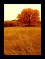
| 11/13/2003 04:21:00 AM |
Grace In Autumnby roy204Comment: A lovely image, with the exception of the sky, which pulls it down somewhat. It's a little bright and bland to complement the rich colours of the foliage. |
| Photographer found comment helpful. |
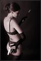
| 11/13/2003 04:19:53 AM |
Femme Fataleby magnetic9999Comment: Hi Koll!
Nice use of subtle lighting and strong use of shadow to create mood. I like that she's looking into the negative space area - makes one wonder what is there. Composition works well for me. Colour tone is a little pink though. |
| Photographer found comment helpful. |
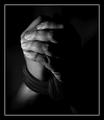
| 11/13/2003 04:18:03 AM |
|
| Photographer found comment helpful. |
| 11/13/2003 04:15:03 AM |
The Joy Of Cookingby GeneralEComment: Sweet! Lighting could be improved - perhaps some tissue or cloth over the lighting source to soften it and reduce the glare on the metal bowl? A touch more light onto his face would also be good. |
| Photographer found comment helpful. |
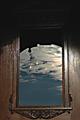
| 11/13/2003 04:14:00 AM |
Through the Looking Glassby elemessComment: A great idea, marred by the very dark shadow towards the top - could do with some additional lighting up there, and the curved (exterior?) overhang that's blocking the reflection of sky and clouds towards the top of the mirror. |
| Photographer found comment helpful. |
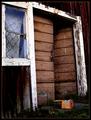
| 11/13/2003 04:12:50 AM |
The Alchemistby MonaComment: I like the contents - great choice of subject with lots of wonderful weathered texture detail and some strong lines from the white paint. Interesting detail of the box - I assume that it relates to the book story? Only thing that doesn't quite work for me is the angle from which we're looking at the subject and the way that makes the vertical and horizontals so wonky within the frame. |
| Photographer found comment helpful. |
| 11/13/2003 04:10:54 AM |
A Light on the Verandaby billiebComment: Would be much improved if not on a tilt - the lines of the floor are quite dominant and would hence be best kept on a true horizontal. Nice sense of depth/ perspective. Would have gone for black and white myself. |
| Photographer found comment helpful. |
| 11/13/2003 04:08:16 AM |
|
| Photographer found comment helpful. |
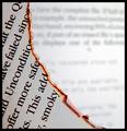
| 11/13/2003 04:06:50 AM |
fahrenheit 451by thelselComment: I like the curve of the burning paper and the capture of the flaming egde. I'm much less keen on your choice for a background - the white is too bright and, although I can appreciate the decision to go for a blurred effect, the blurred text is too uneven in layout to really contribute to a strong composition. |
| Photographer found comment helpful. |
Home -
Challenges -
Community -
League -
Photos -
Cameras -
Lenses -
Learn -
Help -
Terms of Use -
Privacy -
Top ^
DPChallenge, and website content and design, Copyright © 2001-2025 Challenging Technologies, LLC.
All digital photo copyrights belong to the photographers and may not be used without permission.
Current Server Time: 08/25/2025 05:25:47 PM EDT.