| Image |
Comment |
| 04/29/2005 02:36:55 PM |
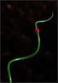
A Twist of Green and a Spot of Red by FalcComment: Very striking composition - the shape of that spiral within the frame, punctuated so perfectly by the ladybird, is wonderful and the utterly black background emphasises it very well. The strong lighting also lends to the confident and upbeat feeling of this image. I'm not sure what the red blob to upper left is but I think it would be better cloned out. The only downside are the jaggies along the edge of the green which are presumably compression artifacts and not present in the full-sized original file? |
 Photographer found comment helpful. Photographer found comment helpful. |
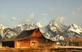
| 04/29/2005 02:34:13 PM |
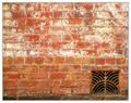
House of the Rising Sunby sherComment: Lovely textures and warm, saturated colours. I like the composition and the quirkiness of the subject matter. |
| Photographer found comment helpful. |
| 04/29/2005 02:33:36 PM |
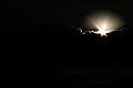
Sunriseby neehaiComment: Really encapsulates the theme of the challenge (according to the description AND the challenge title, which are somewhat unrelated in my mind) and is also a striking and intriguing image. |
| Photographer found comment helpful. |
| 04/29/2005 02:32:14 PM |
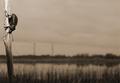
Vantage Pointby NovaTigerComment: Toning works really well to add warmth. Love the composition - great decision not to follow rule of thirds but to position the branch and beetle at the far left of the frame. |
| Photographer found comment helpful. |
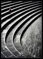
| 04/29/2005 02:31:20 PM |
Repetition with variations for small childby e301Comment: Stunning use of light and shadow to really strengthen the geometric impact of this beautiful amphitheatre and great choice to use black and white to really bring out the textures of the paving. Whilst I like the position of the child within the frame she doesn't, for me, provide a sufficiently strong and obvious focal point to stand up against the striking location itself. I don't know if it would work better if she were wearing a brighter colour (left unsaturated) or, if left in black and white, all white clothes might stand out better. |
| Photographer found comment helpful. |
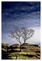
| 04/26/2005 12:00:59 PM |
Out of Stone by e301Comment: What a striking image! Great use of processing to really enhance the image and bring out the perfect balance between foreground and backdrop sky... It's that greeny-yellowy lichen/ moss on the rocks that clinches this one for me. CONGRATS on the ribbon! |
| Photographer found comment helpful. |
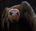
| 04/26/2005 11:59:01 AM |
Doom Watch by ImagineerComment: What a haunting, slightly unnerving connection you have captured here. Unusually strong composition for a bird portrait too and I like the darkness of it... CONGRATS on the ribbon (again)! |
| Photographer found comment helpful. |
| 04/24/2005 01:43:07 PM |
|
| Photographer found comment helpful. |
| 04/23/2005 05:23:03 PM |
|
| Photographer found comment helpful. |
| 04/22/2005 12:41:01 PM |
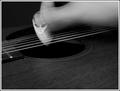
Extreme Grooveby itripnComment: Critique Club
Initial thoughts
Unusual image, focus drawn strongly to alien-face spectrum.
Composition/ Content
In terms of content, I can't say that strumming a guitar puts me in mind of Extreme Action though I do like the way the image shows movement so clearly.
The diagonal lines of the strings work well above the semi-circular edge of the hole. The organic shape of the hand contrasts nicely with both.
In terms of composition, whilst I do like the idea of having a bit of negative space at the bottom the balance doesn't work for me here. I think losing a good chunk off the bottom and showing more of the hand at the top would be more pleasing in terms of composition. As it is, it feels a touch top heavy to me (because the top is where all the interest and detail is). I think you can get away with having less detail at the top of an image than at the bottom - bottom heavy always seems to feel less out-of-kilter than top heavy.
I don't know whether it's intentional but my focus is very quickly and permanently drawn to the alien-face. This means my eyes spend less time appreciating the rest of the image and only look there because I'm deliberately assessing it. Using a regular, plain spectrum would reduce this tendency to focus on the alien's "eyes" and may lead to a more natural movement of the eye around the entire frame.
Presentation
I like your choice to present this in black and white. I think it really allows the lines and curves to come through. It also means there's no conflict between the fleshey tones of the hand and the colour of the polished wooden guitar. The border is simple enough not to interfere hugely with the photograph itself.
Camera Work - Technical
Nice choice of shutter speed to produce just the right amount of motion blur and detail. Nice range of tones within the image.
Fits The Challenge
Not very well, no. Message edited by author 2005-04-22 12:42:15. |
| Photographer found comment helpful. |
Home -
Challenges -
Community -
League -
Photos -
Cameras -
Lenses -
Learn -
Help -
Terms of Use -
Privacy -
Top ^
DPChallenge, and website content and design, Copyright © 2001-2025 Challenging Technologies, LLC.
All digital photo copyrights belong to the photographers and may not be used without permission.
Current Server Time: 08/25/2025 05:17:53 PM EDT.