DPChallenge: A Digital Photography Contest You are not logged in. (log in or register
 
Browse Settings
Currently viewing:
MemberAzrifel

Show comments:

Per page:

Order:

Comments:


Comments Made by Azrifel
Pages:   ... [213] [214] [215] [216] [217] [218] [219] [220] [221]
Showing 2191 - 2200 of ~2207
Image Comment
Christmas tree ball
12/02/2002 08:23:00 AM
Christmas tree ball
by elgomin

Comment:
Nice concept for a Christmas tree ball, but it would have been better with less reflection in the ball and most of all, without the photographer.
Photographer found comment helpful.
Winter
12/02/2002 08:30:00 AM
Winter
by nards656

Comment:
Oversharpened? The sky looks so unnatural grainy.
Photographer found comment helpful.
Water can scald in less than 3 seconds
12/03/2002 03:00:00 PM
Water can scald in less than 3 seconds
by Gracechild7

Comment:
Try a 400x300 format for example.
I tried it in Irfanfiew with this pic, it looked a lot better in that format. (resample using lanczos).
It could also be saved at a much higher quality and the quality wasn't lost in compression artefacts.
It won't work on all pictures, but it is something worth to experiment with.
Photographer found comment helpful.
Battle over Main Street Plaza, Will the LDS Church Maintain Control
12/03/2002 06:19:00 AM
Battle over Main Street Plaza, Will the LDS Church Maintain Control
by Yomi

Comment:
~~~~Critique Club Comment~~~~

*Composition (content)*
The composition needs some work.
The horizon isn't straight, remember to get a straight horizon when composing the shot or leave room for cropping with post processing. Straighten by arbitrary rotation, either guessing or using a measure tool (Photoshop). It should be a slight bit rotated to the left.
The building looks distorted, like it is falling backwards and like all the walls want to meet at a point in the sky. The fence screems wideangle barrel distortion. It is a result of using a wideangle setting. The solution is to stand back and zoom in, using telephoto from a distance takes away the distortion.
Take a look at this photo: //www.dpchallenge.com/image.asp?IMAGE_ID=3353 to see what I mean.
Contrast between light and dark area's is good.

*Background*
Nothing to say something about. Altough, like you can see on the picture from the link a late evening or early morning sky might be more interesting.

*Camera Work (Technical)*
See other comments.
Focus is good, sharpness a bit on the soft side, aperture choice good.

*Digital Processing (technical)*
I think that the soft I see is because of slight jpeg compression image degradation. Remember to save it as close to 150kb as you can get, it is really important for the fine detail, especially when you portray such a large building in a 640x480 image.
Because of the colors in Patella's image I loaded this picture in Photoshop and did some color corrections. Adding red and yellow, but taking out green gave a much more balanced color and got rid of that blue/green cast. It could very well be that the lights are blue, but I doubt it.

*My opinion*
Reasonable picture of a building if it weren't for the distortion and heavy green/blue cast.
Photographer found comment helpful.
In the Shadows
12/02/2002 01:40:00 PM
In the Shadows
by karmat

Comment:
~~~~Critique Club Comment~~~~

*Composition (content)*
The composition is not ideal. I suppose that the picture reflects the title, the life in the shadows. But the position of the man in relation to the sun is far from ideal in my personal opinion. The difference between the dark and bright area of the jacket is too big and detail is lost in the shadows. The shadow over the eyes takes some of the emotional aspects away.
I don't think that is was necessary to change the position, this might also have been overcome with a bit of fill flash. Keep most of the shadows, but brings also some detail back.
As already mentioned by someone else: Shoot from a slightly different angle or position the subject in a different place to get a better position in relation to the traffic lights and to get rid of the sign in the upper right corner (or include more of it).
The position of the subject in the frame is good.

*Background*
The background is not bad, but it also doesn't tell much about the subject.
You might also want to try a wider aperture (F4-F2.x) to blur the background, to focus the attention more on the man. It also blurs the trees that are not very interesting at this time of year.
The lines in the background provide good perspective/depth.

*Camera Work (Technical)*
Already mentioned: Try fill flash (and perhaps exposure compensation in combination with the fill flash or on the flash itself). Try to shoot with a wider aperture to get a narrower depth of field, blur the background.
Otherwise the exposure is good, focus good, perhaps a bit oversharpened (could also be the result of post processing).

*Digital Processing (technical)*
Perhaps a little less sharpening.
B&W is good.
Compression is good, no Jpeg artefacts.

*My opinion*
Interesting subject, but the background is a little bit boring. Can be improved technically.
There is no direct story and the subject expresses little emotion.
Photographer found comment helpful.
Two approaches on wind technology
11/18/2002 03:16:00 AM
Two approaches on wind technology
by morterin

Comment:
Well captured! And I like it so much that I am going to upgrade it from an 8 to a 10.
Photographer found comment helpful.
Hornet
11/11/2002 03:39:00 AM
Hornet
by Mieka

Comment:
Great shot.
I think it could be better when you capture the subject about 40 degrees to the right.
Photographer found comment helpful.
Brass Tower
11/11/2002 03:26:00 AM
Brass Tower
by myqyl

Comment:
A bit soft.
More and diffused light could make it better.
Photographer found comment helpful.
90 degrees latitude
11/25/2002 07:37:00 AM
90 degrees latitude
by zadore

Comment:
Test critique for "The Critique Club"

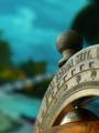
--- Composition & Background (content) ---
It is strange how my eyes react to the image. The first thing they look at is the word "Fredda" and therefore I want to know how it relates to the words "Zona" and "Sett.". But those words are blurred and that is disturbing initially.
When I look a bit better I see that the real point of interest is the mark for 90 degrees, not coincedentally (I assume) that's also a crosspoint of a rule of thirds grid. :-) But so is the knob on top and that's not a pretty item to look at.
The background disturbes me, especially the big shadow in the upper right corner and the greenish blob with a line of blue dots in it (left of "Zona"). The variance of blue above that is a good thing.
The color of the brass is ok-ish. There is something strange about the colors right of 80 and 90.
The DOF / use of aperture is ok, but when possible a wider aperture could do something about the distraction to Fredda (but it could also worsen the view on the 90 degrees mark, so it is something to try out when possible) or allow for another angle while retaining the same DOF.

--- Camera work (technical) ---
Sharpness is good.
Exposure could possibly be slightly better (_longer_ shuttertime / exposure compensation), but that is based on a gamma correction with Irfanview.

--- Digital Processing (technical) ---
There is some minor oversharpening/compression artefact around the knob. But overal it looks ok. Remember to try and push the quality to the 150kb mark, this one is only 135. Could make a small difference to the knob.

--- My opinion on the photo ---
My personal opionon about the subject is: not interesting
Emotional/story factor: low

Would I have done something differently? (Things I would try out)
I would like to see what it does to the image when the bow with the degrees on it is turned to the left to fill more of the frame and get a better balance between foreground and background.
I would like to try to get the same effect, but with more of the globe itself in the picture.
And I would like to see the effect of screwing the knob off.
Photographer found comment helpful.
Small and still beautiful
11/11/2002 04:03:00 AM
Photographer found comment helpful.
Pages:   ... [213] [214] [215] [216] [217] [218] [219] [220] [221]
Showing 2191 - 2200 of ~2207


Home - Challenges - Community - League - Photos - Cameras - Lenses - Learn - Help - Terms of Use - Privacy - Top ^
DPChallenge, and website content and design, Copyright © 2001-2025 Challenging Technologies, LLC.
All digital photo copyrights belong to the photographers and may not be used without permission.
Current Server Time: 09/04/2025 01:55:18 PM EDT.