| Author | Thread |
|
|
11/25/2002 07:37:00 AM |
Test critique for "The Critique Club"
--- Composition & Background (content) ---
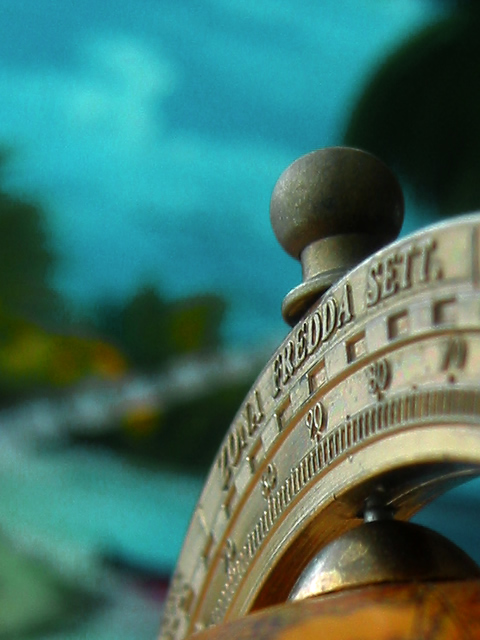
It is strange how my eyes react to the image. The first thing they look at is the word "Fredda" and therefore I want to know how it relates to the words "Zona" and "Sett.". But those words are blurred and that is disturbing initially.
When I look a bit better I see that the real point of interest is the mark for 90 degrees, not coincedentally (I assume) that's also a crosspoint of a rule of thirds grid. :-) But so is the knob on top and that's not a pretty item to look at.
The background disturbes me, especially the big shadow in the upper right corner and the greenish blob with a line of blue dots in it (left of "Zona"). The variance of blue above that is a good thing.
The color of the brass is ok-ish. There is something strange about the colors right of 80 and 90.
The DOF / use of aperture is ok, but when possible a wider aperture could do something about the distraction to Fredda (but it could also worsen the view on the 90 degrees mark, so it is something to try out when possible) or allow for another angle while retaining the same DOF.
--- Camera work (technical) ---
Sharpness is good.
Exposure could possibly be slightly better (_longer_ shuttertime / exposure compensation), but that is based on a gamma correction with Irfanview.
--- Digital Processing (technical) ---
There is some minor oversharpening/compression artefact around the knob. But overal it looks ok. Remember to try and push the quality to the 150kb mark, this one is only 135. Could make a small difference to the knob.
--- My opinion on the photo ---
My personal opionon about the subject is: not interesting
Emotional/story factor: low
Would I have done something differently? (Things I would try out)
I would like to see what it does to the image when the bow with the degrees on it is turned to the left to fill more of the frame and get a better balance between foreground and background.
I would like to try to get the same effect, but with more of the globe itself in the picture.
And I would like to see the effect of screwing the knob off.
|
|
 Photographer found comment helpful. Photographer found comment helpful. |
Comments Made During the Challenge  |
|
|
11/17/2002 12:04:00 PM |
|
I love it. The globe is interesting on it's own, but I like how it's set against the background of blues, greens, and browns - remininscent of the earth when viewed from space. Very nice indeed. IN my top 10 for the week. 9, just-married |
|
| Photographer found comment helpful. |
|
|
11/16/2002 01:05:00 PM |
|
I like the depth of field you used. Nice capture. Jacko |
|
| Photographer found comment helpful. |
|
|
11/15/2002 11:39:00 PM |
|
Very evocative. I like how only a little bit is in focus. It really works for this photo. |
|
| Photographer found comment helpful. |
|
|
11/15/2002 02:45:00 PM |
|
good background choice, great selective depth of field, well composed in the frame |
|
| Photographer found comment helpful. |
|
|
11/15/2002 02:39:00 PM |
|
I think this is an extremely nice composition and I also particularly like the subdued colors... the 'aqua' tones in the background create a nice 'at sea' feeling in this image. I think the only improvement I could imagine for this photo would have been to add about one stop of DOF... just enough to bring the right edge of the gage into focus... the gage fading out of focus to the rear of the handle works fine though... great shot and great concept :) - setzler |
|
| Photographer found comment helpful. |
|
|
11/15/2002 02:33:00 PM |
|
I like the overall composition and subject matter. The depth of field is a little too narrow, I think, though, and maybe a tighter crop would make it more effective. I like the background blues and greens. 6 karmat |
|
|
|
11/14/2002 12:33:00 PM |
|
|
|
11/13/2002 09:00:00 PM |
|
Love the composition and colors! Would have like to have seen a little more dof on the instrument. The background seems a bit odd and grainy...is it a photo? Lisa |
|
|
|
11/13/2002 04:54:00 AM |
|
Changing the angle this was taken at would dramatically improve the DOF. Good idea for a macro though - Inspzil |
|
|
|
11/12/2002 06:30:00 PM |
|
One of the rare photograpies, this week, with an atmosphere. refreshing. |
|
|
|
11/12/2002 04:50:00 AM |
|
Nice balance and use of negative space. Could have possibly used just a wee bit more DOF. DPz |
|
|
|
11/11/2002 11:21:00 PM |
|
|
|
11/11/2002 10:09:00 PM |
|
love the colors and composition, too bad you couldn't get the sextant? more in focus |
|
|
|
11/11/2002 02:16:00 PM |
|
Really good shot and a very strong combination of colours. |
|
|
|
11/11/2002 12:20:00 PM |
|
Nice shot, well done, love the perspective here also the colors. Justine |
|
|
|
11/11/2002 10:51:00 AM |
|
Perhaps a solid background would help. As it is, it is a little bit distracting. Otherwise, good lighting and composition. |
|
|
|
11/11/2002 01:19:00 AM |
|
Home -
Challenges -
Community -
League -
Photos -
Cameras -
Lenses -
Learn -
Help -
Terms of Use -
Privacy -
Top ^
DPChallenge, and website content and design, Copyright © 2001-2026 Challenging Technologies, LLC.
All digital photo copyrights belong to the photographers and may not be used without permission.
Current Server Time: 06/28/2026 03:02:54 AM EDT.