| Image |
Comment |
| 04/20/2005 09:03:28 AM |
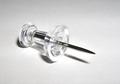
Clear Pointby LadeeMComment: Clean and simple. I like it. You're probably taking a little heat for not having 'Tacks' (plural), but it's fine in my book. The bottom front of the pushpin is a bit hot, but tricky to avoid. It looks like you used white paper for the background and it's coming across a little noisy. You know it's not, but the paper makes it appear that way. Neat Image could have ironed that out a bit for you. Overall, great job. Good luck! |
 Photographer found comment helpful. Photographer found comment helpful. |
| 04/20/2005 08:58:41 AM |
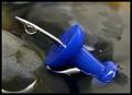
Drop on a tackby lastefComment: Oh no - not another water droplet image! ;^) Nice photo... Was it intentional to have the pin part of this pushpin bent? If not it was a cool accident. The bend mirrors the curve in the rock below it. Great focus, nice composition. Only downside I have is the image size - it's 20% smaller than allowed. Good luck! |
| Photographer found comment helpful. |
| 04/20/2005 08:53:12 AM |
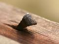
Old Time Tackby MonaComment: I imagine you're getting beat up a bit for only having on tack instead of being tacks (plural)! ;^) I would love to see this photo win. It's an image that is suitable for framing. I really like the color, the composition with the wood angling across and the tack cutting diagonally the other direction. Good clear focus on the tack. Kudos to you for not taking the funny tack(less) approach to this challenge. Great job, and good luck! |
| Photographer found comment helpful. |
| 04/20/2005 08:48:31 AM |
tAcKs iN SpAcE by MickComment: Yep - Here's the winner! It's fun plus the photo itself is well put together. Good use of light to simulate the sun, everything is in focus, etc... Great Job! Enjoy your ribbon! ;^) |
| Photographer found comment helpful. |
| 04/20/2005 08:35:19 AM |
Waiting for The Winds (Sailing Tacks)by BudComment: This is a great photo as it stands. Very nice colors, good composition with the boat coming into the photo at an angle. Exposure is right on. However, this photo is like a fish out of water for this challenge. Yes, sailing tacks technically works for the challenge but without showing a sail it's a thin connection. I'm afraid even with the descriptive title (without the title the connection to challenge is tenuous) many aren't going to get, or appreciate, this entry. I would definitely put this on DPCPrints. Good luck! |
| Photographer found comment helpful. |
| 04/18/2005 03:35:35 PM |
Baywatchby LevTComment: I see this one is racking up the views! Oops, I guess that includes me... ;^) Hooray for zoom! |
| Photographer found comment helpful. |
| 04/13/2005 03:02:14 PM |
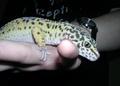
holding handsby clictacameraComment: Hi - I've read thru the comments on this photo and most of them are correct (IMO) on the lighting and distracting elements. One other consideration is the color of the animal, it seems paled out. Perhaps from the lighting. Sometimes color can be adjusted a bit with curves or saturation which could have helped some.
If this was your only available photo for entry and you just had to enter, then considering the rules for this were advanced you could have tried selecting the animal then blurring the heck out of everything else. Just a thought. ;^)
Smile and keep having fun! |
| Photographer found comment helpful. |
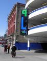
| 04/13/2005 02:52:06 PM |
L is for Luvby clictacameraComment: Hi, It's too bad you didn't walk down the sidewalk to get your photo from the other side of the sign. Then you wouldn't have had to flip the image...wait, either way I guess the L would have been backwards. Sorry.
Anyway, let's look at the rest of it. The parking deck itself is interesting. Potential for some other letters perhaps with some different angles or crops? The focus of your photo is centered which will also cause some grief among DPC voters. The image seems very "busy"..lots of other things to pull your eye away from what the focal point is meant to be.
Hey - that building next to the parking deck looks very interesting. Some potential letters with the windows? How about that radio tower in the background? Looks like an X on top... ;^)
Smile and keep having fun!
|
| Photographer found comment helpful. |
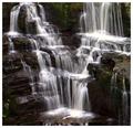
| 04/12/2005 03:44:27 PM |
"V"by TallblokeComment: This is a wonderful find! Most creative 'V' in the challenge and I think it will do well (top 5 at least). Of course that's just my opinion. ;^) I like most of this photo...if I could offer any suggestions I would say that it's just a tad dark and the rocks could be sharper. 8 |
| Photographer found comment helpful. |
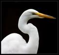
| 04/12/2005 02:55:41 PM |
"S" is for Sleek and Silkyby SandyPComment: I predict a ribbon with this one. Great natural find of the letter 'S'. I like the composition, filling the frame as you've done. The only negative I really have is it seems a bit soft around the eye and top of the beak where you expect it to be very focused and defined. 9 |
| Photographer found comment helpful. |
Home -
Challenges -
Community -
League -
Photos -
Cameras -
Lenses -
Learn -
Help -
Terms of Use -
Privacy -
Top ^
DPChallenge, and website content and design, Copyright © 2001-2025 Challenging Technologies, LLC.
All digital photo copyrights belong to the photographers and may not be used without permission.
Current Server Time: 08/04/2025 08:57:52 PM EDT.