| Author | Thread |
|
|
10/21/2005 10:07:15 PM |
|
|
|
05/03/2005 07:36:01 AM |
|
Thanks, Heather! :) I really appreciate it! I haven't gotten out of the 5's yet, but I'm still trying! :) |
|
|
|
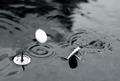
05/02/2005 11:14:58 AM |
*Critique Club*
I like the simplicity of this image. I wish you could have found a way to make a whiter background work though. I think it would go nicely with the clear tack. A whiter background would make the tip stand out a bit more I think, and that would be a good thing.
I like the focus and clarity here. I think that the detail in the tack is fine in my opinion.
The shadow is a slight bit distracting, I can really picture this as a high key kind of thing with no shadows and white background. I think it is the area along the bottom of the tack that makes me want to see it all this way. See how it is a little 'too bright' compared to the rest of the shot? I think instead of wishing that were darker, I wish the rest of the photo were lighter. Doesn't usually happen that way for me, but I think this could be good like that.
I like the angle and framing/cropping you chose. having the pin at a diagonal creates visual appeal and with the large part of the pin toward the upper left, it also offsets it enough to not appear 'dead center'.
Overall I think this is a really good shot, nice to look at and well done. ~Heather~ |
|
 Photographer found comment helpful. Photographer found comment helpful. |
Comments Made During the Challenge  |
|
|
04/20/2005 02:17:03 PM |
|
Very simple and very nice. One thing I did with my entry that I think would have made this even stronger would have been to burn in the shadow a bit. It would have added more dramatic contrast. Love the clarity and simplicity. Beautifully done. |
|
| Photographer found comment helpful. |
|
|
04/20/2005 09:03:28 AM |
|
Clean and simple. I like it. You're probably taking a little heat for not having 'Tacks' (plural), but it's fine in my book. The bottom front of the pushpin is a bit hot, but tricky to avoid. It looks like you used white paper for the background and it's coming across a little noisy. You know it's not, but the paper makes it appear that way. Neat Image could have ironed that out a bit for you. Overall, great job. Good luck! |
|
| Photographer found comment helpful. |
|
|
04/18/2005 10:19:52 PM |
|
I like the quiet simplicity of this shot, and it's sharp and well lit. |
|
| Photographer found comment helpful. |
|
|
04/18/2005 10:05:07 PM |
|
Nice sharp, bright, clean photo. |
|
| Photographer found comment helpful. |
|
|
04/18/2005 09:18:34 AM |
|
nice; clean and simple graphic. |
|
| Photographer found comment helpful. |
|
|
04/16/2005 09:01:23 PM |
|
I get your point but there are no TACKS in this image! ;) Excellent focus, good macro. I think it would be better with a different color background - the white overwhelms the image. But the composition and POV are good. 7 from me! |
|
| Photographer found comment helpful. |
|
|
04/16/2005 02:36:13 PM |
|
It seems your DOF is too shallow and that the tip is ever-so-slightly out of focus. I'm guessing some will say the light is too harsh, but I think it works. |
|
| Photographer found comment helpful. |
|
|
04/16/2005 12:23:23 PM |
|
Ah, but the point isn't clear. |
|
|
|
04/16/2005 05:08:37 AM |
Enter your comment here, and then casjavascript: do_vote(4)
4 t your vote... |
|
|
|
04/16/2005 02:14:09 AM |
|
| Photographer found comment helpful. |
|
|
04/16/2005 01:28:05 AM |
|
This is a great stock image, although I view the challenge as Plural, more than one tack. |
|
| Photographer found comment helpful. |
|
|
04/16/2005 12:30:16 AM |
|
Given the title you seem to have centered the focus in the wrong place. |
|
Home -
Challenges -
Community -
League -
Photos -
Cameras -
Lenses -
Learn -
Help -
Terms of Use -
Privacy -
Top ^
DPChallenge, and website content and design, Copyright © 2001-2026 Challenging Technologies, LLC.
All digital photo copyrights belong to the photographers and may not be used without permission.
Current Server Time: 06/28/2026 07:10:28 PM EDT.