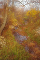
DPChallenge: A Digital Photography Contest You are not logged in. (log in or register
 
Browse Settings
Currently viewing:
MemberL2

Show comments:

Per page:

Order:

Comments:


Comments Made by L2
Pages:   ... [54] [55] [56] [57] [58] [59] [60] ... [100]
Showing 561 - 570 of ~992
Image Comment
Market Man
01/22/2006 11:30:26 PM
Market Man
by e301

Comment:
Black and white treatment works well here. A shame that the hat cast a shadow on the forehead.
Photographer found comment helpful.
He Singled Himself Out
01/22/2006 11:28:59 PM
He Singled Himself Out
by seebrown

Comment:
Oh, this one made me laugh. A shame about the blown out sky, but this has lots of visual interest. Nice perspective.
Photographer found comment helpful.
Afternoon at the Park
01/22/2006 11:26:01 PM
Afternoon at the Park
by kteach

Comment:
Plane of focus appears to the threes, rather than the person.
Photographer found comment helpful.
Mysterious-swan.jpg
01/08/2006 10:22:40 AM
Mysterious-swan.jpg
by kevrobertson

Comment:
Nice timing - that front wing could have easily ruined the line of the neck!
Photographer found comment helpful.
Rose6899
01/02/2006 12:22:34 AM
Rose6899
by angela_packard

Comment:
Good capture of facial expression.
Photographer found comment helpful.
Fresh cheese
12/21/2005 01:42:47 PM
Fresh cheese
by srugolo

Comment:
This was one of my faves in the challenge, as well. I gave it a 10! Who couldn't love this big cheesy smile? Nice job.
Photographer found comment helpful.
Mystical Creek
12/14/2005 10:39:16 AM
Mystical Creek
by tsheets

Comment:
Hi Tsheets, I enjoyed this entry very much and scored it a 6. If it helps, I'll share how I broke it down.

With regard to technical issues: With regard to composition, I thought the leading lines of the creek were good - they definitely drew my eye through the frame. Unfortunately, when I got to the end, there was nothing really there that was different from the rest of the scene. (Like a tree, a stump, a person, etc.) This would be OK for a vanishing point, but IMHO there is too much space left after the lines end to be a true vanishing point. I also really liked how the lines begin on a diagonal from the bottom right of the frame.

With regard to exposure: the sky looks a touch blown out - see the difference in coloration at the tops of the trees? Otherwise, the scene appears properly exposed (no loss of shadow detail under the trees.)

With regard to overall clarity: There isn't one element that really stands out here, other than the lines of the creek. Someone else mentioned it felt a little foreground heavy, and I agree with that in part. The foreground is heavy, but not necessarily with a true foreground element. What I mean here is a set of leaves or branches that might have provided a natural frame to the scene. Alternately, a lower point of view might have brought more visual drama to the overall scene. Here the point the view is pretty standard.

With regard to lighting/colors: this looks good. There are lots of warm tones that add a pleasing and soothing feel to the image, which I liked very much.

With regard to emotional appeal: The image did hold my visual attention. With that said, nothing about it really jumped off the screen and made me want to go there and see it for myself. I was left with the feeling that it was very pretty, but lacked a "wow" factor.

Overall, for each of the elements described above something was done well, yet something was also just a tiny bit off. I can see that you are definitely on the right track here both creatively and technically. This is image is certainly worthy of hanging on the wall. I find myself suprised by it's final score.

Hope this helps,

Laurie
Photographer found comment helpful.
Bowtie
12/10/2005 06:00:46 PM
Bowtie
by Tranquil

Comment:
This is really quite good. With regard to composition, it's very strong. Focus is tack-sharp and shows off architectural detail well. I also really liked the implied oval with the reflection of the bridge in the water. Black and white treatment works well.

It looks like there is a teeny bit of vertical skew on the left side of the frame. The contrast in the scene appears to have exceeded the dynamic range of your camera: the sky looks like it was blown out, and there is a loss of shadow detail in the water under the bridge. With all of these items, they were not noticeable at first glance. I really had to look hard to find them... :)

Overall, this is very compelling, and well worth hanging on the wall.
Photographer found comment helpful.
Mazatlan Corner
12/10/2005 05:24:55 PM
Mazatlan Corner
by Elemmennope

Comment:
Good composition and even though I'm not a big fan of borders, I think it works well here. Focal point has visual interest, but suffers a bit from vertical skew (lines on the front of the building aren't straight).

Unfortunately, the harsh shadows on the building are killing this shot. I see some shadow detail in the tree, but the loss is severe. The more modern buildings in the left side might show contrast between have/have not, but I'm not sure they add as much to the image as you might have hoped.

If you could re-shoot this when the lighting is better, I think it would make an interesting subject for exploration. If not, well, I hate to say it, but I don't know of a way to save this from looking like a travel snapshot of a cool building.
Photographer found comment helpful.
The fashionism of...
12/07/2005 11:06:17 PM
The fashionism of...
by Aron5109

Comment:
Returning for comment: love the reflections in the background.
Photographer found comment helpful.
Pages:   ... [54] [55] [56] [57] [58] [59] [60] ... [100]
Showing 561 - 570 of ~992


Home - Challenges - Community - League - Photos - Cameras - Lenses - Learn - Help - Terms of Use - Privacy - Top ^
DPChallenge, and website content and design, Copyright © 2001-2025 Challenging Technologies, LLC.
All digital photo copyrights belong to the photographers and may not be used without permission.
Current Server Time: 06/19/2025 08:27:35 PM EDT.