| Image |
Comment |
| 02/04/2003 03:47:53 PM |
Maddy in classic pearlsby LindaLeeComment: ROFL! OMG This is the funniest photo I've seen in a while. Must have a very cooperative dog. The only complaint is that toe focus is a bit soft. But the dog has the perfect expression. |
 Photographer found comment helpful. Photographer found comment helpful. |
| 02/02/2003 12:39:09 AM |
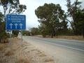
Will you be next?by Delta_6Comment: A visit from the critique club :)
After looking at the photo for a while there's a lot of little oddities that come to mind. First, the technical aspect of the photo. Composition is good but the sign is a little "too close" to the edge. I think you could shift the sign a tiny bit over to the right. The other thing I notice is the jaggies in the diagonal lines. Perhaps you oversharpened the photo a bit.
Now for the artistic quality. I think this photo has some bittersweet irony in it. The road looks desolate but people have been killed :(
The other thing I don't understand is the three crosses vs. 2 fatalities. Do all the roads have one of these signs?
And no, I hope I'm not next! |
| Photographer found comment helpful. |
| 01/25/2003 04:30:06 PM |
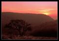
In the Mendip Hillsby KonadorComment: A visit from the critique club :)
Hey Ben, I think this photo is excellent. I think this has very strong composition. The diagonal curves in the hills are excellent. What's even better is that you have the dominant top line going into the smaller one on the right which in turn leads to the solitary tree placed with the rule of 3rds. The sun is great for color and I particularly love the muted color in the hill towards the back.
You also did not place the horizon in the center giving the photo more strength. I like the detail in the foreground as well.
One thing I do think could be done a little better is exposure. It seems that you underexposed this a little bit (intenionally?). On one hand it plays well with the composition giving you specific cues to follow with your eye but in the end, when you arrive at the final destination of the tree it looks a bit dark. Perhaps a slightly longer exposure would have resulted in a much stronger foreground. |
| Photographer found comment helpful. |
| 01/21/2003 07:40:08 PM |
Round Islandby GraciousComment: A visit from the critique club :)
This is a cool photo. I like the colors but the sky is a bit washed out towards the middle. It's bright. Perfectly exposed and has good focus. I like how you managed to fit the whole board-walkway into the shot.
One thing that I think is missing here would be a good focal point for me to rest my eye on. It's a pretty scene but it doesn't draw me in enough. |
| Photographer found comment helpful. |
| 01/20/2003 12:25:22 AM |
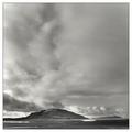
Tranquilityby greenem2Comment: A visit from the critique club (again) ;)
Wow, this photo is excellent. I simply love the negative space use here. The sky is so large and clouds add so much depth.
I love the detail in the mountain and the water around it. I think you did very well getting this much detail into the photo.
What more is there to say to such a good photo? I think you did very well. |
| Photographer found comment helpful. |
| 01/20/2003 12:21:24 AM |
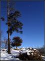
Zenithby KarenBComment: A visit from the critique club :)
Wow, I really like this photo. The photo is very sharp, well lit and has a lot of detail.
One thing I don't understand however, is that the moon in the photo or dust or something? I have mixed feelings on it, it seems oddly shaped and is kind of in the middle of nowhere just drawing your eye to it even though we should be looking at the landscape.
I love the old tall tree to the left contrasting to the much smaller tree a few feet back. It has a lot of detail in the bark and the branches.
Snow is also a nice touch to the scene. Perfectly exposed as well. |
| Photographer found comment helpful. |
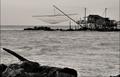
| 01/20/2003 12:13:51 AM |
Ritirata Dei Pescatoriby jimmyn4Comment: A visit from the critique club :)
Hmm, I like this image, it's pretty well executed but I would say it does not jump out at me as "landscape" it's more of a "seascape+cityscape" since emphasis here seems to be on the water and the fishing house(?).
Composition wise, I think the foreground is a bit distracting here. The anchoring the frame to that didn't do the photo justice as I would have rather seen the house not cut off. Another thing I noticed is that you did not place the horizon directly in the center, it's definitely a good idea but I think you should have framed more sky and less water.
It also looks a bit flat and grey. It looks like this was an overcast day so it's kind of hard to liven up a scene that's like that.You really can't alter the landscape at will so I would not worry about it too much.
It's definitely sharp and I like a lot of detail in the house. Message edited by author 2003-01-20 00:16:26. |
| Photographer found comment helpful. |
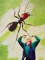
| 01/19/2003 07:45:19 PM |
Incredible Shrinking Manby SwashbucklerComment: A visit from the critique club.
I'm glad you wrote how you did the photo. This helps people who aren't familiar with such techniques to get a better idea on how to execute them.
I suppose I should critique two photos separately, then critique the combination of the two.
The photo of you is great. I love the expression of the face which seems to be fitting with the rest of the photo. One thing that I don't like about it and you explain that you printed it on a transparency is that you can see parts of the background if you look carefully. I'm not sure what your reasoning was to print on a transparency but I think regular paper would have worked well too.
The photo of the ant I don't like too much. It's an interesting photo but I think the background of it is too bright and overpowering. And the ant is in a weird position in relation to you. I think doing a profile shot of the ant would have helped a lot. When I visualize myself doing this photo I would try to get a profile of the ant or some other bug and a profile of me on my knees or something and also make sure I am much smaller than the ant. Then position it in a way that looks like I am begging for my life from the ant. Also, the flash spots on the water are odd, I'm tempted to say they are distracting but on the other hand I would say that this makes the ant look a bit like a magical creature that can do magic and it's about to cast a spell on the man.
This certainly creates an interesting effect with the two photos being sandwhiched together like this. I think although not very strong on their own the two photos make for a very compelling image.
I think this is a great idea, well executed but could be done just a tiny bit better. I think it's the positioning of the subjects that throws me off a bit. |
| Photographer found comment helpful. |
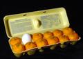
| 01/19/2003 07:04:56 PM |
Laying Lowby myqylComment: A visit from the Critique Club :)
Wow, this made me laugh. I think these types of photos were quite popular for this challenge. But I suppose this was the challenge!
I am not sure which way would have worked better 11 eggs/1 orange or 11 oranges/1 egg. I can see why this is stranger, but I would consider "land" to be the crate and eggs as native inhabitants of that land with one solo orange being the outsider.
Lighting on this photo is pretty good but I think it could be done a bit better without shadows at all. Also the oranges on the right seem to be a slightly less lighted than the ones in the foreground.
I like the composition of the egg crate being slightly on an angle. Also the lines provide some good contrast to the curvy eggs.
The black background is perfect for this photo. It brings all attention to the carton.
I think this is a very well executed photo. |
| Photographer found comment helpful. |
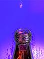
| 01/19/2003 12:56:16 PM |
Bottled Tearsby T-boneComment: A visit from the critique club :)
As I'm sure a lot of people in this challenge have received this as a comment I'll leave one as well. I never heard of this particular song and I don't know who it's by.
Having said that, there are some things I don't particularly like about this photo.
The water/tear drop is way too high in the frame. It's almost on the edge and the eye is drawn towards the top of the bottle. Having it somewhere half way between it's current position and the mouth of the bottle would make it more noticable.
The other thing I don't like is the cartoonish photoshop work on the background and the edges around the bottle. Those flames are very strange in my opinion.
The bottle has some nice color and it's a nice idea but I feel that it could be executed a lot better. |
| Photographer found comment helpful. |
Home -
Challenges -
Community -
League -
Photos -
Cameras -
Lenses -
Learn -
Help -
Terms of Use -
Privacy -
Top ^
DPChallenge, and website content and design, Copyright © 2001-2025 Challenging Technologies, LLC.
All digital photo copyrights belong to the photographers and may not be used without permission.
Current Server Time: 08/04/2025 05:40:29 PM EDT.