| Image |
Comment |
| 08/29/2005 12:03:12 AM |
Quasi una fantasia by nico_blueComment: >>> Quote: Nico Blue: Anyways my goal is to do better than my entry to the last nude challenge. A really ambitious goal, but hey i can at least say i tried :-)
LOL....did more than try! Congrats on the Blue!!! Message edited by author 2005-08-29 00:03:24. |
 Photographer found comment helpful. Photographer found comment helpful. |
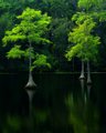
| 08/28/2005 06:00:12 PM |
Green on Blackby LeeDComment: Excellent image! The colors pop and the reflections help to make the trees seem to come right out of the flat panel! |
| Photographer found comment helpful. |
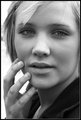
| 08/28/2005 04:57:29 PM |
soldis1by DogAngelComment: Beautiful model, great capture and tones. Nice soft feel to this portrait. Message edited by author 2005-08-28 20:26:09. |
| Photographer found comment helpful. |
| 08/28/2005 04:43:58 PM |
White on Whiteby joezlComment: Beautiful color and contrast on this high-key image! Very subtle detail in the whites and the image is great. |
| Photographer found comment helpful. |
| 08/28/2005 04:38:01 PM |
IMG_0134.jpgby parrotheadComment: Very rich and inviting colors. Perhaps a bit too saturated but very nice nonetheless. A great angle and interesting composition for a landscape. |
| Photographer found comment helpful. |
| 08/28/2005 04:36:16 PM |
|
| Photographer found comment helpful. |
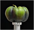
| 08/28/2005 03:40:53 PM |
Pepper on Postby Bear_MusicComment: I think the BG selection with blur x2px may be the cause of the softness comments, but I dont really see a glaring softness to this. I like the image a lot. Wondering about the tiniting (seems the purple is muted) and would have added a bit of punch in its original form. |
| Photographer found comment helpful. |
| 08/28/2005 02:06:41 PM |
Anabela & Antonio Jorgeby atsxusComment: A great pose/angle and composition. Yes, your new flash with bounce (and diffuse) will make a huge difference in the shadow and contrast.
One suggestion on this type of a photo is to remember how close to the wall the couple is and to use a much smaller DOF to try and blur as much of the background as you can. (not always possible, but PS can give you some control over that as well.) |
| Photographer found comment helpful. |
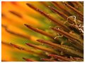
| 08/28/2005 02:03:59 PM |
Spike - Up Close and Personalby RikkiComment: The fibers add a contrast to the rest of the image that I don't think detracts at all unless you want to only focus on the sharp lines of the spikes. |
| Photographer found comment helpful. |
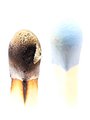
| 08/28/2005 02:01:58 PM |
Burnby RikkiComment: I like this image. It is well balanced and focused just where it needs to be. The color and burn are great contrasts. The border does not seem to add anything to the whole. I see areas of patchy white blocks that have been added to the interior (perhaps to create a more high key approach, but on a calibrated monitor, are distracting (making the matches look added in as opposed to photgraphed).
I personally would drop the border and try to match the white blocked areas to the rest of the grey background (may need to increase the brightness on your monitor to see what I am seeing.) |
| Photographer found comment helpful. |
Home -
Challenges -
Community -
League -
Photos -
Cameras -
Lenses -
Learn -
Help -
Terms of Use -
Privacy -
Top ^
DPChallenge, and website content and design, Copyright © 2001-2025 Challenging Technologies, LLC.
All digital photo copyrights belong to the photographers and may not be used without permission.
Current Server Time: 08/20/2025 07:31:04 PM EDT.