| Author | Thread |
|
|
07/20/2006 06:50:45 AM |
|
I can't fault this one, and I know I just love it, even though I have no idea how it was done..... |
|
 Photographer found comment helpful. Photographer found comment helpful. |
|
|
03/22/2006 01:28:51 PM |
|
Oh goodness. There goes my idea of abstract macro. This is lovely! |
|
| Photographer found comment helpful. |
|
|
09/13/2005 10:18:16 PM |
|
I think you are right about the like it or do like it, but I for one like it. I wish I understood the techniques used in lighting more, and this is a true example why. I think it so cool that you can turn a simple thing as a match stick into art. Great JOB |
|
| Photographer found comment helpful. |
|
|
08/31/2005 03:57:38 PM |
|
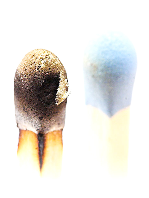
This is my least fav of all, sorry. It's way too high key for my taste. The blue one also has some slight discoloration. |
|
| Photographer found comment helpful. |
|
|
08/31/2005 11:41:54 AM |
|
I like the concept... the "blue" match seems a little washed out, but other than that, another good high key shot. |
|
| Photographer found comment helpful. |
|
|
08/28/2005 05:09:47 PM |
|
well, in regards to that white box bottom right when you're editing a picture just turn up and down the brightness- you would be able to catch things like that then. People will never have all thier monitors calibrated the same anyways... |
|
| Photographer found comment helpful. |
|
|
08/28/2005 02:01:58 PM |
I like this image. It is well balanced and focused just where it needs to be. The color and burn are great contrasts. The border does not seem to add anything to the whole. I see areas of patchy white blocks that have been added to the interior (perhaps to create a more high key approach, but on a calibrated monitor, are distracting (making the matches look added in as opposed to photgraphed).
I personally would drop the border and try to match the white blocked areas to the rest of the grey background (may need to increase the brightness on your monitor to see what I am seeing.) |
|
| Photographer found comment helpful. |
Home -
Challenges -
Community -
League -
Photos -
Cameras -
Lenses -
Learn -
Help -
Terms of Use -
Privacy -
Top ^
DPChallenge, and website content and design, Copyright © 2001-2026 Challenging Technologies, LLC.
All digital photo copyrights belong to the photographers and may not be used without permission.
Current Server Time: 07/15/2026 10:43:26 PM EDT.