| Image |
Comment |
| 06/17/2003 09:39:58 AM |
|
 Photographer found comment helpful. Photographer found comment helpful. |
| 06/17/2003 09:19:15 AM |
|
| Photographer found comment helpful. |
| 06/16/2003 11:33:17 AM |
|
| Photographer found comment helpful. |
| 06/13/2003 02:11:59 PM |
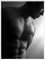
Male Fitnessby imagesloyolaComment: Drat - this would have placed much better in the next challenge, the low key one, than it will as a magazine cover. |
| Photographer found comment helpful. |
| 06/13/2003 02:01:54 PM |
Vogueby danh669Comment: She looks squished. Maybe you need a tighter crop so it looks more intentional that you cut her hands and feet - or a looser crop so she can have some room. the image is lovely |
| Photographer found comment helpful. |
| 06/13/2003 01:59:23 PM |
|
| Photographer found comment helpful. |
| 06/13/2003 01:56:53 PM |
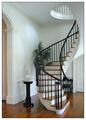
Home and Design by sherComment: Phew! Perfect! I'm not interested in staircases but his picture is terrific. 9 |
| Photographer found comment helpful. |
| 06/13/2003 01:55:46 PM |
|
| Photographer found comment helpful. |
| 06/13/2003 01:51:28 PM |
|
| Photographer found comment helpful. |
| 06/13/2003 01:36:24 PM |
National Geographicby SwashbucklerComment: the yellow detracts big time - I suppose you were going for the national geographic look, but as a stand alone image, the yellow border draws attention away from the yellow eyes and beak which should be the focal point. You have done a nice job of picking up that yelow in the leaves benind while the orange of the beak is picked up by the feathers. Get rid of the border and you have a strong photo. |
| Photographer found comment helpful. |
Home -
Challenges -
Community -
League -
Photos -
Cameras -
Lenses -
Learn -
Help -
Terms of Use -
Privacy -
Top ^
DPChallenge, and website content and design, Copyright © 2001-2025 Challenging Technologies, LLC.
All digital photo copyrights belong to the photographers and may not be used without permission.
Current Server Time: 06/20/2025 02:00:28 AM EDT.