| Image |
Comment |
| 09/14/2005 02:00:29 PM |
Back to Schoolby vtruanComment: a good shot, but i think the angle is unfortunately cropping alot of the expression on his face out. also, the current colours in this shot are making the image blend into itself. i think if this shot was converted to b&w, it would have a lot more aesthetic value (realize this is a colour contest). perhaps draping a black piece of fabric against the wall would have helped isolate the green of the shirt, instead of blending in with the wall. 4/10 |
 Photographer found comment helpful. Photographer found comment helpful. |
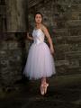
| 09/14/2005 01:55:51 PM |
Ballerinaby kiwinickComment: nice picture, but needs more light brought into the subjects face. i think this shot might be downgraded for not cropping tightly around her face, which isn't necessarily a requirement, but i think for this to be considered a portrait, you need to really highlight the model's face. currently, i think her eyes are too dark and just sink into her face, removing any expression that could have been interpreted. a shame, because the background is lovely, and the model has a lot of potential. I'd try to reshoot this with a light reflector to get some more natural lighting. 5/10 |
| Photographer found comment helpful. |
| 09/14/2005 01:38:02 PM |
|
| Photographer found comment helpful. |
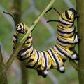
| 09/14/2005 01:29:32 PM |
Portrait of a Potatoby JEFFJSBComment: funny shot. nice colour and composition. probably would crop a bit more from the left-side (perhaps make this shot into a square pic), seems like he's just floating at the edge. a wee bit of burning along the moustache and wish you could have lit up his eyes a bit more. overall a good quality shot. |
| Photographer found comment helpful. |
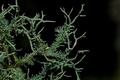
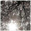
| 09/14/2005 01:17:48 PM |
Tree Moss Branchesby ShaneBlakeComment: 1. no
2. somewhat from the title
3. neither
4. I would crop 30% from the left side
5.
overall, i think this is a good technical shot, but definitely would appreciate more DOF. It seems that the focus is a little tight, and pushes alot of the "branches" out of focus. but when dealing with such a tight macro, I can appreciate the difficulty. lighting is good, there is some slight burning on one of the limbs (middle right)
I think in this case, all of the negative space is actually detracting a bit from the shot. I'm not sure if a white background would have helped, but I think the black pulls some of the punch out of the greens.
|
| Photographer found comment helpful. |
| 09/08/2005 06:31:37 PM |
life, the universe and everything. connected.by th3ph17Comment: an interesting photo, that perhaps its downfall is that it requires a second-thought and more time than usual to grasp the connection. not entirely convinced that the symbolism of the light is justly reflecting the universe and life. the title works for me, even the concept, i guess i've just been subjected to enough long-shutter light trick shots that its lost its novel feel. 5/10 |
| Photographer found comment helpful. |
| 09/08/2005 05:21:31 PM |
|
| Photographer found comment helpful. |
| 09/08/2005 05:21:02 PM |
Submergedby InnaNComment: horizontal tilt, composition needs work (ie: too busy, no compelling subject) |
| Photographer found comment helpful. |
| 09/08/2005 05:20:12 PM |
|
| Photographer found comment helpful. |
| 09/08/2005 05:19:11 PM |
|
| Photographer found comment helpful. |
Home -
Challenges -
Community -
League -
Photos -
Cameras -
Lenses -
Learn -
Help -
Terms of Use -
Privacy -
Top ^
DPChallenge, and website content and design, Copyright © 2001-2025 Challenging Technologies, LLC.
All digital photo copyrights belong to the photographers and may not be used without permission.
Current Server Time: 08/18/2025 04:37:24 AM EDT.