| Image |
Comment |
| 01/22/2003 05:44:50 PM |
Caught Snackingby AnachroniteComment: ha! Cute idea. I like it. The only thing I'd change. Get better lighting next time. Seems a bit patchy. Good luck. Jakco. 7 |
 Photographer found comment helpful. Photographer found comment helpful. |
| 01/22/2003 05:44:00 PM |
Drink Milk?by rj324Comment: Cute girls. They look like they really like milk. The girl on the right is just too cute and I like the look on the face of the girl on the left. One thing though: you might want to watch out for your selection of backgrounds next time; it's a bit too busy, especially since the girls have wild patterns on their clothing. Goo luck. Jacko. |
| Photographer found comment helpful. |
| 01/22/2003 05:38:49 PM |
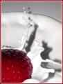
Strawberry Splashby jodiecostonComment: Cute shot. I'd like to see more of the strawberry and splash. Seems a bit tighly cropped. I love th 'whitness' you were able to achieve. Might be able to reduce the shadow with more than one light source. Jacko. |
| Photographer found comment helpful. |
| 01/22/2003 05:36:37 PM |
Milk's Perfect Formby myqylComment: Nice composition. Seems a bit dark. Should used a stronger light source or brighten up with an editing software. Sure looks tasty! Jacko. 7 |
| Photographer found comment helpful. |
| 01/22/2003 05:34:12 PM |
Fortifiedby crabappl3Comment: Seems to be too many focul points. They are all competing for my attention. |
| Photographer found comment helpful. |
| 01/22/2003 05:33:06 PM |
Strawberry Fareby PtmanComment: Cute composition. I thiink it would be more appealing on plain vanilla ice cream (better contrast and less yellowish). Jacko. |
| Photographer found comment helpful. |
| 01/22/2003 05:28:28 PM |
Everybody, che-eee-se!by kenboComment: Very interesting shot. La vache qui rit. (thought that was Canadian?). I like the contrasting colours. One thing I would absolutely change: rotate the shot to make the Low Fat Milk sign level, the angle is disorienting. Jacko. |
| Photographer found comment helpful. |
| 01/22/2003 05:25:16 PM |
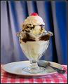
Sundae Bestby DougPazComment: I like the shot right upt to the point where we see the spoon, plate and birght table cloth ... too mnay contrasting colours. I still think it is nicely executed (very sharp, nice exposure). Jacko. |
| Photographer found comment helpful. |
| 01/22/2003 05:23:18 PM |
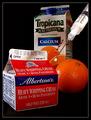
Yoghourtby lionelmComment: Hmmm. I really don't know what I'm looking at here. Looks like a pure white background would have worked better to highlight the "yogourt". Jacko. 7 |
| Photographer found comment helpful. |
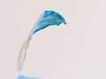
| 01/22/2003 05:21:35 PM |
|
| Photographer found comment helpful. |
Home -
Challenges -
Community -
League -
Photos -
Cameras -
Lenses -
Learn -
Help -
Terms of Use -
Privacy -
Top ^
DPChallenge, and website content and design, Copyright © 2001-2025 Challenging Technologies, LLC.
All digital photo copyrights belong to the photographers and may not be used without permission.
Current Server Time: 08/10/2025 06:11:49 PM EDT.