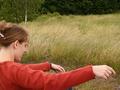
DPChallenge: A Digital Photography Contest You are not logged in. (log in or register
 
Browse Settings
Currently viewing:
Registered Userpidge

Show comments:

Per page:

Order:

Comments:


Comments Made by pidge
Pages:   ... [60] [61] [62] [63] [64] [65] [66] ... [83]
Showing 621 - 630 of ~826
Image Comment
Early autumn
09/18/2005 12:14:38 PM
Early autumn
by gsal

Comment:
Salut from the Critique Club!

With your title, you've capture that autumn feel with the red of the needles from the tree, and met the challenge theme quite nicely. There are a few things that I think will help.

Size: Check out the tutorial on sizing images for DPC. DPC'ers not only don't like small pictures in challenges (many will vote it down!), but you lose detail when looking at a picture that is smaller than it could be.

Composition: Having the red needles follow the rule of thirds make this picture interesting and nice to look at. The only distracting thing is the thick trunk of a tree on the left. I feel it uneccessarily detracts from the focus of the picture, which is the red of the needles.

Focus: The small size of the photo makes it difficult to tell if how in focus the picture is. It seems as though the picture is not quite as sharp as it could be, but as I said, it's difficult to tell.

Color/Lighting: The light on the red needles is excellent. It makes the red really stand out. However, I think a little tweaking of color in post processing will not only bring out the red more, but improve the background colours so it stands out more. Red is a vibrant colour that your eye goes to, so adjusting the color can make it really POP against the background.

Depth of Focus: One way photographers make things stand out is by blurring the background of your photo. Check out this tutorial on depth of focus.

I see you've only entered two challenges so far. I hope to see you shooting more!

Hope this helps, and if you have any questions, feel free to ask!
Cheers
pidge
Photographer found comment helpful.
Branches of a woman
09/18/2005 11:49:31 AM
Branches of a woman
by Willtorecord

Comment:
Salut from the Critique Club!

I believe you were trying to convey a sense of branch with the woman's arms. I like that your thinking outside of the box, but there are a few things that I think can improve the picture

Color: I like the contrast of her red sweater against the earth tones of the grass and background. However, it seems as though this picture was taken on an overcast day, so it lacks a bit of oomph. In your post processing, I would use levels and curves (in photoshop if you have it), as well as color hue and saturation to bring out the colors more so it's not quite as flat.

Focus: I don't feel the soft focus on her works. This is partly due to how in focus the grass behind her is. There are a few things to do to correct this. If you are using autofocus, focus on her first (in the center of the picture) by holding down your shutter button half way and then while still holding down the shutter half way, move your camera so she is now where you would like her in the frame, and then push your shutter button down all the way. Another way is to improve you depth of focus. This is done by closing up your aperture (increase your f-stop number). You will have to adjust your shutter speed accordingly. The other way is to be farther back from your subject so both she and the background are in focus, and then crop in post processing.

Composition: Having your subject off center as you do works quite nicely. However, there are a few nit picky thigns that I'm not to fond of. One is the blue leg at the bottom of the picture. The other is the sliver of background by her neck. Either a tighter cropping to get rid of those things, or a looser cropping (if this was cropped) to include more of her neck and head and leg would help. The choice is yours.
Two other things that I find distracting are the ground in between her and the grass, and the birch tree in the background. When composing pictures, (and I'm still learning this) always remember to keep in mind the rest of the picture that isn't the focus of the picture. They are often what makes a picture 'WOW!' or 'uhm, it's just ok'.

I like the way you only see part of her face, with her eyes closed and a bit of a smile, as if she is lost in her own world. I also love how you've captured the movement of the grass behind her, which mimics how she might be swaying in the wind as well.

Hope you find this helpful, if you have questions, feel free to ask.
Cheers!
pidge
Photographer found comment helpful.
Looking to get back in.
08/31/2005 12:45:00 AM
Looking to get back in.1st Place
by graphicfunk

Comment:
As always, incredibly creative and perfectly executed. Congratulations on a well deserved blue!
Photographer found comment helpful.
"keep those bottles quiet"
08/26/2005 11:41:26 PM
"keep those bottles quiet"
by joansuzy

Comment:
This looks like the milk bottle in Montreal they want to tear down. Picture itself seems slightly tilted and a tighter crop to eliminate hte building on the left would have helped the picture.
Photographer found comment helpful.
Spilled Milk
08/26/2005 11:38:46 PM
Spilled Milk
by jasm8

Comment:
So nice, but I wish there wasn't motion blur on the drop...
Photographer found comment helpful.
Missing
08/26/2005 11:36:55 PM
Missing
by jab119

Comment:
It's just never going to end, is it? :D
Photographer found comment helpful.
Tasteful
08/26/2005 11:34:33 PM
Tasteful
by fotodude

Comment:
Nice use of black and white (not the photo itself but the use of the colors :D )
Photographer found comment helpful.
The Milky Paw
08/26/2005 11:32:29 PM
The Milky Paw
by sarimili

Comment:
This could be a really nice picture. Two things don't help it. One is focus, and the other is noise. A sharp focus and reduction of noise with either a lower iso or noise reduction soft ware would help the picture
Photographer found comment helpful.
Milk Splash
08/26/2005 11:30:13 PM
Milk Splash
by smartypants

Comment:
Nice capture. I really likehow you captured the shadow on the splash. It offsets the transperancy of the top of the splash really nicely. Excellent picture.
Photographer found comment helpful.
Grow-up to be a warrior
08/26/2005 11:26:13 PM
Grow-up to be a warrior
by Ennil

Comment:
Definitely one of the more creative, unique and interesting pictures here. I'm a little confused by the streaks on the skin. I don't quite understand what they mean, but I really like this picture
Photographer found comment helpful.
Pages:   ... [60] [61] [62] [63] [64] [65] [66] ... [83]
Showing 621 - 630 of ~826


Home - Challenges - Community - League - Photos - Cameras - Lenses - Learn - Help - Terms of Use - Privacy - Top ^
DPChallenge, and website content and design, Copyright © 2001-2025 Challenging Technologies, LLC.
All digital photo copyrights belong to the photographers and may not be used without permission.
Current Server Time: 06/17/2025 05:44:35 PM EDT.