| Image |
Comment |
| 08/01/2005 08:02:25 PM |
Colored Reflection IIby RikkiComment: The tilt-shift lens worked well here. You did a great job. The Desaturation on top and color on bottom is an interesting effect but works for me. Great work. |
 Photographer found comment helpful. Photographer found comment helpful. |
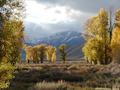
| 08/01/2005 07:49:47 PM |
Tetons Storm Breakby kearockComment: Very nice tonal range. I love the browns and yellows in the foreground and the blues and gray in the background. DOF is good but I feel the tree on the left is a bit distracting. Other than that a great photograph.
-SDW |
| Photographer found comment helpful. |
| 07/31/2005 04:06:02 PM |
Aliby airdanceComment: Hi and welcome to DPChallenge.
The good part your subject is in focus which is the most important thing people seem to look for here at DPChallenge. The cat is a very good subject. Nice features and color. Things that need working on. The highlights are blown-out. No recovering that and the shadows are harsh. I would consider a different angle of light. Always think of where the light is coming from. If the light would of been ore to your back you would have not had the harsh shadows and probably would of done away with the blown out areas. Second, consider your background. If you can get a smooth background by using a physical element such as a sold backdrop or using a shallow DOF with the subject about 6' away from the background.
Other than that, picture is good. Just need a little work on lighting. But don't we all. Again welcome and I hope you have a good time here at DPChallenge. |
| Photographer found comment helpful. |
| 07/30/2005 03:38:53 PM |
marissa-046.jpg2.jpgby mrsamsaComment: I think this one is better. The bottles being bright in color was distracting me from the action and overall photograph. Good work.
BTW: Looks like Lotto numbers on the back of the jerseys :) I may have to go to the store and play 2-3-4-11-21-6. |
| Photographer found comment helpful. |
| 07/30/2005 06:42:19 AM |
The Good Lifeby JOHNBOY1970Comment: Nice approach. But I also feel more contrast is needed. The plant in front is kind of distracting because it blends to much with the subject. Other than that is a nice photograph. |
| Photographer found comment helpful. |
| 07/28/2005 04:34:34 AM |
|
| Photographer found comment helpful. |
| 07/25/2005 01:43:17 AM |
Ashaby SJCarterComment: Congratulations on a top 30 finish and a high score. Very crisp and nice shot. Not a fan of the blurred background but can understand your comment and think you did a good job in the little time you had before the challenge ended. Keep up the great work! |
| Photographer found comment helpful. |
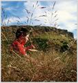
| 07/23/2005 07:13:32 PM |
in the grassby kevrobertsonComment: Foreground a bit distracting. Other than that nice idea and again great colors. Keep up the good work. |
| Photographer found comment helpful. |
| 07/23/2005 07:11:44 PM |
kev-and-ian-water.jpgby kevrobertsonComment: I like this photograph. The reflections are great. Focus does seem to be a bit soft but not bad. I would of cropped out the top so that the cars and people would not be seen. Good job! |
| Photographer found comment helpful. |
| 07/23/2005 07:09:35 PM |
photographer.jpgby kevrobertsonComment: Nice colors and tone. Lighting good. The only thing I see I would of done differently is instead of leveling the picture by using the rails as a guide I would of used the top of the door as a level guide. The wall is so prominent it makes the photo look as it's tilting to the right. |
| Photographer found comment helpful. |
Home -
Challenges -
Community -
League -
Photos -
Cameras -
Lenses -
Learn -
Help -
Terms of Use -
Privacy -
Top ^
DPChallenge, and website content and design, Copyright © 2001-2025 Challenging Technologies, LLC.
All digital photo copyrights belong to the photographers and may not be used without permission.
Current Server Time: 08/18/2025 02:19:28 AM EDT.