| Image |
Comment |
| 04/27/2005 12:02:18 AM |
Ragged by TychoComment: Congratulations on the red for a fantastic entry! |
 Photographer found comment helpful. Photographer found comment helpful. |
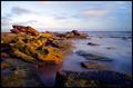
| 04/26/2005 12:17:31 AM |
Evening Shades of Texasby SandyPComment: Hello Sandy, this is really quite excellent and I'm surprised it did not place higher. You have a great eye and I'm sure we'll be seeing a lots more fantastic entries on the horizon. |
| Photographer found comment helpful. |
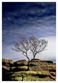
| 04/26/2005 12:05:44 AM |
Out of Stone by e301Comment: Excellent! Ed I'm a huge fan of your impeccibly edited photos. Congratulations on your ribbon! |
| Photographer found comment helpful. |
| 04/26/2005 12:01:20 AM |
|
| Photographer found comment helpful. |
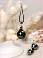
| 04/25/2005 11:58:04 PM |
Fijian Black Pearlsby dkubinComment: Lovely. Nice detail, focus, DOF, and lighting. The processing is relatively clean and free from artifacts (just a slight halo around the center piece pearl). Not a huge fan of the border. Overall one of the best entries though. 8 |
| Photographer found comment helpful. |
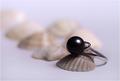
| 04/25/2005 11:57:22 PM |
The Black Pearlby vasilkovayaComment: Lovely blurred backdrop. I'm assuming you edited it in? It works well to isolate your subject. I can easily see this as an ad, well done. |
| Photographer found comment helpful. |
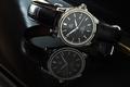
| 04/25/2005 11:55:23 PM |
Omega DeVille Automatic Chronometerby fplouffeComment: Nice timepiece. Band detail is sort of obscured by the background (black on black). There's a bit of reflection cutting across the lower half of the face, but otherwise nicely lit. |
| Photographer found comment helpful. |
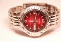
| 04/25/2005 11:53:35 PM |
Classic Mens Timepieces on Saleby alien2thisworldComment: I like the soft, diffuse lighting and you did a nice job in controlling the reflections. Not sure of the composition though. The crop leaves some awkward space on the left that is too small for any print lettering. Almost as if you did so to prevent a centered composition. Sometimes centered is preferable. I would suggest leaving more rorom either above or below, which would naturally follow in this type of ad presentation (landscape aspect ratio). |
| Photographer found comment helpful. |
| 04/25/2005 11:47:14 PM |
Suggestiveby mrmorrisComment: I like this concept and the composition overall. The lighting unfortunately is quite lacking given the harsh, contrasty glare off the jewelry piece which is quite unflattering. I recommend diffusing the flash to soften it up and you could also forego the flash altogether and use available lighting (assuming you fired a flash). Good luck. |
| Photographer found comment helpful. |
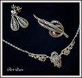
| 04/25/2005 11:44:24 PM |
New "old fashioned" collectionby rhipsterComment: Great arrangement. Not sure the lettering does much for this shot but it doesn't distract, either. Good lighting too.
I recommend either shooting against a more uniformly black background, or adjusting the background in post processing to remove the texture and/or flecks of lint. 7 |
| Photographer found comment helpful. |
Home -
Challenges -
Community -
League -
Photos -
Cameras -
Lenses -
Learn -
Help -
Terms of Use -
Privacy -
Top ^
DPChallenge, and website content and design, Copyright © 2001-2025 Challenging Technologies, LLC.
All digital photo copyrights belong to the photographers and may not be used without permission.
Current Server Time: 06/16/2025 07:46:26 PM EDT.