| Image |
Comment |
| 11/24/2004 12:30:59 AM |
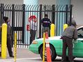
The Crossingby rkligmanComment: Great color combination. There is certain focal point, so I am unsure what is the authority here. The car seems to take the focal point. The use of the bars could offer an interesting take on authority, maybe cropping tightly to the man in front of the stop sign. The artist would have to play with it a bit to see if it would work. Just a thought. |
 Photographer found comment helpful. Photographer found comment helpful. |
| 11/24/2004 12:27:03 AM |
I dare you!by twentyfivesComment: Great angle, it gives a dizzying effect which works well with the concept, but I would crop this a little tighter. It seems to be fading off the frame due to the shadow. That takes away from the imposing image the artist was trying to convey, especially since the title makes a dare. I would also shoot the shot from below even more. Let the sign tower over the viewer. |
| Photographer found comment helpful. |
| 11/24/2004 12:22:44 AM |
Authorityby arsenalComment: Interesting lighting and shadow. I am not sure what I think of the use of this as a symbol of authority. Perhaps an even more extreme angle, shot from below would convey the message better. |
| Photographer found comment helpful. |
| 11/24/2004 12:21:23 AM |
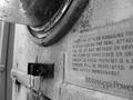
Electric Meterby kittenfcComment: Interesting point of view. I like the gritty realism of the photo. I would like a more determined focal point so that the message would come across more powerfully (get it- sorry, couldn't help myself.) Very interesting contrast of line and curve. |
| Photographer found comment helpful. |
| 11/24/2004 12:19:06 AM |
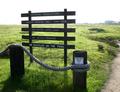
Nature Rules!by ZippyComment: Your focal point would have more impact if it were lit better and framed diferently. Interesting idea. I like the irony of your title. Very creative. |
| Photographer found comment helpful. |
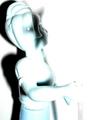
| 11/24/2004 12:17:53 AM |
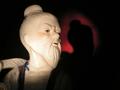
The Man Upstairsby ShadowrainComment: This gives me the feeling of horror rather than authority; however, sometimes they are the same thing, aren't they? I would have cropped the light on the brick wall out of the image, it distracts from your focal point, which is imposing. |
| Photographer found comment helpful. |
| 11/24/2004 12:16:30 AM |
|
| Photographer found comment helpful. |
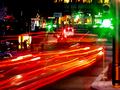
| 11/24/2004 12:15:20 AM |
The Rules of Trafficby dsb_macComment: Great idea. The signs and stop lights really add to the message of the photo. The headlights running across the image are too much, maybe fewer streaks would keep the image to a more managable message for my eye. Brilliant colors. |
| Photographer found comment helpful. |
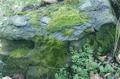
| 11/23/2004 10:49:31 PM |
Moss Coveredby Judith PolakoffComment: Great color and concept. Wow, the foliage in the lower right corner is a beautiful touch. The cropping of the very tip of the rock off the edge of the left side makes me uncomfortable and your subject rests too high in the frame for me to appreciate it fullly. Crop over to the left a bit and move the rock down and see what you think. Keep a hint of those beautiful leaves, or maybe, focus on them instead. I think you haven't quite decided which picture you want this to be. There is the potential for two stunning images here. |
| Photographer found comment helpful. |
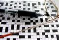
| 11/23/2004 10:43:06 PM |
16 downby biggood53Comment: Great idea. I would have gotten rid of the glasses, used a contrasting colored pen and let the image speak for itself. A more powerful focal point would tighten the message for me. |
| Photographer found comment helpful. |
Home -
Challenges -
Community -
League -
Photos -
Cameras -
Lenses -
Learn -
Help -
Terms of Use -
Privacy -
Top ^
DPChallenge, and website content and design, Copyright © 2001-2025 Challenging Technologies, LLC.
All digital photo copyrights belong to the photographers and may not be used without permission.
Current Server Time: 06/17/2025 04:05:24 AM EDT.