| Image |
Comment |
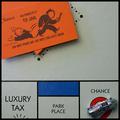
| 11/24/2004 01:21:17 AM |
doh!by hopperComment: Funny. Beautiful crisp image. I would have cropped it differently, much tighter on the card. I would have the card on top of Luxury Tax and Park Place, with those sections partially visible beneath it. Or I would crop them out entirely, letting the question marks complement the card. Just a thought. |
 Photographer found comment helpful. Photographer found comment helpful. |
| 11/24/2004 01:18:29 AM |
STOPby JohannesFrankComment: I love the colors. Nice brilliant red of the sign, then the muted burgandies of the branches and leaves with the backdrop of the snow and buildings. I like the intense focus on your subject with the softness of the background. I really want to straighten the sign, though. It should be ramrod straight to convey the immutable messge. |
| Photographer found comment helpful. |
| 11/24/2004 01:15:45 AM |
Authorityby speaseComment: Nice light, textures, and colors. The light on the badge works well. The photo meets the challenge for me. |
| Photographer found comment helpful. |
| 11/24/2004 01:14:02 AM |
The Foley's - Authority on Antiquesby Prof_FateComment: I really like so much about this image that I wish that your subjects weren't so dead center. Nice images behind your subjects on the left of the frame. The right side doesn't work as well for me. The older woman's expression is priceless. I think I would have moved them back and had them surrounded by their wares. |
| Photographer found comment helpful. |
| 11/24/2004 01:02:07 AM |
the Bossby jmritzComment: Startling in the starkness and then brilliant color. I want something more, maybe the subject's head turned a bit, or less negative space, maybe more contrast in the colors that are there. |
| Photographer found comment helpful. |
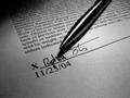
| 11/24/2004 12:57:30 AM |
Fingertip Authorityby bigfishComment: Nice use of light and shadow. Great clean lines in the crisp focus, letters, and pen. I would have angled the pen from the other upper corner so that the signature was not obscured by the shadow from pen. The artist did an excellent job by choosing to make the letters so clear and tight at the bottom of the page and then sliding out of focus as they move up the page. Outstanding choice of angle for that aspect. Great image. |
| Photographer found comment helpful. |
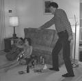
| 11/24/2004 12:50:52 AM |
Don't do that at your age ! ! !by yomanComment: Good use of framing and angle to create the image of one subject towering over the other. The lighting and focus are a bit off. I would like to see facial features for some sort of emotion to pull me in. Again, the power of this photo is how artist used angle and point of view to give the sense of one subject trying to impose his authority over another. It meets the challenge in that way very well. |
| Photographer found comment helpful. |
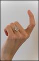
| 11/24/2004 12:47:35 AM |
Demanding your presenceby panoramixComment: Great long, elegant lines in this hand. The curve on the ring really complements that. I don't like the color of the background. I am unsure what color would be better, but white diminishes rather than showcases your subject. Great concept, creative and interesting. |
| Photographer found comment helpful. |
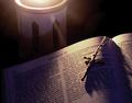
| 11/24/2004 12:45:26 AM |
The Highest Authority?by RussComment: Indeed. Nice lighting on the bible and crucifix. The harsh lighting on the candle(?) is distracting for me. I would crop it out and let the power of your main images take centerstage. Really beautiful lighting on the apex of the curve on each page. Stunning image without the distraction from the top. |
| Photographer found comment helpful. |
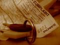
| 11/24/2004 12:37:52 AM |
Bummer....another speeding ticket!by SweetlipsComment: This is brilliant. Nice use of muted color and great focus on the words of the ticket. I would like to see a little tighter focus or a little softer focus on the keys. Take it one way or the other. Right now it just seems that they are a tad soft unintentionally. Very nice photo. Framing is the key to why this photograph works for me. The corner of the summons just barely skimming the right edge of the frame and the placement of the keys and their movement out of the frame adds just the right tension. Sweet. |
| Photographer found comment helpful. |
Home -
Challenges -
Community -
League -
Photos -
Cameras -
Lenses -
Learn -
Help -
Terms of Use -
Privacy -
Top ^
DPChallenge, and website content and design, Copyright © 2001-2025 Challenging Technologies, LLC.
All digital photo copyrights belong to the photographers and may not be used without permission.
Current Server Time: 06/17/2025 06:23:23 AM EDT.