| Image |
Comment |
| 06/06/2004 12:36:28 AM |
First De-Satby KylieComment: Very nice, and you couldn't have picked a better color. I love the yellow against the deepend (almost purple-ish) background. Great Job. |
 Photographer found comment helpful. Photographer found comment helpful. |
| 06/05/2004 01:35:59 PM |
eggsby oferashelComment: Composition is alright, I think the light could be a little more dramatic. When viewing eggs artistically I like to see clean soft surfaces, I think these guys could have been cleaned up a little better prior to shooting. Maybe a softer light would mask some of the artifacts and imperfections a little better or even a dusting of baby powder or talc to whiten them up a tad. |
| Photographer found comment helpful. |
| 06/05/2004 01:21:25 PM |
Three Foundby KylieComment: I think the lighting is hurting this picture. The bushes are blown out and the subject (three rocks) are quite dark. I think I would have tried this from a different angle. From the angle I don't think you could have lightened the rocks at the same time as darkening the very green bush right behind. |
| Photographer found comment helpful. |
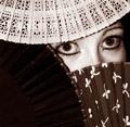
| 05/31/2004 01:08:33 AM |
Peek-A-Boo...by JesuispeureComment: Three fans, very clever. A tad bit noisy (unless that is the effect you was trying to achieve), I would have liked to see a little crisper on at least the top fan and model's facial features. |
| Photographer found comment helpful. |
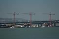
| 05/31/2004 12:18:00 AM |
Retrofittingby jazzmanmgtComment: Cool composition. The contrast is a little harsh for the amount of detail that we need to see. I think lightening the sky would have helped make the cranes stand out a little better. I might have straightened the horzion (water line) a bit more. When ever there is water on the horizon the slightest be of tilt will make your picture feel like things are sliding off to one side. |
| Photographer found comment helpful. |
| 05/25/2004 11:27:48 PM |
Naughty Nunby emobelleComment: Great expression, nice lighting. Got the theme x2. The only thing I would have liked to see here is a little better focus. She's a lovely model and a little more clarity would have mad those big brown eyes stand out. |
| Photographer found comment helpful. |
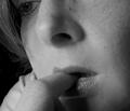
| 05/22/2004 05:27:30 PM |
Stressedby bruskiComment: I can definately see anxiety in this shot. Good capture. I like close ups such as this in b/w so that we don't get too much detail of ones face. I works well here and the lighting is quite nice. |
| Photographer found comment helpful. |
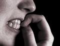
| 05/22/2004 05:17:44 PM |
Nervous Nail Bitingby L1Comment: Great close up. Good crop leaving the eye so that we feel a sense of concern on the models part. Great use of b/w (this would have be overpowering in color). Great expression. |
| Photographer found comment helpful. |
| 05/22/2004 02:49:56 PM |
Marble Madnessby DonatienComment: This would have been perfect if not for the extra reflections in the color marble (I know a bit nit picky here). I give high you high marks but could have gone a bit higher. A lot of time and effort went into this composition, it is a beautiful shot. I may have had someone/something hold up a sheet behind me to remove the window glare on the left and the fridge looking thingy on the right. The red spot on the marble seems out of place but on the none color marbles fits the picture perfectly. Just my thoughts. |
| Photographer found comment helpful. |
| 05/22/2004 01:55:18 PM |
Self Centeredby arnitComment: Excellent job on this one. Composition, lighting, clarity and crop are near perfect. Provokes emotion. |
| Photographer found comment helpful. |
Home -
Challenges -
Community -
League -
Photos -
Cameras -
Lenses -
Learn -
Help -
Terms of Use -
Privacy -
Top ^
DPChallenge, and website content and design, Copyright © 2001-2025 Challenging Technologies, LLC.
All digital photo copyrights belong to the photographers and may not be used without permission.
Current Server Time: 08/04/2025 06:58:30 PM EDT.