| Image |
Comment |
| 05/26/2004 02:14:21 PM |
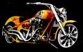
Center of Attentionby jmleliiComment: Hello from the Critique Club.
This is a great shot of a motorcycle. I like the angle and framing, and feel the overall post-processing was done very well. I agree with the comment from Pedro about the difficulty getting the chrome looking good without blowing out all its highlights.
I think the image may have suffered in the challenge because of a few factors that take away from what is essentially a great shot.
1. Focus seems sharp, but maybe a little camera shake at 1/25? I probably would have played with the ISO and/or aperture to get the shutter speed up higher.
2. The crop seems a little tight. If you could have made this a wider shot, that would have given a stronger feeling of the bike being the centered subject. As it is now, it looks like maybe the engine of the bike is the center, not the whole bike.
3. Your comments indicate that you cloned out some distractions. I agree with the comment from doctornick - you could have gone further, cloning out the streaks and dots in the black background, maybe even cloning out the sign behind the fork and headlight.
Feel free to critique my critique,
Ara |
 Photographer found comment helpful. Photographer found comment helpful. |
| 05/26/2004 11:39:31 AM |
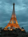
mini eiffel towerby ceyvalComment: I think you got the colors just right on this one. Nice contrast in textures too - the soft clouds against the sharp lines. |
| Photographer found comment helpful. |
| 05/26/2004 11:36:01 AM |
|
| Photographer found comment helpful. |
| 05/26/2004 11:34:18 AM |
|
| Photographer found comment helpful. |
| 05/26/2004 11:32:45 AM |
CMY by EddyGComment: Very nice. I like the angles and the subtle pastel fades in the corners. |
| Photographer found comment helpful. |
| 05/26/2004 11:29:26 AM |
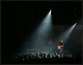
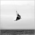
At the concertby heidaComment: I like the framing and angle. Nice negative space. Would have been great if you could have some of the distracting elements above the spot lights. |
| Photographer found comment helpful. |
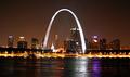
| 05/26/2004 11:27:22 AM |
Gateway to the Westby xcharrierComment: Nice shot. I like that you got the moon in there too. I'd probably like to have seen more water in the crop, but only a minor consideration. |
| Photographer found comment helpful. |
| 05/20/2004 08:43:08 PM |
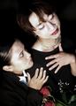
Dragby JesuispeureComment: Hello from the Critique Club!
This is an interesting portrait. The person who seems to be the main subject has an expression on his face which is not immediately discernable without noticing the look from the woman. I like the framing, lighting and the small splashes of color against the deep black background.
Even though I know this is a studio shot, many elements make me want to know what's going on outside of the frame - are they at a wedding, and are they happy or sad. While I realize this was taken in a studio setting, it could easily pass as a candid shot.
For the challenge, I wonder if the photo's score fell short because the opposite isn't readily visible. Are they both in drag? If so, the woman doesn't have enough going on to indicate she's in drag as a man.
Feel free to critique my critique,
Ara |
| Photographer found comment helpful. |
| 05/18/2004 02:28:09 PM |
|
| Photographer found comment helpful. |
| 05/16/2004 08:50:19 AM |
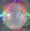
Intergalactic Virusby SamaraComment: Hello from the Critique Club.
This is a good, well composed and interesting photo. To me, the image conveys a great sense of captured motion and feels like it's vibrating with energy. I especially enjoy the interaction between the subject and background elements and the play of color between the two.
Some suggestions:
Your comment says a lot. This image is good, but it could have been great with a few minor adjustments. Minor contrast, perhaps a boost to saturation. Maybe a little coarse sharpening to really bring out the lines orbiting inside the ball.
I think the lighting is a bit off, but I have no idea how you would fix it. I like the specular highlights, but they draw your eye to what looks like a window and a mirror reflecting daylight onto the subject. Not terrible, but I realized that I was trying to figure out what I was seeing in the reflections rather than getting lost in the photo. One of the highlights seems to be a different color than the rest, possibly from an incandescent lamp. I probably would have re-colored it to match the other highlights or simply cloned it out.
Final thoughts:
I like this image, but feel that the lack of post-processing is keeping it from having the impact it could have had.
Feel free to critique my critique,
Ara |
| Photographer found comment helpful. |
Home -
Challenges -
Community -
League -
Photos -
Cameras -
Lenses -
Learn -
Help -
Terms of Use -
Privacy -
Top ^
DPChallenge, and website content and design, Copyright © 2001-2025 Challenging Technologies, LLC.
All digital photo copyrights belong to the photographers and may not be used without permission.
Current Server Time: 08/05/2025 03:49:48 AM EDT.