| Image |
Comment |
| 06/02/2004 03:29:28 PM |
The Louisville Sluggerby ShakeyComment: Nice use of black and white. The contrast here works well for me. Looks like you've got a hot spot on the ball that's washed out. |
 Photographer found comment helpful. Photographer found comment helpful. |
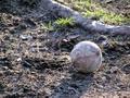
| 06/02/2004 03:28:25 PM |
Forgotten Ballby Sparky9001Comment: A lower point of view might help to emphasize the ball more. The root in the background is of such a similar tone and magnitude it competes in the current composition. |
| Photographer found comment helpful. |
| 06/02/2004 03:25:37 PM |
Stadiumby garlicComment: The goal in the foreground feels awkward, but I like the pattern of the blue seats broken up by the white ones. I think with a little composition tweaking this could be a very nice image. |
| Photographer found comment helpful. |
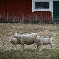
| 05/31/2004 10:51:47 PM |
Profile Pleaseby MotoCycleBoiComment: The pose couldn't be better on these animals! I think that the image is topheavy though - there is interest in the barn which challenges the main subject. |
| Photographer found comment helpful. |
| 05/27/2004 08:02:03 PM |
Stairway of Dreamsby TooCoolComment: IGreat use of the full frame to really bring out your subject. These stairs are amazing! The deeply saturated green aurrounding them is a great contrast with the less colorful stone. All in all a very well composed and enjoyable image. |
| Photographer found comment helpful. |
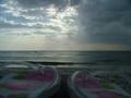
| 05/27/2004 07:57:45 PM |
Last Rays of the Sunby lilnukeeComment: The exposure is so nicely done with the sky and water that I don't I'd even need the sandals to enjoy this. I do like the idea though! I'm thinking that if they didn't dominate so much of frame and were more subtle, the image would work even better. Great job! |
| Photographer found comment helpful. |
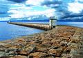
| 05/27/2004 07:50:59 PM |
Sea terminusby bpickardComment: This is almost surreal. The detail in the texture of the stones is incredible. I really like the use of space in this as well. The dramatic sky is the icing on the cake. I really enjoyed this image. |
| Photographer found comment helpful. |
| 05/26/2004 12:05:08 PM |
Young Prayerby shadowangelComment: Cropping is too loose on top. This would be very dramatic if it filled more of the frame. |
| Photographer found comment helpful. |
| 05/26/2004 12:04:21 PM |
Brightby rockfishComment: Way overexposed - too muhc detail is washed out. Also, there's nothing of particular interest to make this accessible. |
| Photographer found comment helpful. |
| 05/26/2004 11:54:11 AM |
Nell'ombraby MarkComment: I'm not sure it needs so much cropping - a bit tighter on the subject would work better for me. I love the background. |
| Photographer found comment helpful. |
Home -
Challenges -
Community -
League -
Photos -
Cameras -
Lenses -
Learn -
Help -
Terms of Use -
Privacy -
Top ^
DPChallenge, and website content and design, Copyright © 2001-2025 Challenging Technologies, LLC.
All digital photo copyrights belong to the photographers and may not be used without permission.
Current Server Time: 06/21/2025 02:15:53 AM EDT.