| Author | Thread |
|
|
12/16/2004 04:44:56 AM |
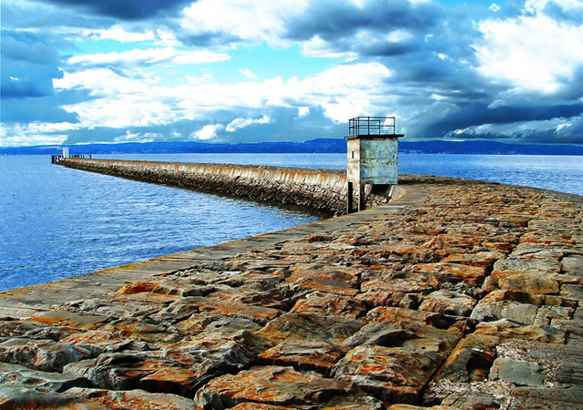
This is a beautiful shot, I can almost feel those stones underfoot. The colour and texture is wondeerful, the low viewpoint brings that out. The composition is spot on, obviously.
I really like the colour of the sky which is reciprocated by the water, must have been a lot of work to get the join right. The contrast in the clouds is perhaps a little overdone but it adds to the dramatic feel of the shot.
A really great shot, one I would be proud of.
(Edited to add this)
PS.
I think some of the other comenters are missing the point a bit. They seem to be taking it a bit too literaly. Accept the image as it stands not how you would have done it. Its a slightly surreal image, kind of half way between abstract and purist. Its not meant to be a photo record of how the scene actually looked, rather the photographers interpretation of it.
Message edited by author 2004-12-16 04:49:08. |
|
 Photographer found comment helpful. Photographer found comment helpful. |
|
|
06/04/2004 05:09:30 AM |
Interesting to read your process for altering the sky ... for me, you've taken the contrast thing just a bit too far: the brightness of those white areas of cloud don't sit correctly with the light on the tower on the harbour, and it is perhaps too blue - these are marginal things for me, just a touch less extreme would I think make this more 'photographic', less 'processed'. In similar situations myself, I usually select with a feathering of 200 pixels, so that that join is very progressive, and less cleaning up required.
Having said that, I love the composition, and the tonality you've found in the little building (where the light is extraordinary) and the stones of the wall. Good work indeed. You Scots are starting to rival the Icelanders here - must be something to do with wind and rain :-)
Ed |
|
| Photographer found comment helpful. |
Comments Made During the Challenge  |
|
|
05/30/2004 08:08:16 PM |
|
I love the composition. The shot seems a little bit oversaturated on the blues. |
|
| Photographer found comment helpful. |
|
|
05/30/2004 01:17:38 PM |
|
The color and leading lines in this shot really sold me. It's a bit overly saturated, but in this case I like the effect. Great use of leading lines. 10 |
|
| Photographer found comment helpful. |
|
|
05/30/2004 07:58:52 AM |
|
| Photographer found comment helpful. |
|
|
05/29/2004 08:42:01 PM |
|
Great composition, but the blown-out sky and super-saturated colors detract 6 |
|
| Photographer found comment helpful. |
|
|
05/29/2004 10:25:49 AM |
|
Very colourful, and the angle you chose was very good. Some parts of the sky could have done with being less overexposed. |
|
| Photographer found comment helpful. |
|
|
05/29/2004 09:33:46 AM |
|
I think this is wonderful. Maybe a little less saturation and contrast would help with the colours of the clouds and land. just my opinion of course. |
|
| Photographer found comment helpful. |
|
|
05/28/2004 12:38:04 AM |
Awesome shot that I would love to see the original of. Not sure I like the oversaturated blue here, but the wide angle rules! Not sure that this is an unusual point of view though...
TC |
|
| Photographer found comment helpful. |
|
|
05/27/2004 07:50:59 PM |
|
This is almost surreal. The detail in the texture of the stones is incredible. I really like the use of space in this as well. The dramatic sky is the icing on the cake. I really enjoyed this image. |
|
| Photographer found comment helpful. |
|
|
05/27/2004 10:47:43 AM |
It's a great viewpoint.... but maybe not that unusual.
With that said, I'm going with a relatively high score because:
I really like the composition
The color of the rock stands out nicely against the blue background
Good texture and the small building is nicely exposed
Great clouds
|
|
| Photographer found comment helpful. |
|
|
05/26/2004 12:45:41 PM |
|
The sky is overdone but it's a nice capture. |
|
| Photographer found comment helpful. |
|
|
05/26/2004 10:33:50 AM |
|
I think this nice scape is overpostprocessed, specialy the sky and the blue of the sea is not natural. Is this effects where intended, well, ok, i just dislike them. |
|
| Photographer found comment helpful. |
|
|
05/25/2004 09:52:26 PM |
|
Interesting composition and point of view. I like the colors, how everything is blue-ish excpet for the stones. (9) |
|
| Photographer found comment helpful. |
|
|
05/25/2004 09:40:22 PM |
|
Beautiful rock path but the sky kinda ruins it for me. The blown highlights in the sky are distracting...painful even to look at. |
|
| Photographer found comment helpful. |
|
|
05/25/2004 10:27:36 AM |
|
Didn't like the photo much as it was slowly loading from the top down, but after I saw the foreground I thought it was an excellent capture. Nice colors, contrast, and clarity. |
|
| Photographer found comment helpful. |
|
|
05/24/2004 09:30:08 PM |
|
The colros are so vivid and strong, a lovely setting. |
|
| Photographer found comment helpful. |
|
|
05/24/2004 08:24:17 PM |
|
Nice composition and textures.. Colours apoear too saturated for my taste though and this I feel detracts from the image. The hues draw me into the stone flags rather than the viewpoint draw me out to sea. |
|
| Photographer found comment helpful. |
|
|
05/24/2004 06:31:07 PM |
|
WAY over saturated but still worth a 7. Could have been a 9 if it didn't look so fake. |
|
| Photographer found comment helpful. |
Home -
Challenges -
Community -
League -
Photos -
Cameras -
Lenses -
Learn -
Help -
Terms of Use -
Privacy -
Top ^
DPChallenge, and website content and design, Copyright © 2001-2026 Challenging Technologies, LLC.
All digital photo copyrights belong to the photographers and may not be used without permission.
Current Server Time: 06/28/2026 11:52:59 AM EDT.