| Image |
Comment |
| 08/18/2004 07:12:33 AM |
Falling Waterby Kha0SComment: There is not enough contrast between the water and the lower material it is spilling over. The image also appears blurred as though taken by hand at a slow shutter speed. |
 Photographer found comment helpful. Photographer found comment helpful. |
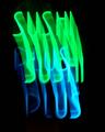
| 08/18/2004 07:11:14 AM |
Sushi Plusby banmornComment: For me there is not enough clarity in the subjects - a bit too much blur to be aesthetically pleasing. |
| Photographer found comment helpful. |
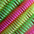
| 08/18/2004 07:09:01 AM |
20 cents neonby PhileineComment: If this were more sharp it would be a great image to me. The washed out color and unsharp lines detract significantly. When composing an image with simpler design elements I think it's important to have them very clear. By simple I mean that you have 6 similar springs as opposed to a landscape, or an intricate flower. Hope this is helpful! |
| Photographer found comment helpful. |
| 08/18/2004 07:06:40 AM |
H3 Ranchby annasenseComment: Nice capture of the reflection in the window. The tilted image is a bit distracting to me, and I would have liked a more hirozontal format to clip out the awning and emphasize the window and sign. |
| Photographer found comment helpful. |
| 08/18/2004 07:05:30 AM |
Rising Starby JeremyFleuryComment: The fuzziness of the image is distracting. Perhaps it was handheld and a tripod would have helped? I do like the composition though. |
| Photographer found comment helpful. |
| 08/18/2004 07:04:07 AM |
Natural Neonby JadeComment: A bit of a turn-off for me in that to get this much brightness / saturation significant detail was sacrificed in the image. Just doesn't feel right to me. |
| Photographer found comment helpful. |
| 08/17/2004 03:26:59 PM |
Helianthus annuus in strong windsby dinnyComment: I'm not normally into impressionistic / abstract styles, but the colors and sense of motion in this really captured my attention. I applaud you for doing somethign different here, and doing it well. [7] |
| Photographer found comment helpful. |
| 08/17/2004 03:25:57 PM |
5:50amby FalcComment: This picture epitomizes the concept of less is more. Excellent! If I were you, I'd put this on DPC prints. |
| Photographer found comment helpful. |
| 08/17/2004 03:25:15 PM |
|
| Photographer found comment helpful. |
| 08/17/2004 03:24:38 PM |
Reach for the sky by smokeditorComment: I love the choice of colors in this image, and overall the simplicity. You've chosen a strong subject and successfully eliminated anything distracting from the image. Well done! |
| Photographer found comment helpful. |
Home -
Challenges -
Community -
League -
Photos -
Cameras -
Lenses -
Learn -
Help -
Terms of Use -
Privacy -
Top ^
DPChallenge, and website content and design, Copyright © 2001-2025 Challenging Technologies, LLC.
All digital photo copyrights belong to the photographers and may not be used without permission.
Current Server Time: 06/19/2025 02:09:04 PM EDT.