| Image |
Comment |
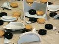
| 08/26/2002 10:23:00 AM |
Oh No!by ClubJuggleComment: The cookies look too 'staged', like they were placed after this unfortunate, uh, accident. Good color and lighting, though a bit flat. I'm trying to figure out the reflection in the cookie jar - it's dark and looks almost like a horse in shape. I like the concept though - good effort. |
 Photographer found comment helpful. Photographer found comment helpful. |
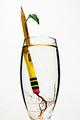
| 08/20/2002 11:18:00 AM |
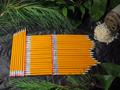
Ticonderoga Cutting by mcmurmaComment: How do you make your pencil grow? was it sitting too long? Creative use of prior challenge ideas for meeting this one. |
| Photographer found comment helpful. |
| 08/22/2002 03:15:00 PM |
Lunchby millerComment: I understand the need for fiber, but is that really necessary? ;-) The lighting is pretty good, and most of the replections work well. The shadow across the plate, however, is a bit distracting. |
| Photographer found comment helpful. |
| 08/19/2002 09:13:00 AM |
|
| Photographer found comment helpful. |
| 08/21/2002 10:45:00 AM |
Office Boyby drewmediaComment: I hope you weren't really buried by these pencils. Cool concept. |
| Photographer found comment helpful. |
| 08/22/2002 03:50:00 PM |
Sigh...by lisaeComment: Very nice sketch in your photo. I think, though, there may be just a bit too much white space. |
| Photographer found comment helpful. |
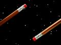
| 08/19/2002 10:15:00 AM |
Negative Space Odysseyby FrooberComment: Is the eraser cracked on the lower pencil? Creative idea, but that line/crack in the eraser is a distraction. |
| Photographer found comment helpful. |
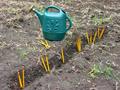
| 08/22/2002 03:13:00 PM |
Homegrown Pencilsby xertionComment: Might work better if the pencils looked like they were actually IN the ground (as if they'd been planted) without the visible trench. It looks like the pencils were just shoved into the ground, which I know they were, but it looks too staged. |
| Photographer found comment helpful. |
| 08/19/2002 09:23:00 AM |
Pencil-vaniaby alanfreedComment: I'm from Pennsylvania, and I find this extremely creative and funny. Mind if I save this and use it as wallpaper on my PC? |
| Photographer found comment helpful. |
| 08/19/2002 05:28:00 PM |
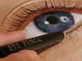
More than meets the eye...by HBunchComment: The glare on the eye, mainly the disc right by the pupil, is distracting here. I like the level of detail shown otherwise, and it's a good effort. |
| Photographer found comment helpful. |
Home -
Challenges -
Community -
League -
Photos -
Cameras -
Lenses -
Learn -
Help -
Terms of Use -
Privacy -
Top ^
DPChallenge, and website content and design, Copyright © 2001-2025 Challenging Technologies, LLC.
All digital photo copyrights belong to the photographers and may not be used without permission.
Current Server Time: 07/31/2025 03:34:52 PM EDT.