| Image |
Comment |
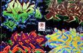
| 02/07/2005 12:34:59 PM |
NoParkingby BruBComment: Beautiful colors and variety - I really like the centered composition with the sign smack in the middle because it brings order to the chaotic colors and shapes. You get a 10 from me. |
 Photographer found comment helpful. Photographer found comment helpful. |
| 02/03/2005 10:57:19 PM |
Determinationby MontereykiddoComment: I like this shot, I think it's well composed, I like the off centered subject and the perspective of the line of the road going off into the distance. However, it's posed and feels forced in a way. I think it could have been more powerful if it felt more natural - a hitchhiker doesn't sit in the middle of the road, after all. Nicely executed. 6 |
| Photographer found comment helpful. |
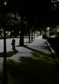
| 08/24/2004 09:09:27 PM |
Vanishing into Darknessby melismaticaComment: Greetings from the Critique Club
I think this was a highly original entry for this challenge.
I like the choice of a street with a slight uphill - it aids in the vanishing point view.
The shadows on the trees and firehydrant help to push they eye up the street to the vanishing point.
The point of view seems just slightly off to me for the overall composition - it might need to be cropped a little along the right edge to have it conform a little more to the rule of thirds.
I enjoy the choice of B&W and found the exposure wonderfully moody. |
| Photographer found comment helpful. |
| 06/04/2004 02:56:38 PM |
Delicately Beautifulby OneSweetSinComment: Greetings from the Critique Club
I love the colors in this shot. The greens are saturated and textured, and the yellows and blue of the butterfly came out very well.
What really helps your composition is the fact that the leaf tips point towards the butterfly in the top of the frame.
The lighter colors of the butterfly look a little overexposed, washing out the "dappled light" feel, but is rather appropriate for the challenge in this case.
I might like to see a closer crop on the butterfly.
You got some nice comments and I agree with the comment about the highlight on the bottom leaf. |
| Photographer found comment helpful. |
| 06/01/2004 03:50:42 PM |
Darkness cannot exist in the presence of Lightby aaronb532Comment: Wonderful lighting - the capture of the eye color is great. The use of the hat heightens the effect of multiple sources. I'm not fond of the pattern on the shirt as the white pops a little too much for me, but an extremely well executed shot. |
| Photographer found comment helpful. |
| 06/01/2004 03:48:51 PM |
CMY by EddyGComment: Stunning composition - the simplicity of it is really wonderful and it is well executed. I wish (ever so slightly, you've done a marvelous job) that the shadows were a little more on one plane than angled up on the blue one. |
| Photographer found comment helpful. |
| 06/01/2004 02:08:29 PM |
Egg, brown or white?by cabaComment: Wonderfully elegant and simple composition that puts this shot above most others - the texture and luminesence of the shell is great along with the highlight around the edge to firmly define the edges. |
| Photographer found comment helpful. |
| 05/26/2004 03:56:11 PM |
Marble and Gameboy. A Generation Gapby ShakeyComment: This one made me laugh. It's just so charming to see a marble with a high tech replacement. The highlights on the left edge of the gameboy are wonderful and the curve of the yellow swish in the marble is especially fun because it's such an organic shape combined with the perfect sphere and then the electronics. Your composition is original and inventive and I like the use of negative space at the top of the frame. Your DOF and focus and exposure are all top notch. |
| Photographer found comment helpful. |
| 05/26/2004 03:45:00 PM |
Lights at the House of Johnby tlchambComment: I wish very much that this photo was larger so I could really enjoy the details you've captured. I love the old style fillament bulbs and the old glass that accentuates the DOF in the window. The irregularness of the bulb placment is really nice. |
| Photographer found comment helpful. |
| 05/26/2004 03:41:42 PM |
Sunny dayby asijComment: I like the colors here very much, the blueness of the sky, the pop of the red shirt and the green fringes of grass to the right. The horizon looks a little off, a slight rotation ccw would make this "feel" a little more natural. I like the capture of the waves and the child as she reaches, it gives the shot a captured moment quality. I'm not seeing multiple light sources, but I thought I'd comment on the photo as a whole. |
| Photographer found comment helpful. |
Home -
Challenges -
Community -
League -
Photos -
Cameras -
Lenses -
Learn -
Help -
Terms of Use -
Privacy -
Top ^
DPChallenge, and website content and design, Copyright © 2001-2025 Challenging Technologies, LLC.
All digital photo copyrights belong to the photographers and may not be used without permission.
Current Server Time: 08/04/2025 07:37:50 PM EDT.