| Image |
Comment |
| 04/27/2005 04:46:41 AM |
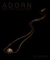
MAMBAby aznymComment: Unique layout/composition here.
Image overall is a bit on the dark side inmy opinion, or the main jewelry cluster could have been a little bigger to offsets the lighting. Text/font used is great,and I like the subdued appearance of it, but again just a little too dark to me. |
 Photographer found comment helpful. Photographer found comment helpful. |
| 04/27/2005 04:42:56 AM |
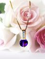
Speak Her Language!by SunnieeComment: Very soft & feminine.
I like the layout here and the silky feel of the background.
Only one thing I see that could use improvement is the lighting, due to the reflections on the chain (tough one to keep from happening though) (7) |
| Photographer found comment helpful. |
| 04/27/2005 04:32:41 AM |
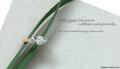
Writing a Love Poemby admart01Comment: Elegant design & layout.
The green is a nice touch in this image, and the text used on your ad is very feminine and complimetary. Focal point is good and the detail & lighting are very good.
Well Done - one of my favorites in this challenge! (10) |
| Photographer found comment helpful. |
| 04/27/2005 04:30:16 AM |
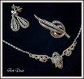
New "old fashioned" collectionby rhipsterComment: Pretty nice image in quality and simplicity.
Lighting worked well and the text is complimentary vs. overdone.
Title of the shot (though not considered in my vote) is kind of at odds here, and may have been a litttle better had it been "Old Fashioned Collection" only. (8) |
| Photographer found comment helpful. |
| 04/27/2005 02:59:40 AM |
Ragged by TychoComment: Congrats on such a wonderful shot to share with us on the home page,
and Congrats on your first and Red Ribbon Ozzy! |
| Photographer found comment helpful. |
| 04/27/2005 02:57:34 AM |
Where the Water Meets the Land by cghubbellComment: Always astounded seeing a few low scores in a beautiful image here on the home page - oh well - it's to be expected I guess.
This is simplicity in nature at it's finest. Well seen and well done!
Congrats on your first and Yellow Ribbon Mr.Hubbell! |
| Photographer found comment helpful. |
| 04/27/2005 02:08:11 AM |
Nature's Studioby dartompkinsComment: I never even made into this challenge submission or vote-wise, and
here is my take on it (for what it's worth):
What is the first thing that gets my attention is this shot?
The young lady (you?) posed nicely here. The black & white was a good choice for the post-processing as it generates a mood and takes away the distractions that color can bring into a shot. Perhaps a little more smile (I'm such a sucker for an attractive lady/model with a nice smile) would warm the shot, maybe not. There's a nice contrast between the light pants & dark rocks and the dark hair/shirt & the light sky.
At no point have I mentioned the rocks. They are a nice setting for this portrait, but are not the focal point of the image. Rocks, Paper, Scissors - any of which "should" have been the strong point to a voter, not a supplemental part of the shot. Granted, the rocks are numerous and well represented, but I can only suspect the voting majority never saw past her.
On a side note, this is a great picture! Your post-processing here was just right. I would have been proud to produce a shot like this. |
| Photographer found comment helpful. |
| 04/27/2005 12:58:54 AM |
Cascading by samtrundleComment: OK, You didn't like my waterfall and you just HAD TO do it better huh? LOL
(WHich you did by the way, in a grand fashion!)
Very nice and Congrats on the Blue! |
| Photographer found comment helpful. |
| 04/26/2005 11:59:16 PM |
|
| Photographer found comment helpful. |
| 04/26/2005 11:58:24 PM |
|
| Photographer found comment helpful. |
Home -
Challenges -
Community -
League -
Photos -
Cameras -
Lenses -
Learn -
Help -
Terms of Use -
Privacy -
Top ^
DPChallenge, and website content and design, Copyright © 2001-2025 Challenging Technologies, LLC.
All digital photo copyrights belong to the photographers and may not be used without permission.
Current Server Time: 06/28/2025 12:04:06 AM EDT.