| Image |
Comment |
| 11/06/2005 09:57:08 PM |
|
 Photographer found comment helpful. Photographer found comment helpful. |
| 11/06/2005 09:56:21 PM |
Jack-O-Lantern Familyby xylkeComment: Best carved pumpkins of the bunch! I like the way you've given the context of a grand and modern(?) porch. Lighting is perfect...but then, you probably know that. |
| Photographer found comment helpful. |
| 11/06/2005 09:54:59 PM |
Happy Dudeby TommyMoe21Comment: Love the way this fills the frame--the round pumpkin in the square hole! ;-) |
| Photographer found comment helpful. |
| 11/06/2005 09:54:24 PM |
splattered furryby raydeanComment: Oooh! I love the hostility of this image! Far better than letting some punk steal your precious carving off the front porch while you sleep and waking up to it smashed in the center of the street! Take control of your pumpkin's fate! =o |
| Photographer found comment helpful. |
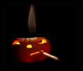
| 11/06/2005 09:52:47 PM |
Lit Upby CutterComment: Well controlled. Super sharp. Interesting smoke element in the background--ads to the humor. Carving, while not "expert" jack-o-lantern school technique, is well fit for your subject. Lighting sweet! |
| Photographer found comment helpful. |
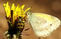
| 11/06/2005 04:36:52 PM |
Three Delicate Beingsby stare_at_the_sunComment: Greetings from the Critique Club!
A facinating find for a subject! Your notes add to the appreciation of the subject. It is an unusual sight.
The composition has a clearly defined subject and focal point. The bugs attention converge on a complex part of the flower. The background is appropriately out of focus helping to isolate the subjects. All the necessary pieces and well captured in arrangement.
The lighting is a bit harsh resulting in hot spots on the beetle's back which detract slightly. The colors are strong to the yellow side--I can't help but think there is color detail sacrificed for the sake of saturation, but the monochromatic quality of the tones helps unify the subjects. A little less yellow might have provided a more realistic rendering for the eye. It's bending toward feeling a bit sickly, especially where the beetle is concerned. The harsh light also has created a difficult situation for trying to maintain detail in both the brights and the darks--the darks lost out a bit--and yet the petals seemed to have little detail in the mid-tones. Not sure what to offer by way of suggestion, unless your prepared to have an assistant walk around holding a diffuser for you. :)
The depth of field was necessary in a macro such as this. However, it seems that the focus needs to be a bit more uniform throughout the critical point of interest where the bugs meet on the flower head. Instead the focus seems to be on the near parts of the flower.
Overall an interesting subject with a great deal of appeal for the naturalist and curious alike. As it placed weel in the challenge, there is little to quibble with the voters over concerning the topicality of your image.
Good luck in future challenges!
Keep shooting!
--Kadi |
| Photographer found comment helpful. |
| 11/06/2005 03:49:39 PM |
Contrastismby emtmdhComment: Greetings from the Critique Club!
A black and white image of a cloudy sky that shows texture and contrast in light and darks.
Your commenters have spoken to the idea of fitting the challenge. I won't say more on that except to say that in the challenges here it is a huge factor influencing voting.
The image strikes me as a good study in black and white. There is a great range of tonality. It appears you may have used a polarizing filter to achieve an almost black sky which enhances the ephemeral nature of the clouds.
The composition has a sense of diagonals because of the light direction and placement of the subject. This provides a bit of interest and energy to a rather mundane subject.
Technically, I can see striations on the most solid of the cloud formations. It appears that although you have 640 pixels on the longest side of your image, the file size is about half of what it could be. These noisy artifacts detract from the purity of the image you're trying to present.
Overall the image appears to be a fine study of a common subject.
Keep shooting!
--Kadi |
| Photographer found comment helpful. |
| 11/06/2005 12:14:30 PM |
my first pair of shoesby misterjoshComment: Greetings from the Critique Club!
An appealing image of baby shoes! I can relate well to the image because my shoes (and many of children I've known) were similar. The wear on the shoes is classic and shows that the child both crawled around in them (the wear on the toes), spent a fair amount of time walking in them (the creases in the upper leather and the back of the heels), and wore them for some time (the aging and wear on the laces).
As some of your commenters noted, I think a greater depth of field would have helped the image. The near lace just begs to be in focus where the frays are. It would have helped with the detail in the stitching as well.
The arrangement is appealing. I like the way the one rests on the other--it helps relate the two better than placing them side by side. It's probably just me, but I think the shoes should have been inter-changed so that the left shoe would be where the left foot would be on a child. The use of negative space seems appropriate--it helps frame the shoes.
The lighting brings out the form and preserves detail in the shadows. The color of the shadows does not fit as well with the photo, however. Perhaps desaturating the cyan would have pulled the image together a bit more. The multiple shadows under the shoe on the left create unwanted interest--for this type of shot I might have diffused all but one of the light sources so there would be only one clean shadow cast. (I use tissue paper or gauzy fabric in front of lights, or bounce light off white foam-core.)
Overall a pleasing and nostalgic image. It's a beautiful way to preserve the memory of an object without having to preserve the object.
Keep shooting!
--Kadi |
| Photographer found comment helpful. |
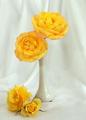
| 11/06/2005 11:46:59 AM |
My Wifes Rosesby kiwinickComment: Greetings from the Critique Club!
A simple still-life of vibrant yellow flowers. Carefully posed. Thoughtful lighting.
Composition is a classic set up. It's the sort of image one might expect to find on a greeting card--cheerful roses arranged to show the detail of the blossoms. I like the way the four flowers are arranged in a "c" curve from most to least mature. My eye begins with the uppermost and follows down to the very satisfying rosebud. There seems to be too much empty space left on the right side--I feel a closer crop could have helped eliminate the un-needed space and would have also placed the uppermost bloom at one of the rule-of-thirds intersections. The diagonal created by the arrangement is nice. One other quibble with the arrangement, I feel the stem on the one flower in the vase should either be hidden completely or shown to effect--as is, it simply ends up being a dark spot where one is not desirable.
Technically well rendered. I like the soft, controlled lighting. There is interest in the reflection on the vase--light from a window? The two odd dots of light in the center of the vase are a minor distraction. There are also a few stray flecks in the image--sensor dust, perhaps. The one dark speck under the vase appears to have been avoidable. I like the detail in the flowers--each petal is distinct.
I think the background fabric folds add interest--but they also work against the subject somewhat by attracting too much interest--perhaps they could have been thrown slightly out of focus or the fabric smoothed a bit more to create less distinct lines.
Overall, a very nice studio shot which, with minor tweaking, would stand well on its own. For this challenge I think the voters were looking for a whiter, plainer background and paler subjects--but then, what do the voters know?
Keep shooting!
--Kadi |
| Photographer found comment helpful. |
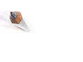
| 11/05/2005 10:35:46 AM |
Is simplicity best, or simply the easiest?by GrigollyComment: Greetings from the Critique Club!
This image is an exteme point of view of a common subject. Obviously fun to view as it inspired many commenters to create puns.
It is a simple image. Traditional placement of the object follows the rule-of-thirds. Background is minimized. Depth of field is shallow. What is the "message" of the image? Not sure. Maybe, here is a different way of looking at a pencil.
The angle of view causes the pencil to lean out of the composition, leaving the rest of the image there for balance. The shadows fall out of the edge as well making me wonder what's over that way. I wonder if this would have been just as successful with a square crop.
I agree with the several commenters that the point of the pencil could be in focus. At f 4.0 it seems you mus have been rather close to limit the depth of field so much. It appears there were 2 directional light sources--this flattened the pencil to the degree that the third side which should have been partially visible is lost. At an exposure of 4 seconds, the light source couldn't have been very strong--at that sort of exposure time you risk losing important details (such as along the edges of the knife sharpened pencil lead).
Overall a fun and well-recieved image. A good study piece that has potential for further experimentation. And, to answer the question in the title, simplicity is neither best (the image did not win and the winner was not simple) nor the easiest...it is always difficult to pull of an image with few details, to make it convicing as a subject and to control every technical aspect such that you will receive no complaint.
Keep shooting!
--kadi |
| Photographer found comment helpful. |
Home -
Challenges -
Community -
League -
Photos -
Cameras -
Lenses -
Learn -
Help -
Terms of Use -
Privacy -
Top ^
DPChallenge, and website content and design, Copyright © 2001-2025 Challenging Technologies, LLC.
All digital photo copyrights belong to the photographers and may not be used without permission.
Current Server Time: 08/26/2025 05:47:36 PM EDT.