| Author | Thread |
|
|
11/05/2005 10:35:46 AM |
Greetings from the Critique Club!
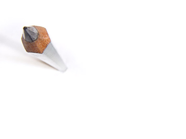
This image is an exteme point of view of a common subject. Obviously fun to view as it inspired many commenters to create puns.
It is a simple image. Traditional placement of the object follows the rule-of-thirds. Background is minimized. Depth of field is shallow. What is the "message" of the image? Not sure. Maybe, here is a different way of looking at a pencil.
The angle of view causes the pencil to lean out of the composition, leaving the rest of the image there for balance. The shadows fall out of the edge as well making me wonder what's over that way. I wonder if this would have been just as successful with a square crop.
I agree with the several commenters that the point of the pencil could be in focus. At f 4.0 it seems you mus have been rather close to limit the depth of field so much. It appears there were 2 directional light sources--this flattened the pencil to the degree that the third side which should have been partially visible is lost. At an exposure of 4 seconds, the light source couldn't have been very strong--at that sort of exposure time you risk losing important details (such as along the edges of the knife sharpened pencil lead).
Overall a fun and well-recieved image. A good study piece that has potential for further experimentation. And, to answer the question in the title, simplicity is neither best (the image did not win and the winner was not simple) nor the easiest...it is always difficult to pull of an image with few details, to make it convicing as a subject and to control every technical aspect such that you will receive no complaint.
Keep shooting!
--kadi |
|
 Photographer found comment helpful. Photographer found comment helpful. |
|
|
11/04/2005 08:25:42 AM |
|
Congrats on the top 20 spot. |
|
| Photographer found comment helpful. |
|
|
11/04/2005 06:55:07 AM |
|
i like this. very simple but effective. |
|
| Photographer found comment helpful. |
Comments Made During the Challenge  |
|
|
11/01/2005 10:33:37 PM |
|
Like the perspective,,, unsure if its my screen or the point could be in better foucu though - 7 |
|
| Photographer found comment helpful. |
|
|
11/01/2005 09:32:54 PM |
|
| Photographer found comment helpful. |
|
|
11/01/2005 07:36:08 PM |
|
| Photographer found comment helpful. |
|
|
11/01/2005 05:22:58 PM |
|
| Photographer found comment helpful. |
|
|
11/01/2005 07:28:43 AM |
|
Love the shot, would like to see the image and lens specs. |
|
| Photographer found comment helpful. |
|
|
10/31/2005 06:38:04 PM |
|
| Photographer found comment helpful. |
|
|
10/31/2005 05:16:03 PM |
|
Good perspective. Simple yet to the point, lol. |
|
| Photographer found comment helpful. |
|
|
10/31/2005 03:55:10 PM |
|
| Photographer found comment helpful. |
|
|
10/29/2005 09:05:53 AM |
|
I do like the simplicity of this. Somehow the focus seems a touich off. The composition and use of lots of negative space is a favorite of mine. Hurray for originality. |
|
| Photographer found comment helpful. |
|
|
10/28/2005 08:03:50 PM |
|
This is my favorite picture of the challenge. 10 for you |
|
| Photographer found comment helpful. |
|
|
10/28/2005 04:08:27 PM |
|
| Photographer found comment helpful. |
|
|
10/28/2005 11:36:34 AM |
I like this, simple and minimal. Slighty crisper would be better.
best of luck though |
|
| Photographer found comment helpful. |
|
|
10/28/2005 09:43:08 AM |
|
| Photographer found comment helpful. |
|
|
10/28/2005 05:48:28 AM |
|
The shadow into the picture, not out of the frame, if you ask me. |
|
| Photographer found comment helpful. |
|
|
10/28/2005 03:09:27 AM |
|
Simply cool! Great idea and great shot.9 |
|
| Photographer found comment helpful. |
|
|
10/28/2005 12:48:55 AM |
|
| Photographer found comment helpful. |
|
|
10/27/2005 11:13:40 PM |
|
| Photographer found comment helpful. |
|
|
10/27/2005 04:36:25 PM |
|
| Photographer found comment helpful. |
|
|
10/27/2005 01:47:13 PM |
|
Wow, simple and to the point. (get it? LOL) Great idea and composition. |
|
| Photographer found comment helpful. |
|
|
10/27/2005 12:26:00 PM |
|
| Photographer found comment helpful. |
|
|
10/26/2005 11:32:22 PM |
|
Great perspective shot. I really like how you placed it in the picture. It may be simple but it seems powerful too. |
|
| Photographer found comment helpful. |
|
|
10/26/2005 03:38:29 PM |
|
great use of perspective to add visual interest. the pencil's tip is a bit too dark for me to feel like this is really "light on white." |
|
| Photographer found comment helpful. |
|
|
10/26/2005 12:56:08 PM |
|
i liked this simplicity.. |
|
| Photographer found comment helpful. |
|
|
10/26/2005 01:14:12 AM |
|
Woah....that is fabulous. |
|
| Photographer found comment helpful. |
Home -
Challenges -
Community -
League -
Photos -
Cameras -
Lenses -
Learn -
Help -
Terms of Use -
Privacy -
Top ^
DPChallenge, and website content and design, Copyright © 2001-2026 Challenging Technologies, LLC.
All digital photo copyrights belong to the photographers and may not be used without permission.
Current Server Time: 06/29/2026 03:33:37 AM EDT.