| Author | Thread |
|
|
11/06/2005 11:46:59 AM |
Greetings from the Critique Club!
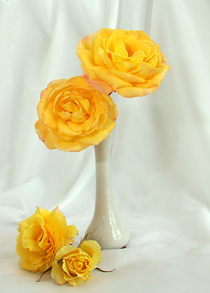
A simple still-life of vibrant yellow flowers. Carefully posed. Thoughtful lighting.
Composition is a classic set up. It's the sort of image one might expect to find on a greeting card--cheerful roses arranged to show the detail of the blossoms. I like the way the four flowers are arranged in a "c" curve from most to least mature. My eye begins with the uppermost and follows down to the very satisfying rosebud. There seems to be too much empty space left on the right side--I feel a closer crop could have helped eliminate the un-needed space and would have also placed the uppermost bloom at one of the rule-of-thirds intersections. The diagonal created by the arrangement is nice. One other quibble with the arrangement, I feel the stem on the one flower in the vase should either be hidden completely or shown to effect--as is, it simply ends up being a dark spot where one is not desirable.
Technically well rendered. I like the soft, controlled lighting. There is interest in the reflection on the vase--light from a window? The two odd dots of light in the center of the vase are a minor distraction. There are also a few stray flecks in the image--sensor dust, perhaps. The one dark speck under the vase appears to have been avoidable. I like the detail in the flowers--each petal is distinct.
I think the background fabric folds add interest--but they also work against the subject somewhat by attracting too much interest--perhaps they could have been thrown slightly out of focus or the fabric smoothed a bit more to create less distinct lines.
Overall, a very nice studio shot which, with minor tweaking, would stand well on its own. For this challenge I think the voters were looking for a whiter, plainer background and paler subjects--but then, what do the voters know?
Keep shooting!
--Kadi |
|
 Photographer found comment helpful. Photographer found comment helpful. |
|
|
11/02/2005 02:57:06 PM |
|
Lovely composition - definitely deserved to do better for this challenge. |
|
| Photographer found comment helpful. |
Comments Made During the Challenge  |
|
|
10/27/2005 09:04:45 PM |
a nice simple composition that works well for this challenge... well done... :)
|
|
| Photographer found comment helpful. |
|
|
10/27/2005 01:22:54 PM |
|
This is brilliant color on white. Nice comp and lovely photo! |
|
| Photographer found comment helpful. |
Home -
Challenges -
Community -
League -
Photos -
Cameras -
Lenses -
Learn -
Help -
Terms of Use -
Privacy -
Top ^
DPChallenge, and website content and design, Copyright © 2001-2026 Challenging Technologies, LLC.
All digital photo copyrights belong to the photographers and may not be used without permission.
Current Server Time: 06/28/2026 09:29:03 AM EDT.