| Image |
Comment |
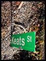
| 01/20/2003 07:27:17 PM |
Keats St.by jimmythefishComment: Aarggh - this photo makes me dizzy. My brain tells me that I'm looking straight down (or even titled further than "straight" down). I presume the sign is sticking out of the ground for some reason. Technically a good photo, but I'm not sure about it's message - what is it trying to say? |
 Photographer found comment helpful. Photographer found comment helpful. |
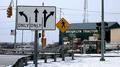
| 01/20/2003 07:25:13 PM |
Street Signby STEINRComment: Even though the sign is huge I'm not drawn to it - there's a lot happening in this photo and it's difficult to understand the main subject. In some ways it's a nice collection of lots of types of signs, although you title suggests a single sign is the intended focal point. |
| Photographer found comment helpful. |
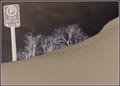
| 01/20/2003 07:23:22 PM |
Parking - 30 Minutes Onlyby mcraelComment: I'm not usually a fan of infrared type photo's but I guess in this case the photo would have been quite boring in normal colour. Focus is good and the trees add interest. Is the sign deliberately crooked in the photo? |
| Photographer found comment helpful. |
| 01/20/2003 07:17:43 PM |
Will you be next?by Delta_6Comment: Nice composition. The trees are a little blurry, but I suspect this might be from a long exposure and wind combined - not much you can do about that. Perhaps a clearer sky would be nicer, but it's not a big deal. Colour is nice and realistic |
| Photographer found comment helpful. |
| 01/20/2003 07:15:43 PM |
|
| Photographer found comment helpful. |
| 01/20/2003 07:11:29 PM |
Sign & Moonby marboComment: Sorry, I don't quite understand the relevance of the moon in this shot. Unfortunately the title doesn't explain it either. |
| Photographer found comment helpful. |
| 01/20/2003 07:10:00 PM |
On the Roadby lionelmComment: Nice subject and composition although the photo is a little grainy. The black is a little washed out (perhaps levels in photoshop could have helped) and the yellow is showing some artifacts. Of course, depending on the camera (and or zoom) used you may have done quite well. |
| Photographer found comment helpful. |
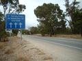
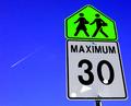
| 01/20/2003 06:21:43 PM |
maximum thirty studentsby ParentxComment: The perspective is great, colours are wonderful and the jet stream is an interesting addition. My question, then, is what are the three white patches on the 30 sign? Are they some kind of reflection or something stuck to the sign? I must say again though - the blue and green is wonderful. |
| Photographer found comment helpful. |
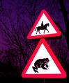
| 01/20/2003 05:25:14 PM |
Beware of the Giant Toadby KonadorComment: You've managed to get the colours incredibly vivid in this photo - although I believe it's a totally legal manipulation. The sky is a lovely outcome of this - I really like the colour against the silohuetted trees. The "giant toad" title is also very funny - well done. |
| Photographer found comment helpful. |
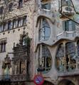
| 01/20/2003 05:19:43 PM |
Signs by Antoni Gaudiby bcncrazyComment: What a lovely building (we have no architecture like this in Australia really). You've managed to include a sign although it looks a little out of focus - the main building is focused very well. |
| Photographer found comment helpful. |
Home -
Challenges -
Community -
League -
Photos -
Cameras -
Lenses -
Learn -
Help -
Terms of Use -
Privacy -
Top ^
DPChallenge, and website content and design, Copyright © 2001-2025 Challenging Technologies, LLC.
All digital photo copyrights belong to the photographers and may not be used without permission.
Current Server Time: 08/25/2025 01:16:29 PM EDT.