| Image |
Comment |
| 01/23/2003 09:42:15 PM |
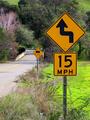
Show Me A Signby bobgaitherComment: Colour is great in this photo. I also like the composition - the road and the array of signs (thankfully all the same colour scheme). Does the mud in the grass imply that a few people miss the corner. :-) |
 Photographer found comment helpful. Photographer found comment helpful. |
| 01/23/2003 07:14:18 PM |
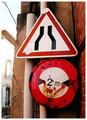
...or another!by crabappl3Comment: My very initial reaction was "that front sign is superimposed" - the reason is your red border line. It merges with the red painted gutter and makes the signpost float. I'd suggest a different border perhaps. The focus on the sign is wonderful, the image is perhaps a tiny bit too dark but not my much. Composition is good. |
| Photographer found comment helpful. |
| 01/23/2003 07:12:02 PM |
look rightby neoathematrixComment: This is certainly a little different to most of this signs this week, and that in itself is refreshing. Choosing to have the picture rotated so much is also interesting (my boring nature wouldn't allow me to take such a shot!) Unfortunately the sign doesn't really draw my attention (except that it is the only focused point), but I certainly appreciate the attempt at something different. Well done. |
| Photographer found comment helpful. |
| 01/23/2003 07:06:14 PM |
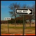
Go Away!by myqylComment: Unfortunately this sign really hides against the gutter and road - only the chain led my eyes to it. The plants take my attention because they are so much brighter. Focus and exposure are good, and I like the aspect ratio you chose for the final image (I hate square images normally). |
| Photographer found comment helpful. |
| 01/23/2003 07:04:05 PM |
-by jjbeguinComment: Those signs have some real history to them. The agressive cropping really draws attention to them. You're image has a lot of texture and even though I'm not a fan of black and white I suspect this is an image that could look really powerful converted to black and white - There are some articles on using Photoshops "Channel Mixer" to create powerful black and white images. Your border is ok, but not really necessary in my opinion - that might change after converting to b&w though. Focus and exposure are great, except perhaps the building on the left which is a bit overexposed (not much you could do about that). Well done. |
| Photographer found comment helpful. |
| 01/23/2003 12:34:32 AM |
Breaking the rulesby zadoreComment: I love the mood of this photo. It looks like you maybe used a flash to light the sign - either way the effect is great, it really draws your attention by being much brighter than anything else. The texture of the sign really adds interest as well. If I changed anything it would be to extend the right edge just slightly - the sign feels a little to close for my liking. |
| Photographer found comment helpful. |
| 01/23/2003 12:27:04 AM |
What the Duck?by dodobirdComment: I like the taillights going through the image. The main negative from my point of view (and it's not a big one) is the reflection occuring under the word "XING". Other than that it's quite good - composition is good with the sign well placed. The black and white border also works well, effectively providing a border to both the white snow and the black sky. Good work. |
| Photographer found comment helpful. |
| 01/23/2003 12:24:31 AM |
forty-fiveby johnny_justjohnnyComment: Certainly an artistic view of a streetlight and sign. Focus looks fine to me, composition is good, and the clouds are interesting. |
| Photographer found comment helpful. |
| 01/23/2003 12:22:31 AM |
Where am I?by hardwaybetsComment: Nice focus and exposure - makes a very crisp image. Composition is also good - I really have nothing bad to say about this image. |
| Photographer found comment helpful. |
| 01/23/2003 12:18:16 AM |
Seventeenby emorgan49Comment: This photo looks just a little bit blurry / grainy. Perhaps it was taken in fairly low light (it looks a little like ISO noise). Composition of the image is good, although the title isn't too obvious without knowing the full story(perhaps someone's age?). |
| Photographer found comment helpful. |
Home -
Challenges -
Community -
League -
Photos -
Cameras -
Lenses -
Learn -
Help -
Terms of Use -
Privacy -
Top ^
DPChallenge, and website content and design, Copyright © 2001-2025 Challenging Technologies, LLC.
All digital photo copyrights belong to the photographers and may not be used without permission.
Current Server Time: 08/26/2025 11:43:18 AM EDT.