| Image |
Comment |
| 03/25/2004 11:55:04 AM |
I Couldn't Resistby dsawchukComment: I'd have cropped it a bit more at the top but I really like it (of course my favorite color is orange and I really like lemons). |
 Photographer found comment helpful. Photographer found comment helpful. |
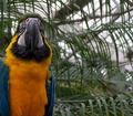
| 03/25/2004 11:53:35 AM |
Orange and blue macawby carycComment: Composition leaves a lot to be desired since bird is not completely in frame and foliage to the right really adds nothing to the picture thematically. |
| Photographer found comment helpful. |
| 03/25/2004 11:47:59 AM |
|
| Photographer found comment helpful. |
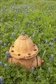
| 03/25/2004 11:13:43 AM |
Hydrantby GordonComment: While it's certainly not a shade of orange that I like, it is a great photo considering composition, exposure, everything. I especially like the hint of orange towards top from the Indian Blankets. |
| Photographer found comment helpful. |
| 03/25/2004 11:08:06 AM |
|
| Photographer found comment helpful. |
| 03/25/2004 11:03:39 AM |
The colour of moneyby kevrobertsonComment: Reflections off the orange mylar (or whatever it is) are distracting. Polorizing filter might have reduced those I suppose. I like idea of leaving one coin out so it doesn't have orange tint. |
| Photographer found comment helpful. |
| 03/25/2004 11:01:10 AM |
|
| Photographer found comment helpful. |
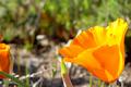
| 03/25/2004 10:56:38 AM |
California Poppyby Ram21Comment: I'd have cropped flower on the left, it being only partially in the frame is very distracting to me. |
| Photographer found comment helpful. |
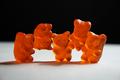
| 03/25/2004 10:54:31 AM |
The Yummiest Colorby soupComment: I'd have cropped it tighter at top and bottom. Think I'd have filled the shadows from the left a bit more too. |
| Photographer found comment helpful. |
| 03/25/2004 10:52:40 AM |
Disposableby AndelainComment: Really nice try, but ... because of DOF the emphasis is on the white not the orange. Adjusting the DOF to be on the orange but not the white probably wouldn't have worked, just made it look weird. My only suggestion would be to extend DOF so it's all in focus but that might have made it look too commercial. Black background was a good choice though. |
| Photographer found comment helpful. |
Home -
Challenges -
Community -
League -
Photos -
Cameras -
Lenses -
Learn -
Help -
Terms of Use -
Privacy -
Top ^
DPChallenge, and website content and design, Copyright © 2001-2025 Challenging Technologies, LLC.
All digital photo copyrights belong to the photographers and may not be used without permission.
Current Server Time: 08/23/2025 02:53:32 PM EDT.