| Image |
Comment |
| 09/01/2006 07:34:55 AM |
Parkedby MelethiaComment: i like this! the high contrast really brings out the lines and repition of the patterns and it's lovely that you're brave enough to submit something so seemingly mundane for an open challenge. as a visual piece of abstract art i think it works wonderfully, and leaves me longing to see a similarly processed series of supermarket shots. really effective. 10. |
 Photographer found comment helpful. Photographer found comment helpful. |
| 09/01/2006 07:23:50 AM |
Aucun Titreby L2Comment: really pretty girl who has been well lit and, erm, nicely flattered from the choice of clothing (which eyes are inevitably drawn too... :)). i'm not too keen on the oppressively black and dead feeling background though, but that's generally a complaint i have with black backgrounds in portraits because it kind of detaches your subject in terms of her personality. impression wise, she also seems good natured, which again doesn't suit the background. her posture is a little weird too, feeling a bit unnatural... overall the shot is visually appealing, though i feel the picture is a bit too conventional to do your model justice. 6. |
| Photographer found comment helpful. |
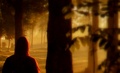
| 09/01/2006 06:09:59 AM |
|
| Photographer found comment helpful. |
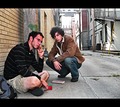
| 09/01/2006 06:01:13 AM |
Brickby stare_at_the_sunComment: i totally adored this film, and the setting and composure of the characters in the scene very much has the style and feel of it. though your guys don't necessarily look like the characters, expressions and posture is very much in keeping, and makes it recogniseable even without the title - though one fears it might be a bit too indie / obscure to reach the masses on dpc. technically, it feels a bit over exposed, and the background feels too cluttered, busy and more urban than suburban of the film. however, my adoration for the film makes it personally interesting, so 8. |
| Photographer found comment helpful. |
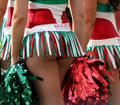
| 09/01/2006 05:44:08 AM |
Debbie Does Dallasby StagoleeComment: nice pom poms! okay, the view might be bordering on the gratuitous (albeit pleasantly so) but i think that it's probably the good thing about. it feels such suburban kitsch, you know? and consequently has a high degree of realness about it that i like. it's fun, playful and i don't know, semi-iconic, so much more than just a bum shot. i'm not saying i'd want it hanging on my wall (other half would probably object) but i wouldn't consider it out of place in a modern photo exhibit. i really like this; 9. |
| Photographer found comment helpful. |
| 09/01/2006 05:08:17 AM |
Girl with Parasolby Keith ManiacComment: like most of these types of IR shots, it has masses of instant visual appeal. though, this one more so than others because it's so damn picturesque! composition is wonderful; the girl on the left really makes it gel, and the skyline really adds a depth, sense of scale and a nice break between the light sky and trees. only slight quibble is that the slightly yellow tinge makes the trees less visually appealing (like smokers teeth) and the blob of turquoise on the brolly is a bit distrcting. otherwise, great stuff that's visually lovely. 9.
on a side note, i must confess i have been dabbling with this sort of thing recently, and really everything i do is really crud compared to this - technically i wonder how you got such a great shot from the evidentally short exposure time (either that of the swan is amazingly compliant with the still pose). was this with a dslr, or a converted compact? |
| Photographer found comment helpful. |
| 08/31/2006 04:13:40 AM |
What Lies Beneathby michael_pComment: i've never actually seen the film, but the picture is strongly reminiscent of the poster campaign, which i would assume is taken from a defining moment in the film. it's a really simple set up, but fantastically done - the whiteness of the shot really working. the only slight criticism is that the hand isn't quite creepy enough - perhaps a slightly blue tint to the picture might have enhanced the "is it dead?" kind of theme? otherwise, great take on the challenge - 9. |
| Photographer found comment helpful. |
| 08/31/2006 03:18:59 AM |
Batman Beginsby k_n_rajaComment: i would guess that it's an action figure, but it's not really that noticeably obvoius so kudos to you for an effective capture. the silhouette is very batman, and the colours are in keeping with the style of and artwork accompanying the film. dirty sensor splodges lessen the slickness of the picture, unfortunately, as does the level of noise / grain in the sky. otherwise, really nice! 7. |
| Photographer found comment helpful. |
| 08/31/2006 03:15:09 AM |
THE VILLAGEby kwaniComment: you've captured the spirit and style of the film precisely! the colours are perfect, and it is a glorious looking image; the soft focus working really effectively here. big fat 10. |
| Photographer found comment helpful. |
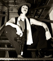
| 08/31/2006 03:00:25 AM |
Pulp Fictionby lentilComment: not really a scene from the film, nor is it really of the same genre... surely some other B&W movie from depression / elliot ness era USA might be more suitable?? as a photo, the lighting and the whites feel a little bright and overpowering. the setting is very appropriate, as is the pose and attitude. 5. |
| Photographer found comment helpful. |
Home -
Challenges -
Community -
League -
Photos -
Cameras -
Lenses -
Learn -
Help -
Terms of Use -
Privacy -
Top ^
DPChallenge, and website content and design, Copyright © 2001-2025 Challenging Technologies, LLC.
All digital photo copyrights belong to the photographers and may not be used without permission.
Current Server Time: 09/01/2025 12:35:08 PM EDT.