| Image |
Comment |
| 09/09/2014 02:01:10 PM |
In memory of Robin Williams, American actor recently diedby clickodakComment: Critique Club Comment:
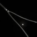
Interesting that I should get this as I was a huge Robin Williams fan since before anyone knew who or what a "Mork" was. That said, even while I knew he was a cyclist and had seen him on broadcast of Le Tour several times I did find the title a bit out of sync with what I would expect for a tribute image and I suspect that may have put some people off.
That said, even before I scrolled down I really liked this image for its stark simplicity. The color tonality is very basic and the off-white background works well with the color of the chain. There's not a lot else going on here, so what us there needs to be exacted perfectly and here's where I had a couple issues, ultimately giving you a 6 when I really wanted to give you more. There are really only two issues that I have - not enough depth of field and skewed orientation.
For the life of me I tried to find a reason why it would make sense to have the top and bottom out of focus, but without there being something in the center, on the chain, that would be emphasized by the lack of focus elsewhere I found the blurred sections to be distracting and would have much preferred the entire chain be in focus. The other thing is the right lean of the heart. While this is definitely not a perfect shaped heart, a 2-3 degree rotation of the image to the left gives the shape a straighter feel, and a more pleasing orientation - at least for me.
Otherwise I think that the only other thing this suffered from was being too simple in a challenge that normally shows off some wild images, so voters may have been inclined to undervalue it when held against some of the other images. Not necessarily fair, but that's the way things tend to work around here some times. |
 Photographer found comment helpful. Photographer found comment helpful. |
| 09/09/2014 09:41:51 AM |
In The Florida Sun.....by Ja-9Comment: Critique Club Comment:
A absolutely lovely image, Janine, and deserving of your top 10 finish. The lovely pastel hues of the sky as it reflects against the calm water is wonderful. I would have loved it if you could have pulled out some of the pinks barely visible in the high clouds a bit more, and maybe deepen some of the oranges. Noticing you have the Nik Collection, this is where some of the Bi-Color filters in Color Efex can really make a sunset image pop. But I'm getting picky.
The composition is excellent, though it would have been better if you had been able to get beyond what appears to be the tide line of shells that runs across the bottom right. Or perhaps masked them out a little better. I can never tell if these would be considered "powerline-like incidental distractions". Regardless, it's what kept me from giving this an 8 or 9 instead of a 7.
Really a fine capture. Anything else I might find to call attention to would be a fact of nature and location and I suspect there wouldn't have been much you could have done about that at the moment. :) |
| Photographer found comment helpful. |
| 09/09/2014 03:46:59 AM |
Binding the Edgesby LydiaComment: Nice. Would have prefered not to see the shadow under the zipper in the upper left. |
| Photographer found comment helpful. |
| 09/09/2014 03:45:57 AM |
Zip itby BenstedComment: A little too much blur for me. Looks artificial. Was it? |
| Photographer found comment helpful. |
| 09/09/2014 03:44:12 AM |
|
| Photographer found comment helpful. |
| 09/09/2014 03:43:07 AM |
|
| Photographer found comment helpful. |
| 09/09/2014 03:42:14 AM |
Worn Treasure by naomikComment: Great look on the old cover. I'm thinking I'd rather lose some of the white above and raise it in the frame or go with a long thin crop just below the dark areas at the top. Nicely processed otherwise. |
| Photographer found comment helpful. |
| 09/09/2014 03:39:04 AM |
Helping handby lei_73Comment: Framing doesn't work for me. Maybe cropped up and in from the bottom left so the zipper lands on the left third line? |
| Photographer found comment helpful. |
| 09/09/2014 03:37:37 AM |
|
| Photographer found comment helpful. |
| 09/09/2014 03:36:59 AM |
|
| Photographer found comment helpful. |
Home -
Challenges -
Community -
League -
Photos -
Cameras -
Lenses -
Learn -
Help -
Terms of Use -
Privacy -
Top ^
DPChallenge, and website content and design, Copyright © 2001-2025 Challenging Technologies, LLC.
All digital photo copyrights belong to the photographers and may not be used without permission.
Current Server Time: 09/02/2025 08:30:05 AM EDT.