|
|
|
Showing 1501 - 1510 of ~1950 |
| Image |
Comment |
| 09/23/2014 02:46:05 PM | |  Photographer found comment helpful. Photographer found comment helpful. |
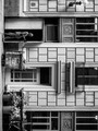
| 09/23/2014 02:44:35 PM | in passingby tvsometimeComment: Interesting use of wide angle perspective warping with right angles. | | Photographer found comment helpful. |
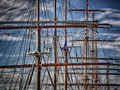
| 09/23/2014 02:43:49 PM | Masts and Yardsby LN13Comment: Neat shot and there are plenty of right angles in there, but the skewed lines just get noisy for me. Still a nice shot. | | Photographer found comment helpful. |
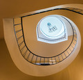
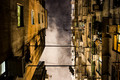
| 09/23/2014 02:42:23 PM | Change of Directionby MargaretNetComment: Part of me wishes you'd moved a touch forward to lose the doorway one floor up and gained a bit of the railing on the next level, but I suspect that wasn't entire possible. Great place to shoot. | | Photographer found comment helpful. |
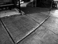
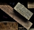
| 09/23/2014 02:40:39 PM | scrapby mefnjComment: I like the combination of hard angles and grain, but I'm not crazy about the level of "glow". Shadow across the top is a little distracting as well. | | Photographer found comment helpful. |
| 09/23/2014 02:39:39 PM | existences by TiberiusComment: Really like this. Can't find that look in a small town - I tried. :) | | Photographer found comment helpful. |
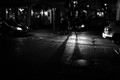
| 09/23/2014 07:32:25 AM | Saturday nightby boguloComment: Critique Club Comment:
Very nicely seen and shot. This is one of those photos that suffers greatly due to the constraints of this website. As presented there are many details here that are not apparent, for when I critique I always take a copy of the photo and open it in Photoshop to test any suggestions I might make, and as I opened it I saw things I could not see (and still cannot) on the same monitor as presented here. I suspect it's seeing it against the light gray background of DPC vs. the dark gray of PS. My point being that the impact of monitor calibration (or lack thereof) across the breadth of the voters, when combined with what I pointed out regarding the differences against light and dark backgrounds, may be what's responsible for the amazingly wide array of votes you've received. I suspect a notch of the midtones to the brighter side in Silver Efex may have remedied that, particularly given the number of "too dark" comments below.
As for the photograph itself, the huge variety of lines going in all directions is what makes this image both interesting and problematic. People with "level horizon OCD" look for a grounding point when there are lines, and what struck me when I opened this in Photoshop is that the one thing that is straight - the sign - looks absolutely skewed when I don't have a grid overlay turned on. While these lines are wonderful (even for someone with my condition), they do distract from the one actual shadow (as opposed to darkness, which I realize is also "shadow") that appears in the photo. As lit, the shadow simply exists along with the other darkness, which is not a problem unless you factor in that voters were looking for "shadows". I think a notch in the midpoint light to brighten the entire scene a hair coupled with a darkening of the central shadow against the headlight reflection may have gotten you some extra points from those who are on the lower end of the curve. I know it would have brought my 5 up to a 7 or 8, easily.
Again, there's not a lot I don't like about this photograph seeing it properly. My only criticism is in light of the challenge parameters, and the format in which it's presented here. Nicely done. | | Photographer found comment helpful. |
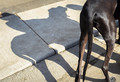
| 09/23/2014 06:59:44 AM | The cowboy and his horseby clickodakComment: Critique Club Comment:
Marcel, so here we meet again. LOL
As I mentioned below, I thought this was a nice use of shadows, but compositionally it didn't seem to work for me. I've now been staring at this to try and explain why, but I may have been wrong in that assessment and I want to now blame the treatment. While I do believe that the composition is a little cramped, what doesn't work for me is that there are too many distractions to keep me from wanting to look at the shadow (which also lacks punch). From the green fleck to the piece of white paper to the lines in the road and sidewalk, it's a little messy there.
Darken the shadow and this helps some. Getting rid of the green and the paper would be nice, but you run the risk of rules violations, but if make convert this to B&W those become almost non-issues.
Well seen and captured. I gave the original a 5, but I believe with a different treatment that removed distractions and made the shadow stand out against the dog I would have easily bumped it up a few points. | | Photographer found comment helpful. |
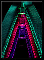
| 09/18/2014 07:43:44 AM | Z is for ....by adriano74Comment: Critique Club Comment:
I love the visual impact of this image. The stark colors against the black background, and lighting that brings out the detail in the fabric. Perfect example of how simplicity can often trump more complicated compositions. Your statement about setting WB to Fluorescent makes me wonder what the colors were originally.
Compositionally this is very strong, with lines leading the viewers eye up from the corners and then down into the depth of the trio. Any other order of colors would not have worked as well (did you try?). You obviously spent a lot of time getting the three of them to line up so well, and risked nothing by shooting at ISO 100 and 30 seconds. Which makes me wonder how you managed to miss the slightly skewed symmetry? That's my only real nit to pick on this photo, but for me it's a big one because everything is so stark that it's immediately obvious against the black background. This one is due partially to a slightly skewed camera rotation (fixable in post, ~1.2 degrees left), as well as the top zipper set slightly off on the right side (fixable using Free Transform with the Distort option in Photoshop). This is ultimately a minor thing for most, but it's one of those things (like crooked horizons) that are so important, to me at least, when differentiating a good photo from a great photo.
The only other thing I might have fixed was the reflection of the bottom zipper against the black surface, either eliminating it completely (could risk a DQ, I suppose), make it less distracting by muting the light and color more, or bringing it to the fore as an obvious reflection (you can see from one comment that it was misinterpreted as a 4th zipper).
Again, a really fine image, and well done on the top 5 finish. | | Photographer found comment helpful. |
| 09/17/2014 07:01:03 AM | Openness on my next vacationby clickodakComment: Critique Club Comment:
I really liked this one a lot. The green grabs you and offsets the sand and shell nicely. Composition is very good, though I would have preferred the zipper to lead from the corner rather than the edge. The shell might have been better placed in the center of the spread of the zipper, more towards the crossing of 1/3 lines, or a second object placed there. Regardless, the shell feels like it's too close to the edge given all the sand. As I mentioned below, I'd also like to have had the green on the top zipper pushed back so that it exposed the teeth as with the zipper below.
A fine image that I gave a 7. A very deserving top 10. | | Photographer found comment helpful. |
|
Showing 1501 - 1510 of ~1950 |
Home -
Challenges -
Community -
League -
Photos -
Cameras -
Lenses -
Learn -
Help -
Terms of Use -
Privacy -
Top ^
DPChallenge, and website content and design, Copyright © 2001-2025 Challenging Technologies, LLC.
All digital photo copyrights belong to the photographers and may not be used without permission.
Current Server Time: 09/02/2025 07:07:50 PM EDT.
|