| Author | Thread |
|
|
09/23/2014 06:59:44 AM |
Critique Club Comment:
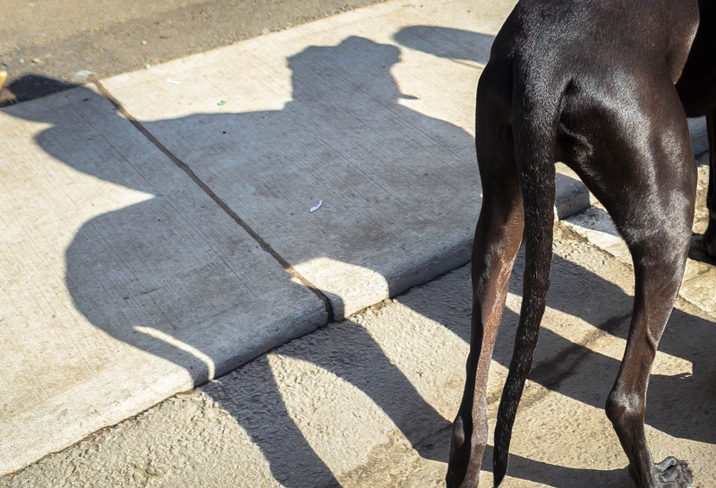
Marcel, so here we meet again. LOL
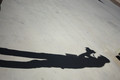
As I mentioned below, I thought this was a nice use of shadows, but compositionally it didn't seem to work for me. I've now been staring at this to try and explain why, but I may have been wrong in that assessment and I want to now blame the treatment. While I do believe that the composition is a little cramped, what doesn't work for me is that there are too many distractions to keep me from wanting to look at the shadow (which also lacks punch). From the green fleck to the piece of white paper to the lines in the road and sidewalk, it's a little messy there.
Darken the shadow and this helps some. Getting rid of the green and the paper would be nice, but you run the risk of rules violations, but if make convert this to B&W those become almost non-issues.
Well seen and captured. I gave the original a 5, but I believe with a different treatment that removed distractions and made the shadow stand out against the dog I would have easily bumped it up a few points. |
|
 Photographer found comment helpful. Photographer found comment helpful. |
Comments Made During the Challenge  |
|
|
09/16/2014 10:57:01 PM |
|
| Photographer found comment helpful. |
|
|
09/16/2014 10:53:23 PM |
|
one of the few entries to make use of shadows this way. well seen. |
|
| Photographer found comment helpful. |
|
|
09/16/2014 10:50:42 PM |
|
| Photographer found comment helpful. |
|
|
09/15/2014 07:34:59 AM |
|
Interesting shadow, but the overall composition, not so much. A little space to the left of the "cowboy" and maybe more of the dog's legs (rotate clockwise a bit?) might have improved it. |
|
| Photographer found comment helpful. |
|
|
09/12/2014 02:08:02 PM |
|
skinny legged horse that is ... |
|
| Photographer found comment helpful. |
|
|
09/11/2014 10:44:45 AM |
|
Sure does look like a horse and rider in the shadow! |
|
| Photographer found comment helpful. |
|
|
09/10/2014 05:53:15 PM |
Interesting part of the horse to include as the only part of the shadow's source.
...Going back I realize it's a dog, that's worth a point bump up :) |
|
| Photographer found comment helpful. |
Home -
Challenges -
Community -
League -
Photos -
Cameras -
Lenses -
Learn -
Help -
Terms of Use -
Privacy -
Top ^
DPChallenge, and website content and design, Copyright © 2001-2026 Challenging Technologies, LLC.
All digital photo copyrights belong to the photographers and may not be used without permission.
Current Server Time: 06/27/2026 07:46:13 PM EDT.