| Author | Thread |
|
|
09/18/2014 07:43:44 AM |
Critique Club Comment:
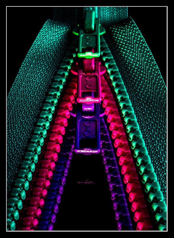
I love the visual impact of this image. The stark colors against the black background, and lighting that brings out the detail in the fabric. Perfect example of how simplicity can often trump more complicated compositions. Your statement about setting WB to Fluorescent makes me wonder what the colors were originally.
Compositionally this is very strong, with lines leading the viewers eye up from the corners and then down into the depth of the trio. Any other order of colors would not have worked as well (did you try?). You obviously spent a lot of time getting the three of them to line up so well, and risked nothing by shooting at ISO 100 and 30 seconds. Which makes me wonder how you managed to miss the slightly skewed symmetry? That's my only real nit to pick on this photo, but for me it's a big one because everything is so stark that it's immediately obvious against the black background. This one is due partially to a slightly skewed camera rotation (fixable in post, ~1.2 degrees left), as well as the top zipper set slightly off on the right side (fixable using Free Transform with the Distort option in Photoshop). This is ultimately a minor thing for most, but it's one of those things (like crooked horizons) that are so important, to me at least, when differentiating a good photo from a great photo.
The only other thing I might have fixed was the reflection of the bottom zipper against the black surface, either eliminating it completely (could risk a DQ, I suppose), make it less distracting by muting the light and color more, or bringing it to the fore as an obvious reflection (you can see from one comment that it was misinterpreted as a 4th zipper).
Again, a really fine image, and well done on the top 5 finish. |
|
 Photographer found comment helpful. Photographer found comment helpful. |
|
|
09/16/2014 08:38:48 PM |
|
Top 5 in every challenge submit their originals... It's an honor :-) |
|
| Photographer found comment helpful. |
|
|
09/15/2014 01:15:16 AM |
Holy Bugger!!! Truly a first time for me having such a high place and score. Never did I realize I would've done so well. I am happy with how it went and I hope to learn from this experience although I will falter, I know there will always be that diamond-in-the-ruff that I can produce.
Thank you so much for everyone's vote and commenters. I look forward to giving my best in the future.
Ohhh!!! I have been tagged to submit my original. I hope I didn't do anything wrong.
Now we'll just have to see if this holds up. I have never been DQ'd for anything. Ok...Original submitted. Now for the verdict. XX Fingers crossed.
Again Thanks to everyone.
Adrian |
|
|
|
09/15/2014 12:06:49 AM |
|
See, you did great! And note how the vote distribution mimics the shape of your entry :-) |
|
| Photographer found comment helpful. |
Comments Made During the Challenge  |
|
|
09/13/2014 04:22:39 PM |
|
Love the strong colors here. It pops nicely. |
|
| Photographer found comment helpful. |
|
|
09/10/2014 10:52:45 PM |
|
Great pattern. Lovely for the challenge topic. |
|
| Photographer found comment helpful. |
|
|
09/09/2014 03:33:07 AM |
|
Nice colors. Would have worked a little better if you nailed the symmetry in the framing. |
|
| Photographer found comment helpful. |
|
|
09/09/2014 02:39:16 AM |
|
great colour and idea like it a lot |
|
| Photographer found comment helpful. |
|
|
09/08/2014 10:03:55 PM |
I really like the colors here together they just pop!
10 |
|
| Photographer found comment helpful. |
|
|
09/08/2014 01:37:52 PM |
|
This is very cool. I like the neon colors and the striking contrast, and the composition is great. Maybe it's a calibration issue but all I see of the fourth row is the bright part of the zipper pull. If it was meant to be that dark, I would have left that out to keep it simple. |
|
| Photographer found comment helpful. |
Home -
Challenges -
Community -
League -
Photos -
Cameras -
Lenses -
Learn -
Help -
Terms of Use -
Privacy -
Top ^
DPChallenge, and website content and design, Copyright © 2001-2026 Challenging Technologies, LLC.
All digital photo copyrights belong to the photographers and may not be used without permission.
Current Server Time: 07/08/2026 03:21:30 PM EDT.